> ## Documentation Index
> Fetch the complete documentation index at: https://www.courier.com/docs/llms.txt
> Use this file to discover all available pages before exploring further.
# Action
> Action Blocks let you add buttons or links to Courier notifications. Configure text, URL actions, alignment, and styling. Behavior and appearance vary by channel, with limited support in SMS/chat.
Action Blocks add interactive buttons or links to your notifications, letting recipients take action directly from the message. They render as buttons in email and as plain URLs in SMS and chat channels.
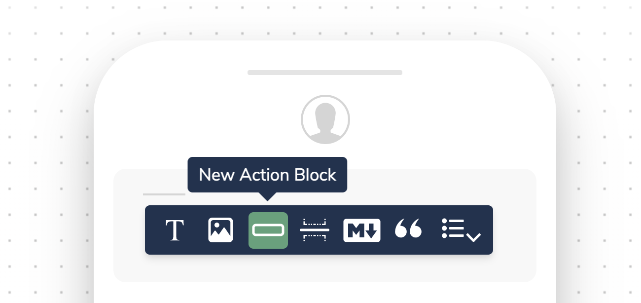 ## Configuring Action Blocks
When you select an action block, you are presented with a toolbar with the following formatting options depending on the notification channel.
## Configuring Action Blocks
When you select an action block, you are presented with a toolbar with the following formatting options depending on the notification channel.
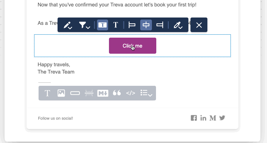 ### Text and Link
* Click the Edit icon to set the `Friendly Text` and `Action`. For most channels, the action is a URL. For Slack, you can opt to use a webhook.
### Button Type
* Select between different button styles, as well as a text-only link option
Action buttons are not available across all channels. For SMS and chat, the button renders as a URL.
### Alignment
* Align the content of the block left, center or right.
### Color (Action Buttons Only)
* Select the button color. You can use a color from the palette or enter the hex value for a custom color, or select from pre-defined brand template colors. This option is only available for action buttons.
Adding, reordering, and filtering blocks
Add hyperlinks inline within text content
Conditionally show or hide action blocks
Use dynamic URLs and button text
### Text and Link
* Click the Edit icon to set the `Friendly Text` and `Action`. For most channels, the action is a URL. For Slack, you can opt to use a webhook.
### Button Type
* Select between different button styles, as well as a text-only link option
Action buttons are not available across all channels. For SMS and chat, the button renders as a URL.
### Alignment
* Align the content of the block left, center or right.
### Color (Action Buttons Only)
* Select the button color. You can use a color from the palette or enter the hex value for a custom color, or select from pre-defined brand template colors. This option is only available for action buttons.
Adding, reordering, and filtering blocks
Add hyperlinks inline within text content
Conditionally show or hide action blocks
Use dynamic URLs and button text