> ## Documentation Index
> Fetch the complete documentation index at: https://www.courier.com/docs/llms.txt
> Use this file to discover all available pages before exploring further.
# Content Block Overview
> Courier Content Blocks are reusable, drag-and-drop components for building cross-channel notifications. They support variables, conditional logic, custom styling, and include types like text, image, markdown, list, and more.
Content Blocks are the building blocks of your notifications in Courier. They are reusable, drag-and-drop components that allow you to build notification content across multiple channels. Key features include:
* Responsive and cross-channel by default
* Reusable across different notification channels
* Support for [variables](/platform/content/variables/inserting-variables) and [conditional filtering](/platform/content/template-settings/send-conditions#for-content-blocks)
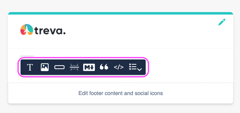
## Type of Content Blocks
* Text Blocks
* Image Blocks
* Action Blocks
* Divider Blocks
* Markdown Blocks
* Quote Blocks
* Template Blocks
* List Blocks
* Jsonnet Blocks
Some blocks, like Text and Action Blocks, have channel-specific options or formatting. For example, you can set the color of a text block differently for email and SMS.
## Working with Content Blocks
### Adding Content Blocks
1. Create a new notification and add delivery channels
2. Use the content toolbar to add desired block types
3. Drag and drop blocks to reorder them
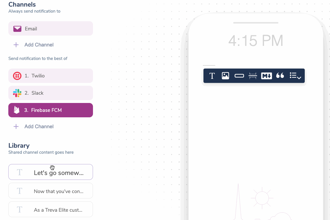
 ### Using the Content Block Library
The Block Library stores shared channel content:
* Displays blocks not in use by the selected channel
* Marks unused blocks for easy identification
* Allows deletion of unused blocks
### Using the Content Block Library
The Block Library stores shared channel content:
* Displays blocks not in use by the selected channel
* Marks unused blocks for easy identification
* Allows deletion of unused blocks
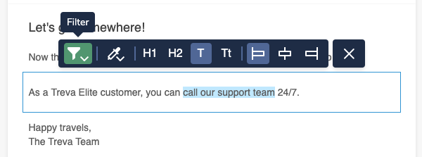
 ### Applying Conditional Filters
You can hide or show blocks based on specific conditions:
1. Select a block and click the filter button
### Applying Conditional Filters
You can hide or show blocks based on specific conditions:
1. Select a block and click the filter button
 2. Set conditions in the modal that appears. You can use values passed in the data object or from the merged recipient profile for the property and values.
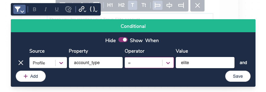 You can use values passed in the data object or from the merged recipient profile for the property and values.
See [Content Block Conditions](/platform/content/template-settings/send-conditions#for-content-blocks) for more information.
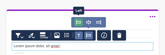
### Customizing Block Settings
Each content block has block-specific settings. The available settings are block-dependent but include things like alignment, color, and text formatting.
You can use values passed in the data object or from the merged recipient profile for the property and values.
See [Content Block Conditions](/platform/content/template-settings/send-conditions#for-content-blocks) for more information.
### Customizing Block Settings
Each content block has block-specific settings. The available settings are block-dependent but include things like alignment, color, and text formatting.
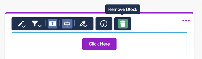
 ### Removing a Block
Blocks can be removed from a channel by selecting the block and clicking the Remove Block button. This action will send it to the Block Library.
### Removing a Block
Blocks can be removed from a channel by selecting the block and clicking the Remove Block button. This action will send it to the Block Library.
 ## Block Types
Rich text with inline conditions, variables, and formatting
Visual content with channel-specific rendering
Buttons and links for interactive notifications
Dynamic arrays rendered as styled lists
Formatted content using plain text syntax
Custom HTML, CSS, and Handlebars
Highlighted text and citations
Visual separators between content sections
## Block Types
Rich text with inline conditions, variables, and formatting
Visual content with channel-specific rendering
Buttons and links for interactive notifications
Dynamic arrays rendered as styled lists
Formatted content using plain text syntax
Custom HTML, CSS, and Handlebars
Highlighted text and citations
Visual separators between content sections