> ## Documentation Index
> Fetch the complete documentation index at: https://www.courier.com/docs/llms.txt
> Use this file to discover all available pages before exploring further.
# Column Blocks
> Create multi-column layouts in Design Studio for side-by-side content like product cards, image grids, and comparison layouts.
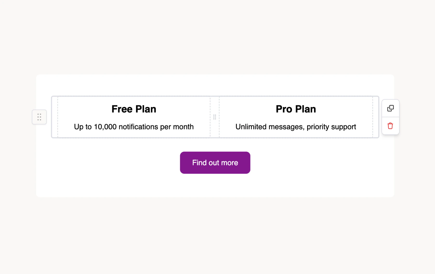
Column blocks create multi-column layouts for side-by-side content. Use them for product cards with images and descriptions, comparison layouts, image grids, or any content that benefits from horizontal structure.
## Adding a column block
1. In Design Studio, select a channel.
2. Add a **Column** block from the block sidebar, toolbar, or slash menu.
3. The block starts as a two-column row with equal widths.
4. Drag content blocks (text, image, button, etc.) into each column cell.
Each column cell is an independent container that accepts any content block type: text, images, buttons, dividers, lists, and nested columns.
 ## Column settings
Select the column block to configure it in the settings panel:
* **Columns count** — choose 1, 2, 3, or 4 columns
* **Frame** — horizontal/vertical padding (pixels) and background color for each cell
* **Border** — width, radius, and color for each cell
* **Conditions** — show or hide the block based on profile or data values
## Column settings
Select the column block to configure it in the settings panel:
* **Columns count** — choose 1, 2, 3, or 4 columns
* **Frame** — horizontal/vertical padding (pixels) and background color for each cell
* **Border** — width, radius, and color for each cell
* **Conditions** — show or hide the block based on profile or data values
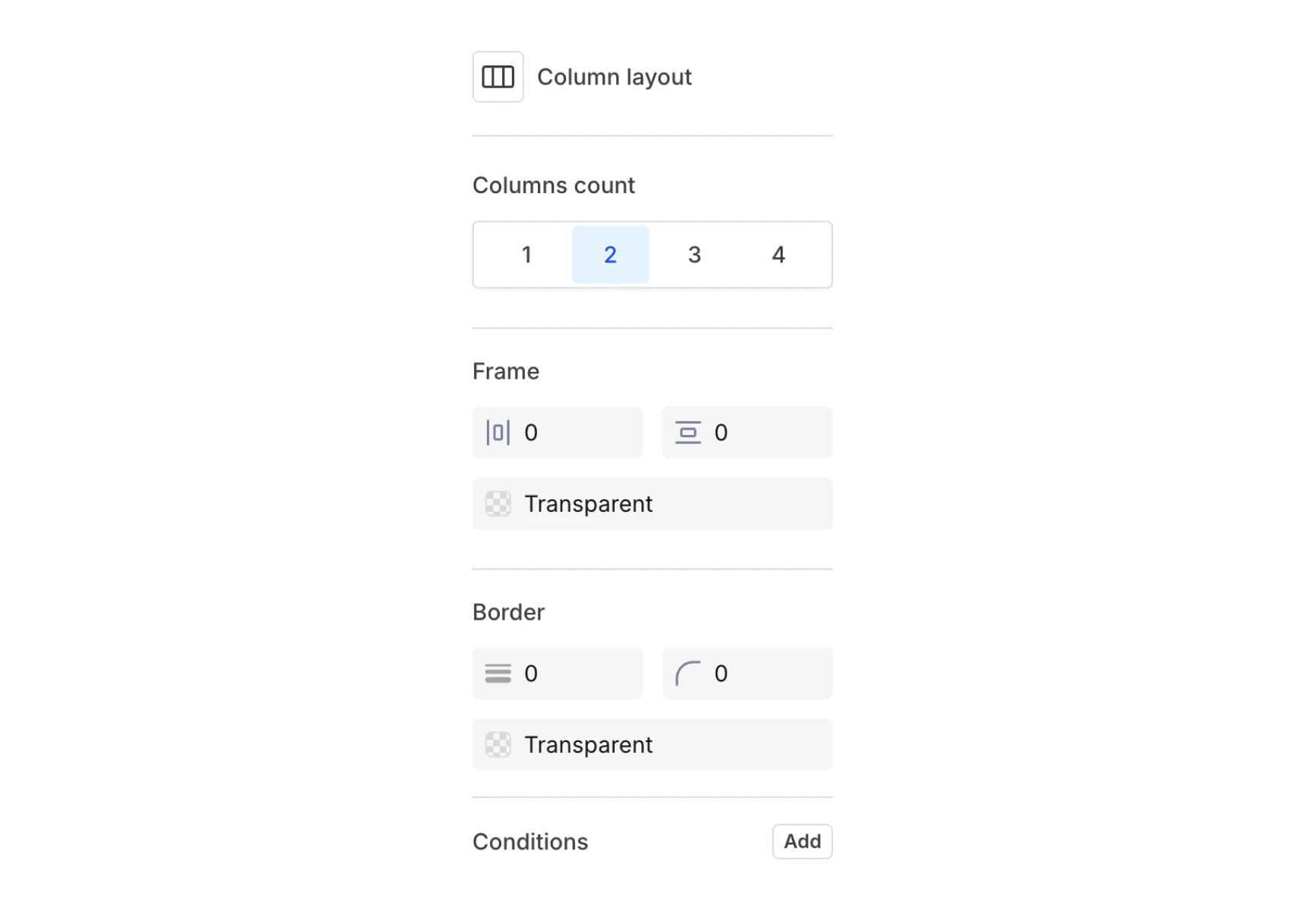 Frame and border settings apply per cell, so you can style each column independently (e.g. a highlighted left column with a colored background next to a plain right column).
## Channel behavior
Column blocks render differently depending on the channel:
| Channel | Behavior |
| ------------------ | -------------------------------------------------------------------------- |
| **Email** | Full multi-column layout using MJML for maximum email client compatibility |
| **Push** | Columns stack vertically (single-column fallback) |
| **SMS** | Not applicable; content renders as plain text |
| **In-App (Inbox)** | Full support with responsive behavior |
On mobile email clients, columns typically stack vertically to fit narrow screens. Design your column content so it reads well in both side-by-side and stacked layouts.
## Tips
* **Keep to 2-3 columns** — more columns get cramped, especially on mobile where they stack.
* **Balance content height** — columns with very different content lengths can look uneven. Use vertical alignment or padding to compensate.
* **Test across channels** — preview your template in email, push, and inbox to verify the layout works in each context.
* **Use for product cards** — a common pattern is an image column (30-40% width) alongside a text + button column (60-70% width).
Frame and border settings apply per cell, so you can style each column independently (e.g. a highlighted left column with a colored background next to a plain right column).
## Channel behavior
Column blocks render differently depending on the channel:
| Channel | Behavior |
| ------------------ | -------------------------------------------------------------------------- |
| **Email** | Full multi-column layout using MJML for maximum email client compatibility |
| **Push** | Columns stack vertically (single-column fallback) |
| **SMS** | Not applicable; content renders as plain text |
| **In-App (Inbox)** | Full support with responsive behavior |
On mobile email clients, columns typically stack vertically to fit narrow screens. Design your column content so it reads well in both side-by-side and stacked layouts.
## Tips
* **Keep to 2-3 columns** — more columns get cramped, especially on mobile where they stack.
* **Balance content height** — columns with very different content lengths can look uneven. Use vertical alignment or padding to compensate.
* **Test across channels** — preview your template in email, push, and inbox to verify the layout works in each context.
* **Use for product cards** — a common pattern is an image column (30-40% width) alongside a text + button column (60-70% width).