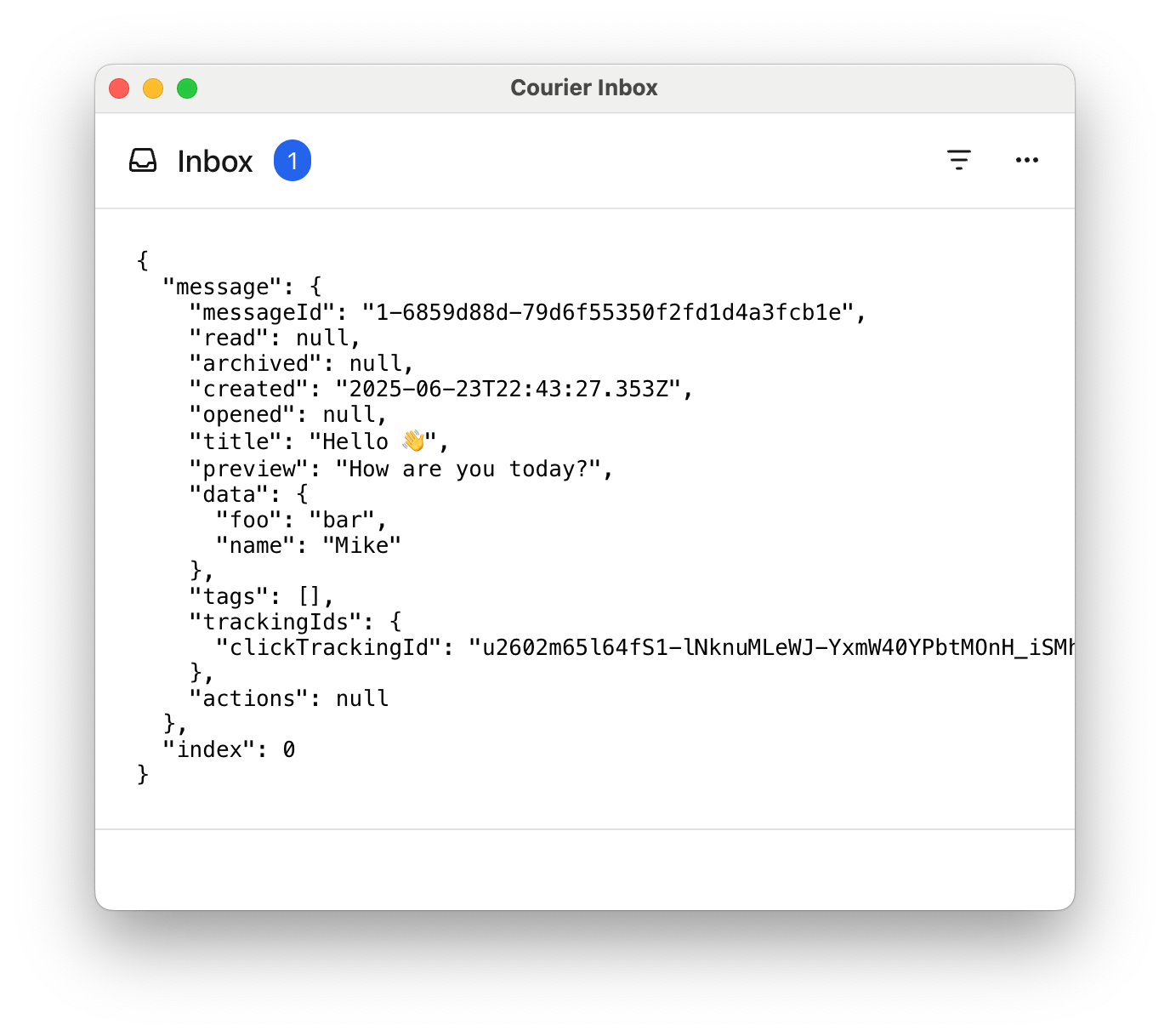
{JSON.stringify({ message, index }, null, 2)}
);
export default function App() {
// Authentication code...
return (
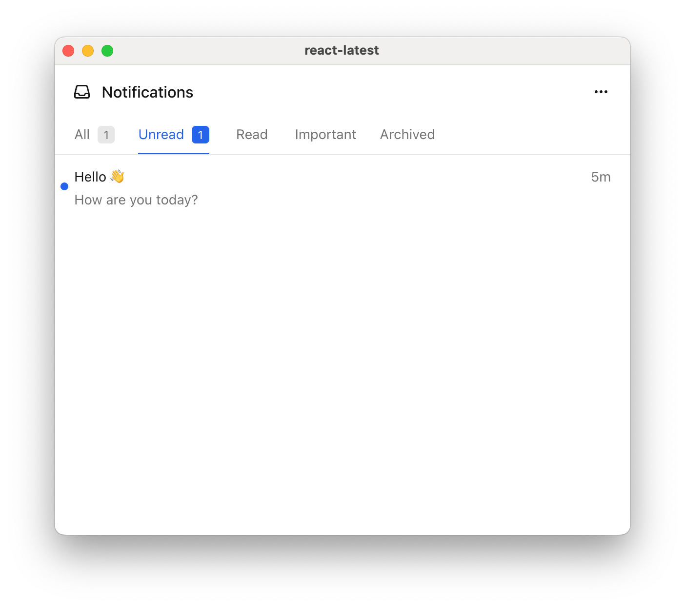
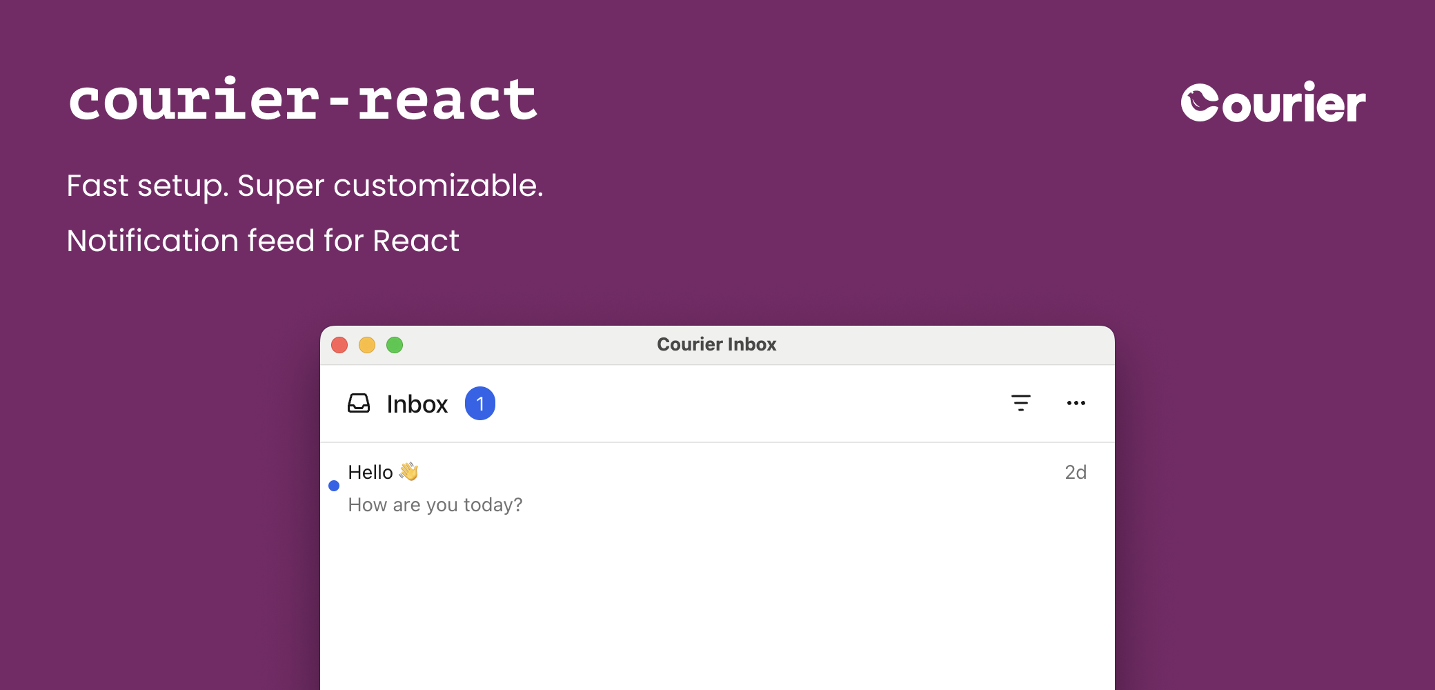 The Courier React SDK provides ready-made components and programmatic hooks for building notification experiences:
* `
The Courier React SDK provides ready-made components and programmatic hooks for building notification experiences:
* `
 | Vertical Alignment | Options |
| :----------------- | :--------------------------------------------------- |
| Top | `"top-right"`, `"top-center"`, `"top-left"` |
| Center | `"center-right"`, `"center-center"`, `"center-left"` |
| Bottom | `"bottom-right"`, `"bottom-center"`, `"bottom-left"` |
```jsx theme={null}
| Vertical Alignment | Options |
| :----------------- | :--------------------------------------------------- |
| Top | `"top-right"`, `"top-center"`, `"top-left"` |
| Center | `"center-right"`, `"center-center"`, `"center-left"` |
| Bottom | `"bottom-right"`, `"bottom-center"`, `"bottom-left"` |
```jsx theme={null}
{JSON.stringify({ message, index }, null, 2)}
);
export default function App() {
// Authentication code...
return (
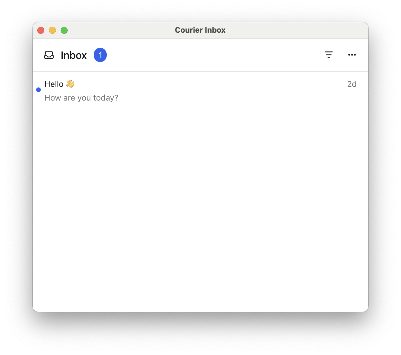
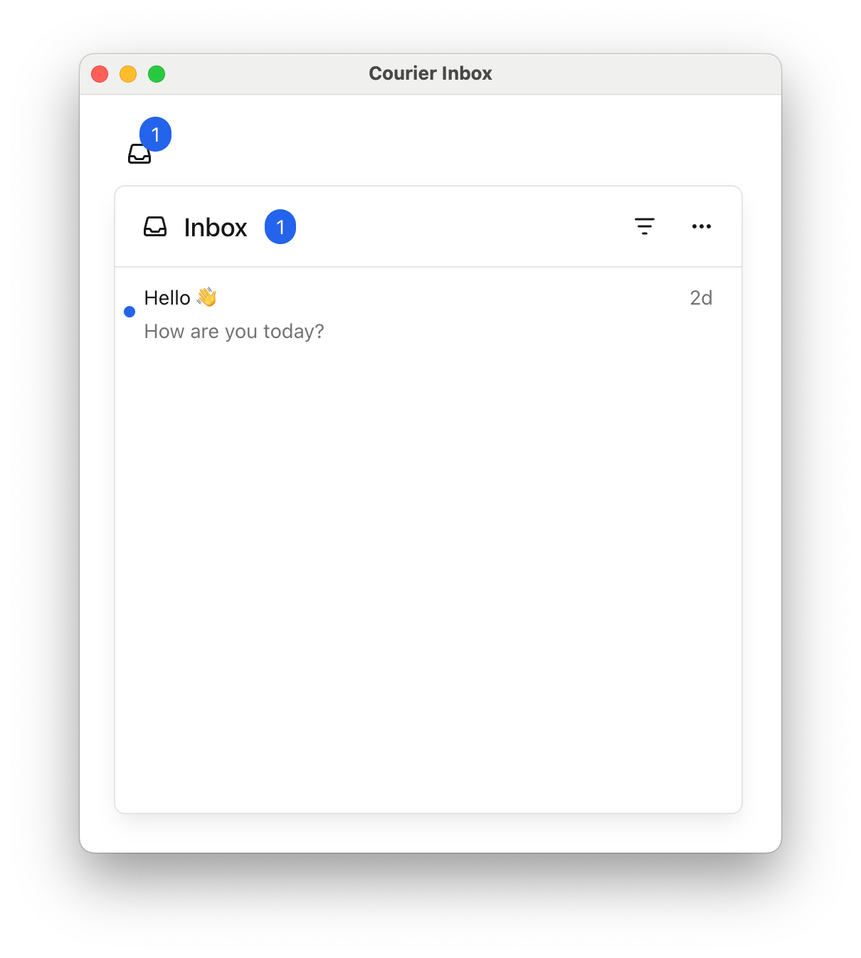
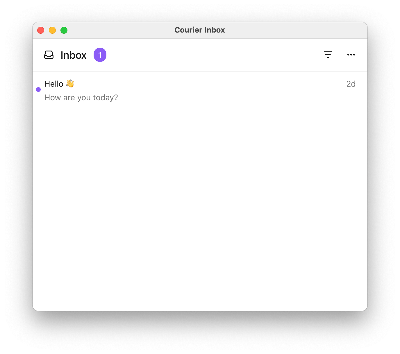
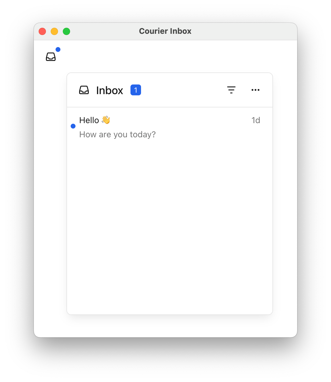
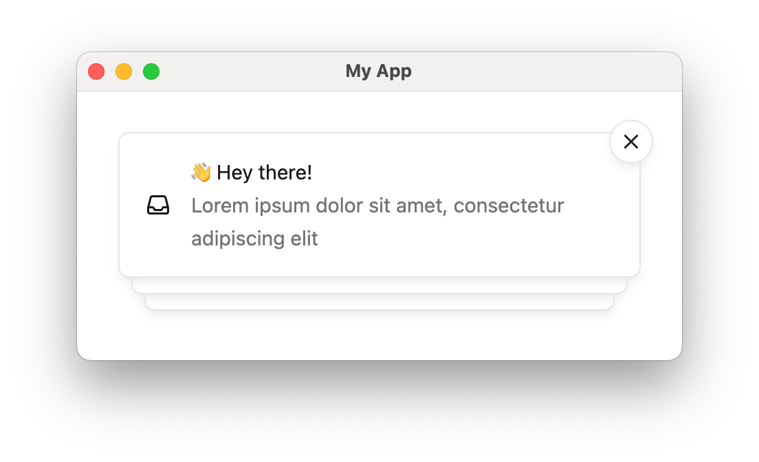 Toasts are short-lived notifications that notify users and prompt them to take action.
The Toast component is connected to the feed of Courier Inbox messages.
Toasts are short-lived notifications that notify users and prompt them to take action.
The Toast component is connected to the feed of Courier Inbox messages.
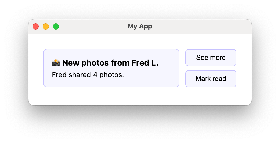
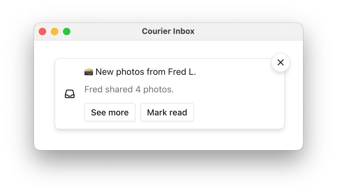 If a message contains [actions](/platform/content/content-blocks/action-blocks), toast items
include a button for each. Use `onToastItemActionClick` to handle those clicks.
```jsx theme={null}
If a message contains [actions](/platform/content/content-blocks/action-blocks), toast items
include a button for each. Use `onToastItemActionClick` to handle those clicks.
```jsx theme={null}
{message.body}
{message.body}
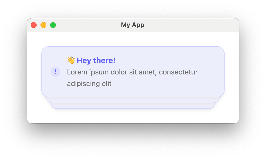
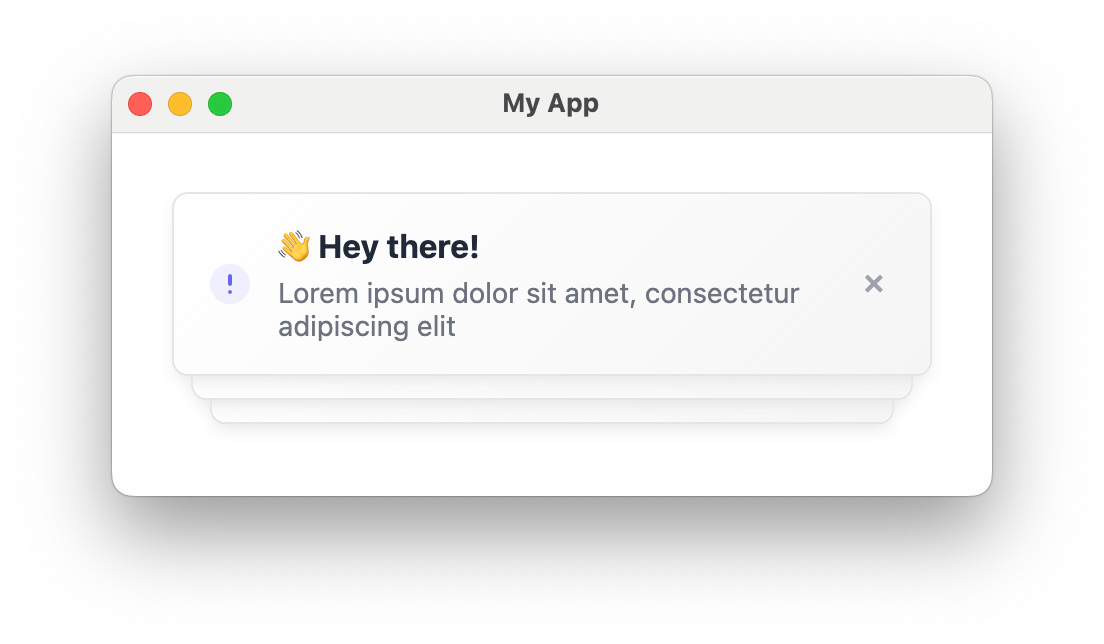
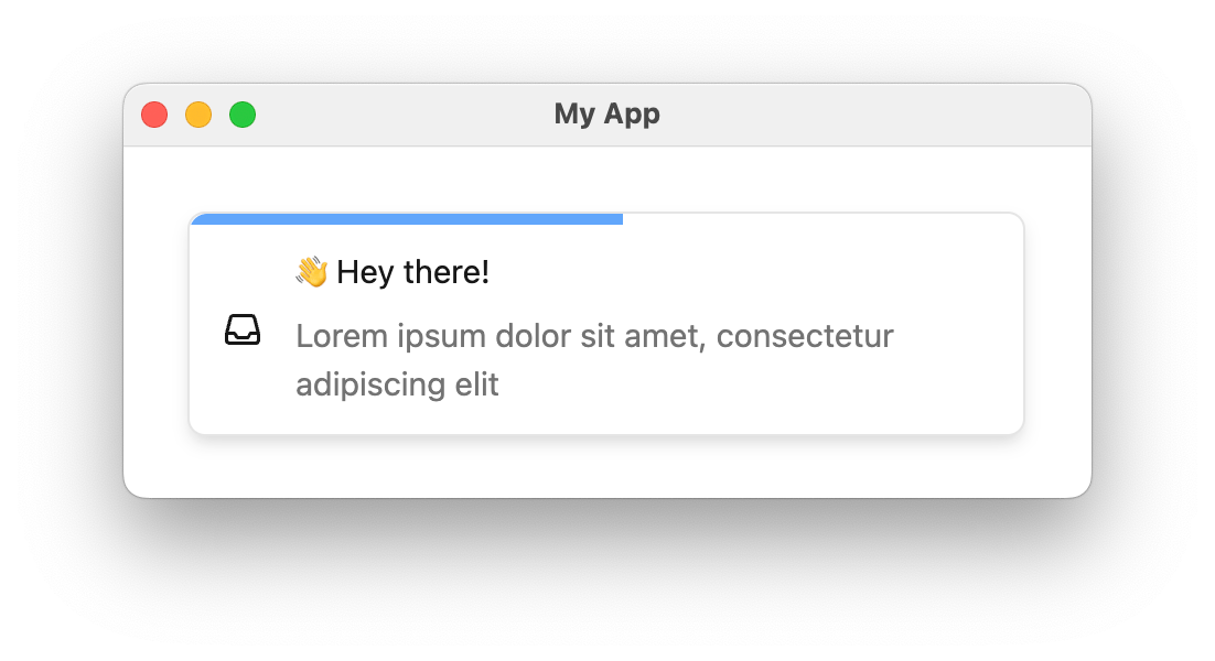 Enabling `autoDismiss` adds a countdown bar to each toast and automatically removes it after the timeout. The countdown bar color is theme-able via `autoDismissBarColor` in `CourierToastTheme`.
```jsx theme={null}
Enabling `autoDismiss` adds a countdown bar to each toast and automatically removes it after the timeout. The countdown bar color is theme-able via `autoDismissBarColor` in `CourierToastTheme`.
```jsx theme={null}