> ## Documentation Index
> Fetch the complete documentation index at: https://www.courier.com/docs/llms.txt
> Use this file to discover all available pages before exploring further.
# Courier Web Components SDK
> Embed a customizable in-app notification center, toasts, and notification preferences in your web app using Web Components. Works with any JavaScript framework.
The Courier Web Components SDK provides drop-in components for building notification experiences in any JavaScript project:
* `` — full-featured inbox for displaying and managing messages
* `` — popup menu version of the inbox
* `` — toast notifications for time-sensitive alerts
* `` — notification preferences center for managing topic subscriptions and delivery
This is the latest version of the Courier Web Components SDK, recommended for new and existing apps.
Coming from an earlier version? We recommend upgrading -- check out the
[migration guide for the React SDK](/sdk-libraries/courier-react-v8-migration-guide), which
is a thin wrapper around these Web Components and exposes a similar API.
## Installation
Inbox and Toast are published as separate packages. Install one or both depending on your needs.
```bash theme={null}
npm install @trycourier/courier-ui-inbox @trycourier/courier-ui-toast
```
Available on GitHub and npm:
Inbox ·
Inbox ·
Toast ·
Toast
The Courier SDKs work with any JavaScript build system and do not require any additional build configuration.
Using React? Check out the [Courier React SDK](/sdk-libraries/courier-react-web/), which provides React components and hooks built on top of these Web Components.
## Authentication
To use the SDK, you need to generate a JWT (JSON Web Token) for your user. **This JWT should always be generated by your backend server, never in client-side code.**
Inbox and Toast share the same `Courier.shared` authentication instance and connection to the Courier backend. Authenticate once and both components work.
***
### JWT Authentication Flow
When your app needs to authenticate a user, your client
should make a request to your own backend (ex. `GET https://your-awesome-app.com/api/generate-courier-jwt`).
In your backend endpoint, use your [Courier API Key](/platform/workspaces/environments-api-keys/) to call the [Courier Issue Token Endpoint](/api-reference/authentication/create-a-jwt) and generate a JWT for the user.
Having received the JWT from Courier, your backend should return it to your client and pass it to the Courier SDK.
See [all available user scopes](/api-reference/authentication/create-a-jwt) for the Courier APIs.
***
### Development Authentication with cURL
To quickly test JWT generation for development only, you can use cURL to call the [Courier Issue Token Endpoint](/api-reference/authentication/create-a-jwt) directly.
Do not call the Issue Token API from client-side code. Always keep your Courier API keys secure.
```bash wrap theme={null}
curl --request POST \
--url https://api.courier.com/auth/issue-token \
--header 'Accept: application/json' \
--header 'Authorization: Bearer $YOUR_API_KEY' \
--header 'Content-Type: application/json' \
--data \
'{
"scope": "user_id:$YOUR_USER_ID write:user-tokens inbox:read:messages inbox:write:events read:preferences write:preferences read:brands",
"expires_in": "$YOUR_NUMBER days"
}'
```
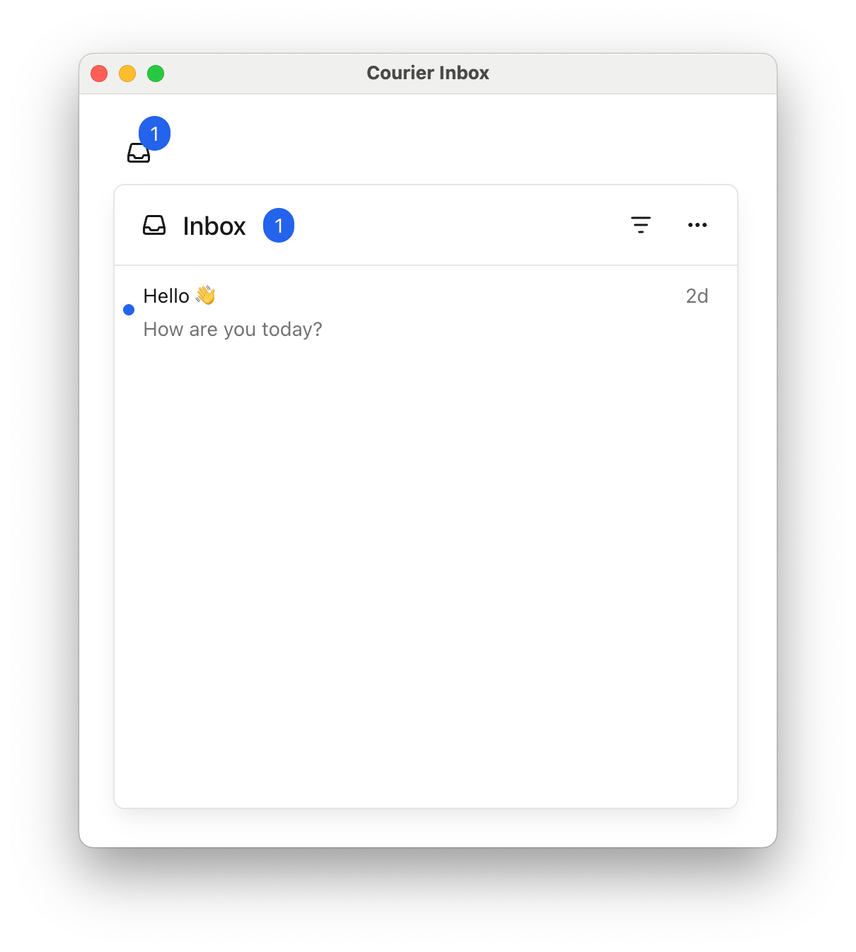
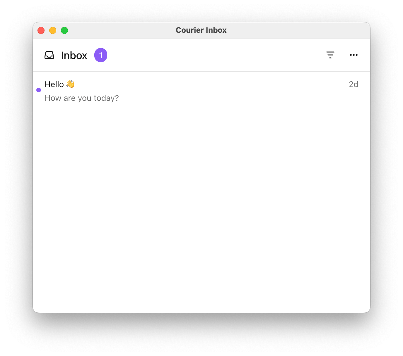
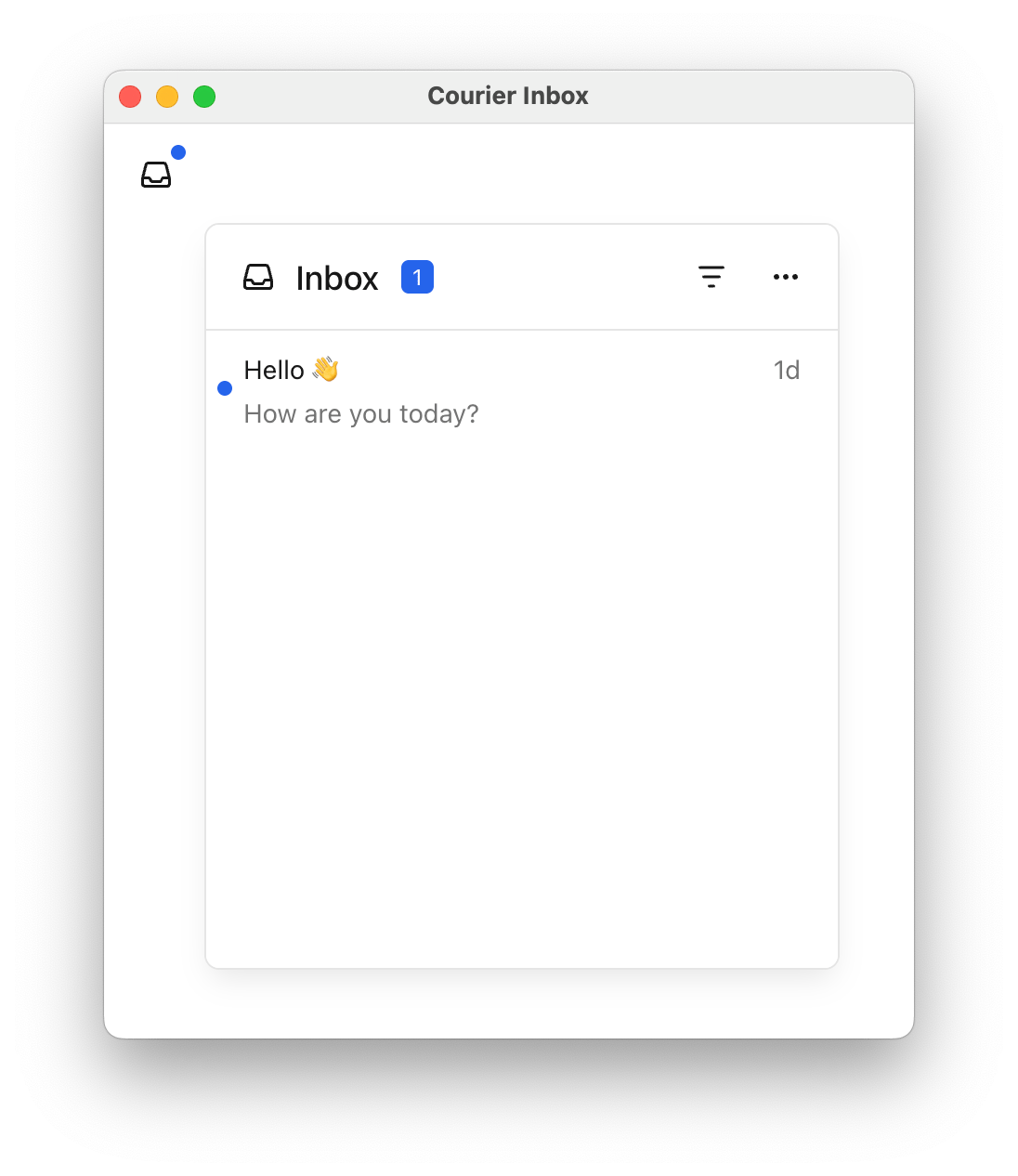
## Inbox Web Components
***
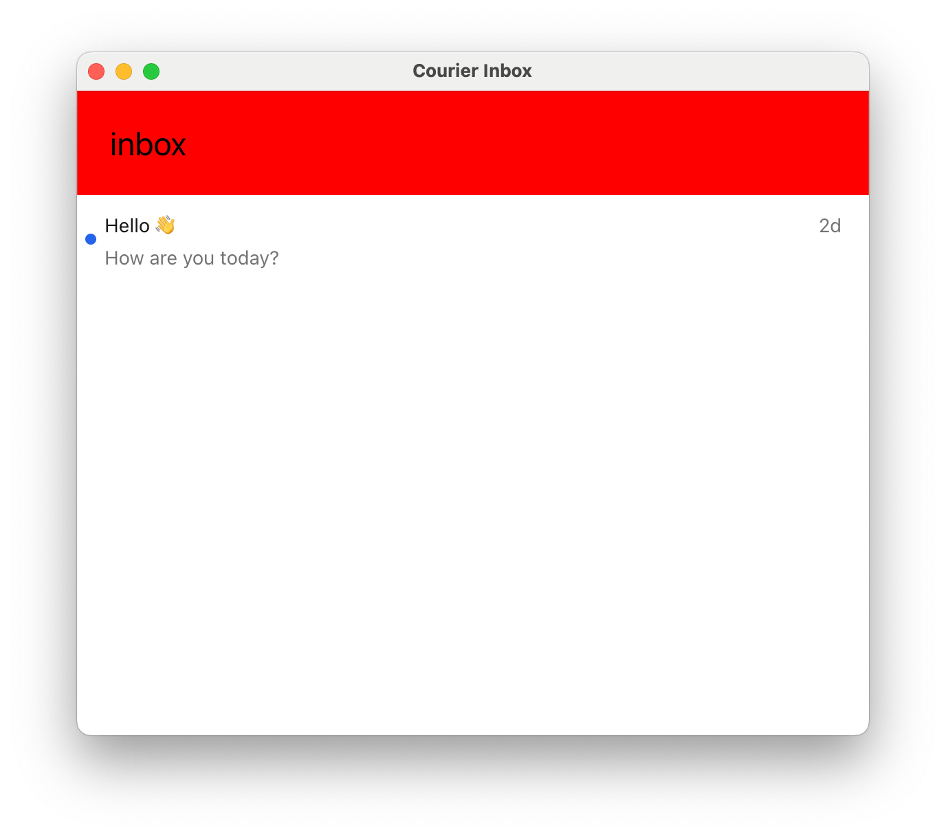
### ``
Importing the Courier SDK registers Courier's Web Components (``, ``).
```html highlight={2,5} theme={null}
```
**Sample App**: See a complete working example in our [Vanilla JS Inbox sample app](https://github.com/trycourier/courier-samples/tree/main/web/vanilla/inbox).
If you're using [tenants](/platform/tenants/tenants-overview), you can scope requests to a particular
tenant by passing its ID to the `signIn` request.
```js theme={null}
Courier.shared.signIn({
userId: "my-user-id",
jwt: jwt,
tenantId: "my-tenant-id"
});
```
For the full reference of sign in parameters, see the [Courier JS docs](/sdk-libraries/courier-js-web#courierclient-options).
***
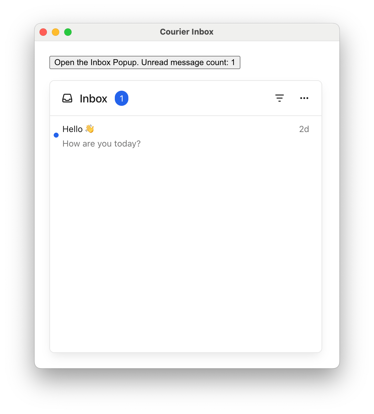
### ``
```html highlight={3,7} theme={null}
```
**Sample App**: See a complete working example in our [Vanilla JS Popup Menu sample app](https://github.com/trycourier/courier-samples/tree/main/web/vanilla/popup-menu).
***
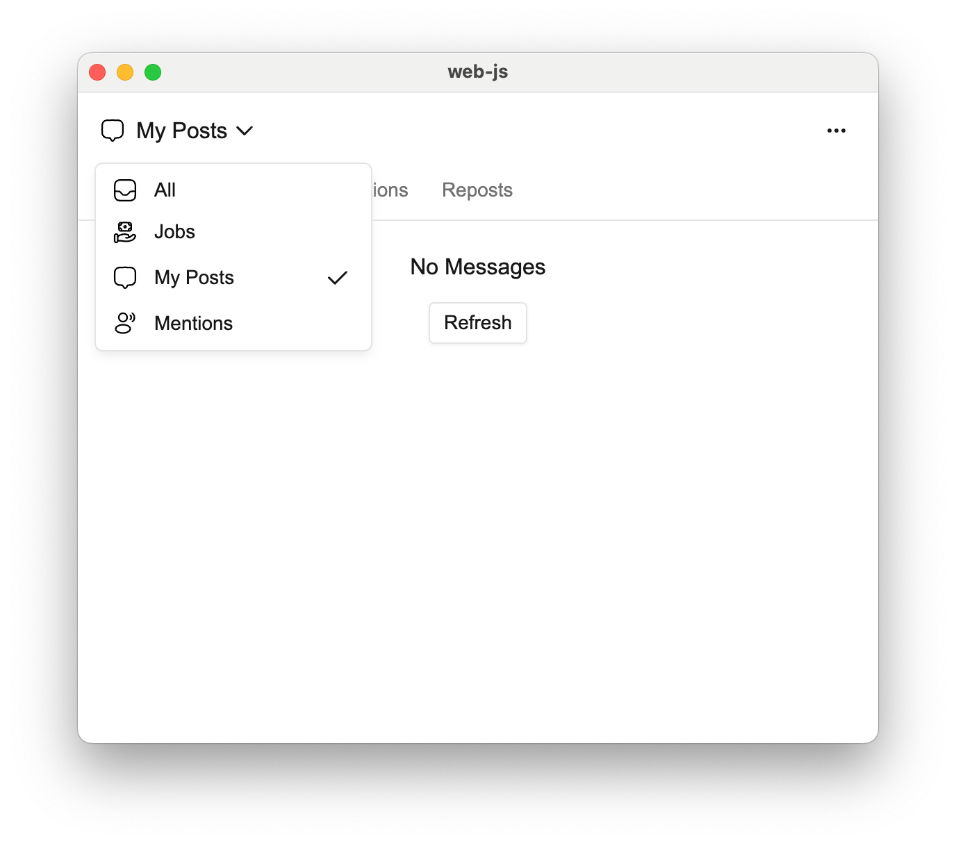
## Tabs and Feeds
Tabs and feeds allow you to organize and filter messages in your inbox. A **feed** is a container that groups related **tabs** together. Each tab represents a filtered view of messages.
If there is only one feed, the feed selection dropdown is hidden. If a feed has only one tab, the tab bar is hidden and the unread count appears next to the feed.
| Filter Property | Type | Description |
| :-------------- | :------------------- | :------------------------------------------------------------------ |
| `tags` | `string[]` | Messages that have any of the specified tags |
| `archived` | `boolean` | Whether to include archived messages (defaults to `false` if unset) |
| `status` | `'read' \| 'unread'` | Filter by read/unread status |
```html theme={null}
```
You can define multiple feeds to organize messages into different categories. Each feed appears as a selectable option in the inbox header.
```html theme={null}
```
***
### Handle Clicks and Presses
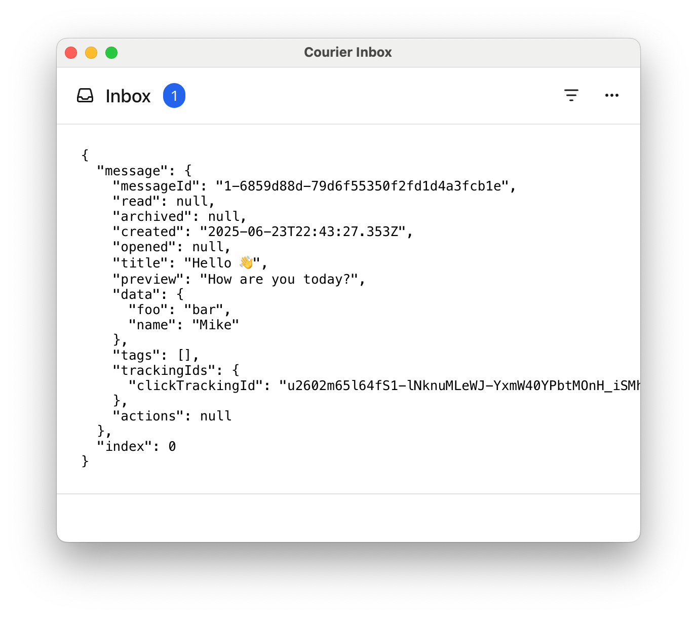
Use the `onMessageClick()`, `onMessageActionClick()`, and `onMessageLongPress()` methods to handle clicks and presses in the inbox.
`onMessageLongPress()` is only applicable on devices that support touch events.
```html highlight={2,18-40} wrap theme={null}
```
***
### Styles and Theming
The fastest way to style the Courier Inbox to match your app is with a custom theme.
You can customize fonts, icons, text, and more. Check out the [`CourierInboxTheme` reference](/sdk-libraries/courier-react-web#courierinboxtheme-reference).
```html highlight={2,11-35} theme={null}
```
### Popup alignment, position, and dimensions
| Vertical Alignment | Options |
| ------------------ | ---------------------------------------------------- |
| Top | `"top-right"`, `"top-center"`, `"top-left"` |
| Center | `"center-right"`, `"center-center"`, `"center-left"` |
| Bottom | `"bottom-right"`, `"bottom-center"`, `"bottom-left"` |
```html highlight={4-10} wrap theme={null}
```
**Fixed height:** `` has a default height of `auto`. Set a fixed height with the `height` attribute:
```html highlight={2} theme={null}
```
***
### Custom Elements
Customize individual parts of the inbox by passing factory functions that return HTML elements.
```html theme={null}
```
Call `removeHeader()` to remove the header entirely.
The `setHeader` callback receives a `props` object with a `feeds` array. Each feed includes selection state, tabs with unread counts, and filter information.
```html highlight={2,8-46} wrap theme={null}
```
#### Header Factory Props
```ts theme={null}
{
feeds: [
{
feedId: string;
title: string;
iconSVG?: string;
tabs: [
{
datasetId: string;
title: string;
unreadCount: number;
isSelected: boolean;
filter: {
tags?: string[];
archived?: boolean;
status?: 'read' | 'unread';
};
}
];
isSelected: boolean;
}
];
}
```
```html highlight={2,10-16} wrap theme={null}
```
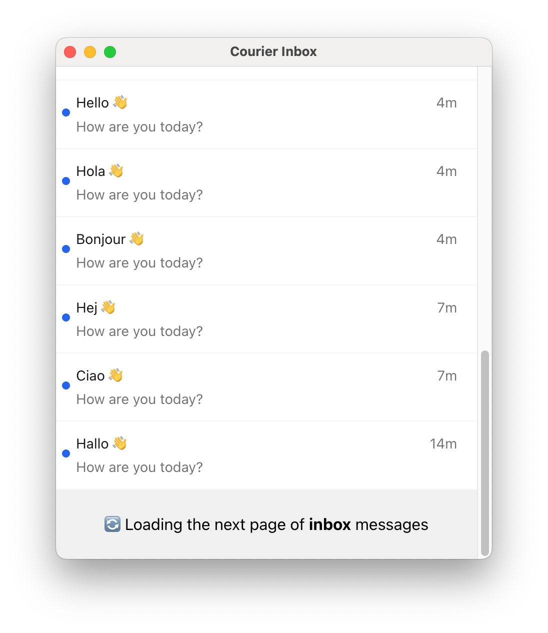
Subsequent pages of messages are loaded automatically when the user scrolls to the bottom of the inbox,
so the pagination component may only be visible briefly.
```html wrap theme={null}
```
***
### Programmatic Control
The `` component exposes methods for programmatic control, allowing you to dynamically manage feeds, tabs, actions, and data refresh.
#### Feed and Tab Selection
| Method | Description |
| :----------------------- | :--------------------------------------------------------------------------- |
| `selectFeed(feedId)` | Switch to the specified feed and load its data. |
| `selectTab(tabId)` | Switch to the specified tab within the current feed. |
| `getFeeds()` | Returns the current array of configured feeds. |
| `currentFeedId` (getter) | Returns the ID of the currently selected feed. |
| `refresh()` | Forces a reload of inbox data, bypassing the cache. Returns `Promise`. |
#### Header Actions
| Method | Description |
| :---------------------------- | :---------------------------------------------------------------------------- |
| `setActions(actions)` | Set header actions. Action IDs: `'readAll'`, `'archiveRead'`, `'archiveAll'`. |
| `setListItemActions(actions)` | Set list item actions. Action IDs: `'read_unread'`, `'archive_unarchive'`. |
#### Popup Menu Control (on ``)
| Method | Description |
| :------------- | :---------------------------------------------------------- |
| `showPopup()` | Open the popup programmatically with transition animation. |
| `closePopup()` | Close the popup programmatically with transition animation. |
#### Static Helper Methods
| Method | Description |
| :-------------------------------------- | :--------------------------------------------- |
| `CourierInbox.defaultFeeds()` | Returns the default feeds (Inbox and Archive). |
| `CourierInbox.defaultActions()` | Returns the default header actions. |
| `CourierInbox.defaultListItemActions()` | Returns the default list item actions. |
```html theme={null}
```
```html theme={null}
```
***
### Attribute vs Method Usage
Many configuration options can be set either via HTML attributes or programmatic methods:
* **HTML attributes**: Best for initial, static configuration
* **Programmatic methods**: Best for dynamic, runtime configuration
```html theme={null}
```
Some features are only available via methods (e.g., `selectFeed()`, `refresh()`, `getFeeds()`) and cannot be set via attributes.
## Toast Web Components
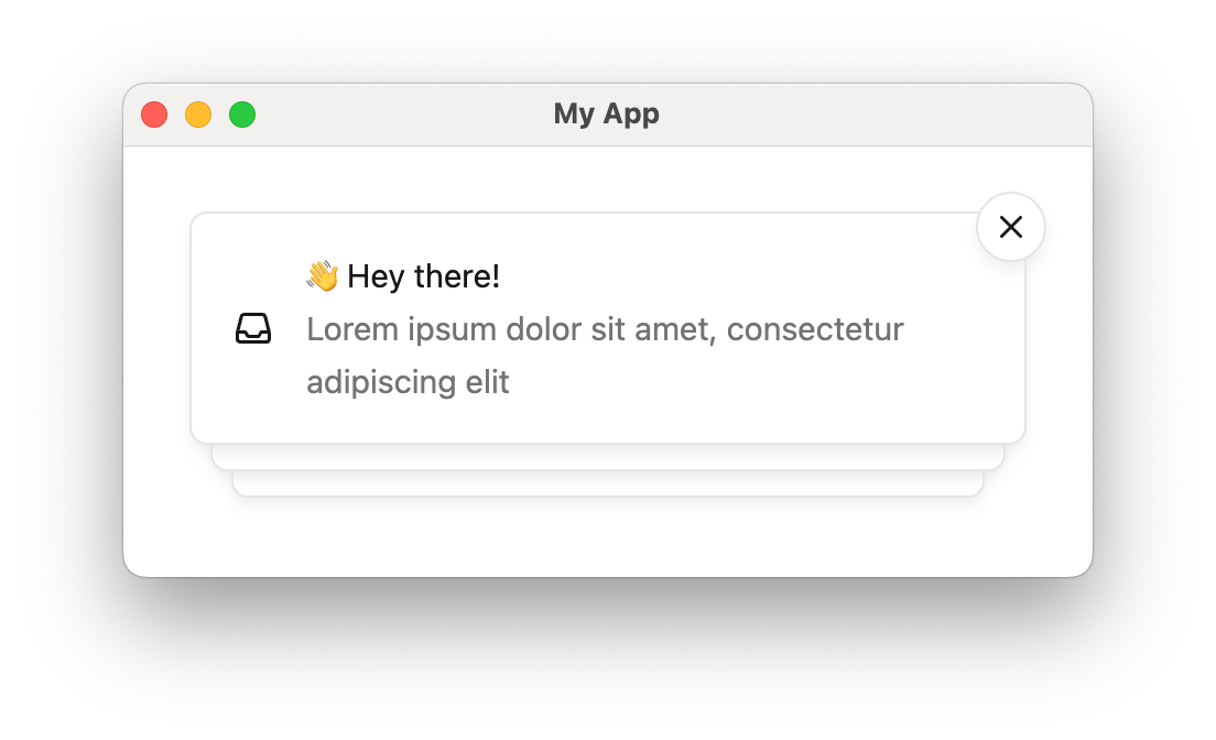
Toasts are short-lived notifications that notify users and prompt them to take action.
The Toast component is connected to the feed of Courier Inbox messages.
Toasts are synced with the Inbox message feed. You can use both components together to provide persistent and temporary notifications.
***
### ``
Importing `@trycourier/courier-ui-toast` registers Courier's Web Components (``).
```html lines highlight={2,5} theme={null}
```
**Sample App**: See a complete working example in our [Vanilla JS Toast sample app](https://github.com/trycourier/courier-samples/tree/main/web/vanilla/toast).
***
### HTML Attributes
A note on terminology: **toast** refers to the entire stack of toasts managed by ``, while **toast item** refers to a single toast displayed for a message.
| Attribute | Type | Default | Description |
| :------------------------ | :------------------------------------------- | :---------- | :---------------------------------------------------------------------------------------------------------------------------------------------------------- |
| `auto-dismiss` | `boolean` | `false` | Whether toast items should auto-dismiss. |
| `auto-dismiss-timeout-ms` | `integer` | `5000` | If `auto-dismiss` is enabled, the timeout in milliseconds before dismissal. |
| `dismiss-button` | `"visible" \| "hidden" \| "hover" \| "auto"` | `"auto"` | Display option for the dismiss button. `"auto"` makes the button always visible if `auto-dismiss` is false, and visible on hover if `auto-dismiss` is true. |
| `light-theme` | `json` | `undefined` | JSON-stringified `CourierToastTheme` applied in light mode. Merged with defaults. |
| `dark-theme` | `json` | `undefined` | JSON-stringified `CourierToastTheme` applied in dark mode. Merged with defaults. |
| `mode` | `"light" \| "dark" \| "system"` | `"system"` | Theme mode for the toast component. |
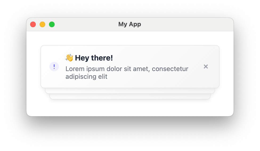
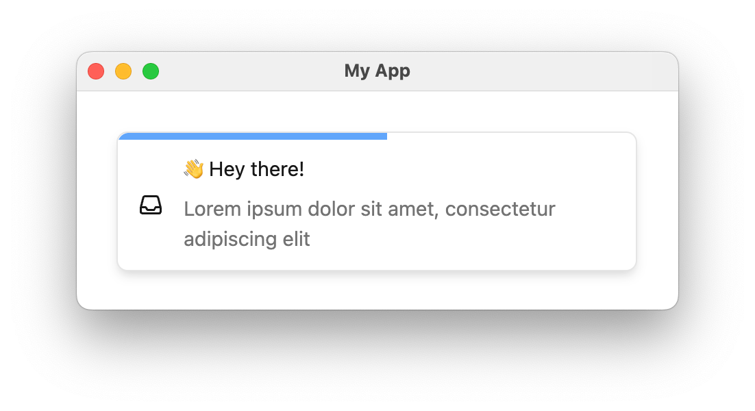
If the `auto-dismiss` attribute is set, the dismiss button (**x**) will only be visible on hover
and each toast item will automatically be dismissed. A countdown bar is shown to indicate the time
remaining before the toast disappears.
***
### Handle Clicks
| API Method | Description |
| :-------------------------------- | :------------------------------------------------------- |
| `onToastItemClick(handler)` | Called when a toast item is clicked. |
| `onToastItemActionClick(handler)` | Called when an action button on a toast item is clicked. |
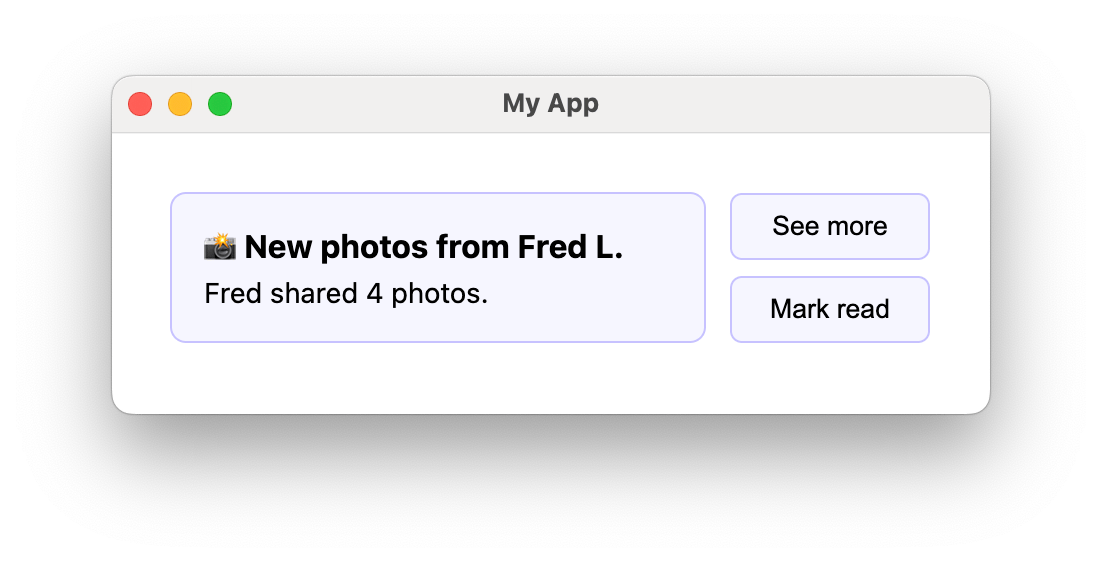
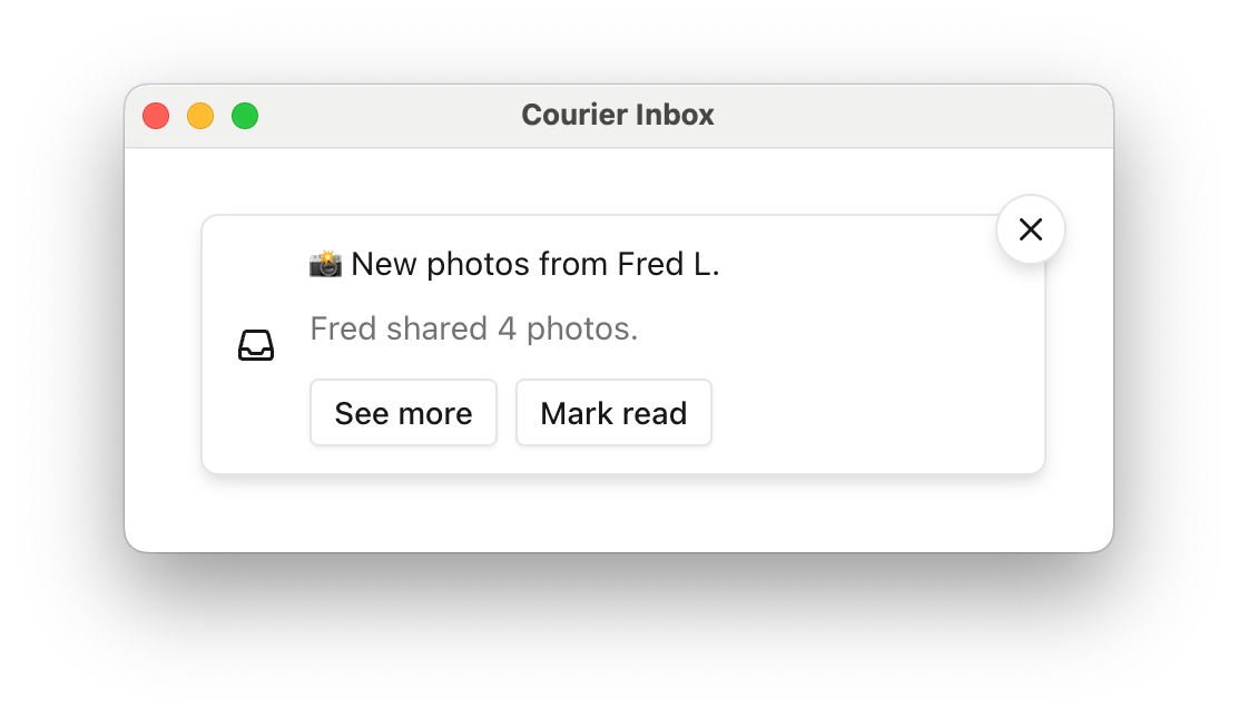
If a message contains [actions](/platform/content/content-blocks/action-blocks), toast items
will include a button for each. By default, these buttons do not implement any functionality.
```html index.html lines highlight={12-15} theme={null}
```
```ts theme={null}
type CourierToastItemClickEvent = {
message: InboxMessage;
toastItem: CourierToastItem | HTMLElement;
};
type CourierToastItemActionClickEvent = {
message: InboxMessage;
action: InboxAction;
};
```
***
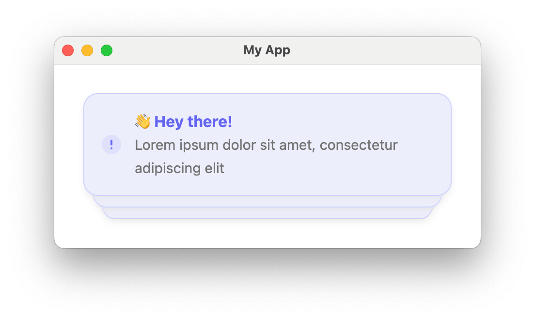
### Styles and Theming
```html index.html lines highlight={2,10-25} theme={null}
```
```ts theme={null}
export type CourierToastTheme = {
item?: {
backgroundColor?: string;
hoverBackgroundColor?: string;
autoDismissBarColor?: string;
title?: {
family?: string;
weight?: string;
size?: string;
color?: string;
};
body?: {
family?: string;
weight?: string;
size?: string;
color?: string;
};
icon?: {
color?: string;
svg?: string;
};
dismissIcon?: {
color?: string;
svg?: string;
};
shadow?: string;
border?: string;
borderRadius?: string;
actions?: {
backgroundColor?: string;
hoverBackgroundColor?: string;
activeBackgroundColor?: string;
border?: string;
borderRadius?: string;
shadow?: string;
font?: {
family?: string;
weight?: string;
size?: string;
color?: string;
};
}
}
}
```
***
### Custom Elements
| Method | Description |
| :----------------------------- | :-------------------------------------------------------------- |
| `setToastItemContent(factory)` | Customize the content area only, keeping default stack styling. |
| `setToastItem(factory)` | Fully replace each toast item for complete control. |
```html index.html lines highlight={6,37-42} theme={null}
```
`auto-dismiss` and `auto-dismiss-timeout-ms` remain valid when using custom items. If `auto-dismiss` is `true`, custom items are automatically removed after the timeout.
```html index.html lines theme={null}
```
***
### Programmatic Control
| Method | Description |
| :---------------------------- | :------------------------------------------------------------------------------ |
| `enableAutoDismiss()` | Enable auto-dismiss for toast items. |
| `disableAutoDismiss()` | Disable auto-dismiss. Items remain visible until manually dismissed. |
| `setAutoDismissTimeoutMs(ms)` | Set the auto-dismiss timeout in milliseconds. |
| `setDismissButton(option)` | Set dismiss button visibility: `'visible'`, `'hidden'`, `'hover'`, or `'auto'`. |
| `setMode(mode)` | Set theme mode: `'light'`, `'dark'`, or `'system'`. |
| `setLightTheme(theme)` | Set the light theme programmatically. |
| `setDarkTheme(theme)` | Set the dark theme programmatically. |
***
### Toast Datastore
`CourierToastDatastore` is the central repository of Inbox messages from which
`` listens for messages to display and dismiss. It is a singleton accessed through `CourierToastDatastore.shared`.
| Method | Description |
| :----------------------- | :---------------------------------------------------------------------- |
| `addMessage(message)` | Add a message to display as a toast. Messages must include `messageId`. |
| `removeMessage(message)` | Remove a message, dismissing any displayed toast for it. |
```ts theme={null}
import { CourierToastDatastore } from "@trycourier/courier-ui-toast";
// Add a test message (useful for prototyping)
CourierToastDatastore.shared.addMessage({
title: "Lorem ipsum dolor sit",
body: "Lorem ipsum dolor sit amet",
messageId: "abcd-1234-abcd-1234",
actions: [{ "content": "Click me!" }]
});
// Remove a message (dismiss its toast)
CourierToastDatastore.shared.removeMessage(message);
```
***
## Preferences Web Components
The Preferences component lets your users manage which topics they're subscribed to and how each topic is delivered (per-channel routing and digest schedules), directly inside your app.
Preferences ship in a separate package, `@trycourier/courier-ui-preferences`. Install it alongside the inbox package:
```bash theme={null}
npm install @trycourier/courier-ui-preferences
```
### ``
Importing `@trycourier/courier-ui-preferences` registers the `` Web Component.
```html lines highlight={2,5} theme={null}
```
Preferences use the same [authentication](#authentication) mechanism as the inbox, but the JWT must include the `read:preferences` and `write:preferences` scopes.
***
### Preferences HTML Attributes
| Attribute | Type | Default | Description |
| :------------ | :------------------------------ | :---------- | :-------------------------------------------------------------------------------------- |
| `light-theme` | `json` | `undefined` | JSON-stringified `CourierPreferencesTheme` applied in light mode. Merged with defaults. |
| `dark-theme` | `json` | `undefined` | JSON-stringified `CourierPreferencesTheme` applied in dark mode. Merged with defaults. |
| `mode` | `"light" \| "dark" \| "system"` | `"system"` | Theme mode for the component. |
| `tenant-id` | `string` | `undefined` | Scope preferences to a specific tenant (multi-tenant apps). |
| `brand-id` | `string` | `undefined` | Render preferences using a specific brand's styling. |
***
### Preferences Styling and Theming
Set themes programmatically with `setLightTheme()`, `setDarkTheme()`, and `setMode()`. Themes are merged with the defaults, so you only need to specify what you want to override. The default accent color matches the Inbox component for a consistent look.
```html index.html lines highlight={2,9-29} theme={null}
```
Theme utilities are also exported: `defaultLightTheme` / `defaultDarkTheme` for the defaults, and `mergeTheme(mode, overrideTheme)` to merge a partial theme.
```ts theme={null}
type CourierPreferencesFontTheme = {
family?: string;
weight?: string;
size?: string;
color?: string;
};
type CourierPreferencesTheme = {
primaryColor?: string;
title?: CourierPreferencesFontTheme;
subtitle?: CourierPreferencesFontTheme;
container?: {
font?: CourierPreferencesFontTheme;
};
loading?: {
animation?: {
barColor?: string;
barHeight?: string;
barBorderRadius?: string;
duration?: string;
};
};
error?: CourierPreferencesInfoStateTheme;
empty?: CourierPreferencesInfoStateTheme;
section?: {
title?: CourierPreferencesFontTheme;
backgroundColor?: string;
};
topic?: {
backgroundColor?: string;
border?: string;
borderRadius?: string;
title?: CourierPreferencesFontTheme;
statusLabel?: CourierPreferencesFontTheme;
toggle?: {
trackColor?: string;
trackActiveColor?: string;
thumbColor?: string;
borderRadius?: string;
};
};
digest?: {
font?: CourierPreferencesFontTheme;
selectedFont?: CourierPreferencesFontTheme;
iconColor?: string;
radio?: {
ringColor?: string;
checkedColor?: string;
font?: CourierPreferencesFontTheme;
selectedFont?: CourierPreferencesFontTheme;
};
};
channelChip?: {
font?: CourierPreferencesFontTheme;
selectedFont?: CourierPreferencesFontTheme;
divider?: string;
checkbox?: {
checkedColor?: string;
font?: CourierPreferencesFontTheme;
selectedFont?: CourierPreferencesFontTheme;
};
};
};
// Title text, font, and button styling for the error and empty states.
type CourierPreferencesInfoStateTheme = {
title?: {
text?: string;
font?: CourierPreferencesFontTheme;
};
button?: {
text?: string;
font?: CourierPreferencesFontTheme;
backgroundColor?: string;
hoverBackgroundColor?: string;
border?: string;
borderRadius?: string;
};
};
```
***
### Custom Channel Labels
Topics can be delivered over multiple channels. Use `setChannelLabels()` to rename how those channels appear in the UI.
```html index.html lines highlight={9-13} theme={null}
```
The default labels are:
| Channel key | Default label |
| :--------------- | :------------ |
| `direct_message` | Chat |
| `email` | Email |
| `push` | Push |
| `sms` | SMS |
| `webhook` | Webhook |
| `inbox` | Inbox |
## EU and regional endpoints
Only if your workspace uses the [EU datacenter](/platform/workspaces/eu-datacenter): pass EU URLs in `Courier.shared.signIn`. This package re-exports `EU_COURIER_API_URLS` and `getCourierApiUrlsForRegion` from `@trycourier/courier-js`.
```js icon="square-js" theme={null}
import { EU_COURIER_API_URLS } from "@trycourier/courier-ui-inbox";
Courier.shared.signIn({
userId: "my-user-id",
jwt: "eyJ.mock.jwt",
apiUrls: EU_COURIER_API_URLS,
});
```
See [Courier JS — EU and regional endpoints](/sdk-libraries/courier-js-web#eu-and-regional-endpoints) for hostnames, helpers, and JWT issuance.
## Related Documentation
React components and hooks built on top of the web components.
Full CourierInboxTheme type definition for customizing the inbox.
 The Courier Web Components SDK provides drop-in components for building notification experiences in any JavaScript project:
* `
The Courier Web Components SDK provides drop-in components for building notification experiences in any JavaScript project:
* `
 ```html highlight={3,7} theme={null}
 ```html theme={null}
 ```html theme={null}
 ```html highlight={2,11-35} theme={null}
 | Vertical Alignment | Options |
| ------------------ | ---------------------------------------------------- |
| Top | `"top-right"`, `"top-center"`, `"top-left"` |
| Center | `"center-right"`, `"center-center"`, `"center-left"` |
| Bottom | `"bottom-right"`, `"bottom-center"`, `"bottom-left"` |
```html highlight={4-10} wrap theme={null}
| Vertical Alignment | Options |
| ------------------ | ---------------------------------------------------- |
| Top | `"top-right"`, `"top-center"`, `"top-left"` |
| Center | `"center-right"`, `"center-center"`, `"center-left"` |
| Bottom | `"bottom-right"`, `"bottom-center"`, `"bottom-left"` |
```html highlight={4-10} wrap theme={null}
 #### Header Factory Props
```ts theme={null}
{
feeds: [
{
feedId: string;
title: string;
iconSVG?: string;
tabs: [
{
datasetId: string;
title: string;
unreadCount: number;
isSelected: boolean;
filter: {
tags?: string[];
archived?: boolean;
status?: 'read' | 'unread';
};
}
];
isSelected: boolean;
}
];
}
```
#### Header Factory Props
```ts theme={null}
{
feeds: [
{
feedId: string;
title: string;
iconSVG?: string;
tabs: [
{
datasetId: string;
title: string;
unreadCount: number;
isSelected: boolean;
filter: {
tags?: string[];
archived?: boolean;
status?: 'read' | 'unread';
};
}
];
isSelected: boolean;
}
];
}
```
 If the `auto-dismiss` attribute is set, the dismiss button (**x**) will only be visible on hover
and each toast item will automatically be dismissed. A countdown bar is shown to indicate the time
remaining before the toast disappears.
***
### Handle Clicks
| API Method | Description |
| :-------------------------------- | :------------------------------------------------------- |
| `onToastItemClick(handler)` | Called when a toast item is clicked. |
| `onToastItemActionClick(handler)` | Called when an action button on a toast item is clicked. |
If the `auto-dismiss` attribute is set, the dismiss button (**x**) will only be visible on hover
and each toast item will automatically be dismissed. A countdown bar is shown to indicate the time
remaining before the toast disappears.
***
### Handle Clicks
| API Method | Description |
| :-------------------------------- | :------------------------------------------------------- |
| `onToastItemClick(handler)` | Called when a toast item is clicked. |
| `onToastItemActionClick(handler)` | Called when an action button on a toast item is clicked. |
 If a message contains [actions](/platform/content/content-blocks/action-blocks), toast items
will include a button for each. By default, these buttons do not implement any functionality.
```html index.html lines highlight={12-15} theme={null}
If a message contains [actions](/platform/content/content-blocks/action-blocks), toast items
will include a button for each. By default, these buttons do not implement any functionality.
```html index.html lines highlight={12-15} theme={null}
 ```html index.html lines highlight={2,10-25} theme={null}