> ## Documentation Index
> Fetch the complete documentation index at: https://www.courier.com/docs/llms.txt
> Use this file to discover all available pages before exploring further.
# Courier Vue SDK
> Embed an in-app inbox, toasts, and preferences center in Vue 3 apps. Use the useCourier composable for programmatic control and real-time updates.
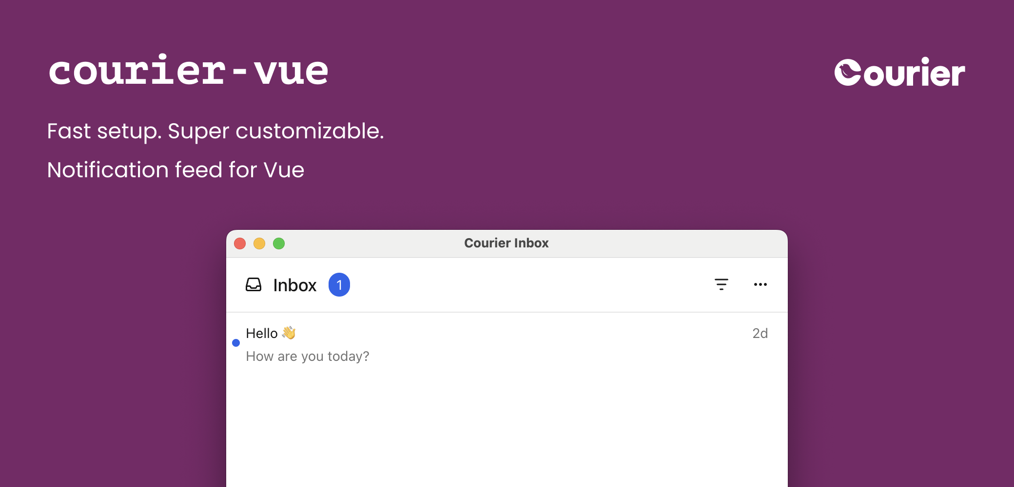
The Courier Vue SDK provides ready-made components and a programmatic composable for building notification experiences:
* `` — full-featured inbox for displaying and managing messages
* `` — popup menu version of the inbox
* `` — toast notifications for time-sensitive alerts
* `` — notification preferences center for managing topic subscriptions and delivery
* `useCourier()` — composable for programmatic access and custom UIs
See these components in action with the [interactive Inbox demo](https://www.courier.com/inbox-demo) — no setup required.
## Installation
Available on
GitHub
and npm.
```bash theme={null}
npm install @trycourier/courier-vue
```
`vue` (>= 3.3) is a peer dependency.
Not using Vue? Check out the
[@trycourier/courier-ui-inbox](/docs/sdk-libraries/courier-ui-inbox-web/) and
[@trycourier/courier-ui-toast](/docs/sdk-libraries/courier-ui-inbox-web#toast-web-components)
packages instead, which provide Web Components for any JavaScript project.
## Authentication
To use the SDK, you need to generate a JWT (JSON Web Token) for your user. **This JWT should always be generated by your backend server, never in client-side code.**
When your app needs to authenticate a user, your client
should make a request to your own backend (ex. `GET https://your-awesome-app.com/api/generate-courier-jwt`).
In your backend endpoint, use your [Courier API Key](/docs/platform/workspaces/environments-api-keys) to call the [Courier Issue Token Endpoint](/docs/api-reference/authentication/create-a-jwt) and generate a JWT for the user.
Having received the JWT from Courier, your backend should return it to your client and pass it to the Courier SDK.
For a step-by-step walkthrough of authentication and token generation, see our JWT authentication tutorial.
### Development testing with cURL
To quickly test JWT generation for development only, you can call the [Issue Token Endpoint](/docs/api-reference/authentication/create-a-jwt) directly.
Do not call the Issue Token API from client-side code. Always keep your Courier API keys secure.
```bash theme={null}
curl -X POST https://api.courier.com/auth/issue-token \
-H 'Authorization: Bearer $YOUR_API_KEY' \
-H 'Content-Type: application/json' \
-d '{
"scope": "user_id:$YOUR_USER_ID inbox:read:messages inbox:write:events",
"expires_in": "1 day"
}'
```
## Quick Start
Get up and running with Courier Vue in minutes. This minimal example shows how to add the inbox component to your app. Courier components are normal Vue components — import them and use them in your template.
```vue theme={null}
```
Follow the [inbox implementation tutorial](/docs/tutorials/inbox/how-to-implement-inbox) for detailed step-by-step guidance including backend JWT generation.
## Inbox Component
### ``
```vue theme={null}
```
If you're using [tenants](/docs/platform/tenants/tenants-overview), scope requests to a particular
tenant by passing its ID to `signIn`:
```js theme={null}
courier.shared.signIn({ userId: "my-user-id", jwt, tenantId: "my-tenant-id" });
```
For the full reference of sign in parameters, see the [Courier JS docs](/docs/sdk-libraries/courier-js-web#courierclient-options).
### ``
```vue theme={null}
```
## Tabs and Feeds
Tabs and feeds organize and filter messages in the inbox. A **feed** is a container that groups related **tabs** together. Each tab applies filters to show relevant messages. Pass them with the `:feeds` prop.
If there is only one feed, the feed selection dropdown is hidden. If a feed has only one tab, the tab bar is hidden and the unread count appears next to the feed.
Filter options for each tab:
| Filter Property | Type | Description |
| :-------------- | :------------------- | :------------------------------------------------------------------ |
| `tags` | `string[]` | Messages that have any of the specified tags |
| `archived` | `boolean` | Whether to include archived messages (defaults to `false` if unset) |
| `status` | `'read' \| 'unread'` | Filter by read/unread status |
```vue theme={null}
```
### Handle Clicks and Presses
Listen for interactions with `@message-click`, `@message-action-click`, and `@message-long-press`.
| Event | Payload |
| :---------------------- | :--------------------------------------- |
| `@message-click` | `CourierInboxListItemFactoryProps` |
| `@message-action-click` | `CourierInboxListItemActionFactoryProps` |
| `@message-long-press` | `CourierInboxListItemFactoryProps` |
`message-long-press` is only applicable on devices that support touch events.
```vue theme={null}
```
### Styles and Theming
Customize the inbox to match your app with a theme object passed to `:light-theme` and/or `:dark-theme`. Pass the object directly — the component serializes it for you.
```vue theme={null}
```
Theme utilities: `defaultLightTheme` / `defaultDarkTheme` provide the default inbox themes, and `mergeTheme(baseTheme, overrideTheme)` merges two themes with the override taking precedence.
The full `CourierInboxTheme` type covers the popup trigger button, the inbox window (header, feeds, tabs, actions), the message list (items, scrollbar, menus), and loading/empty/error states. Every property is optional. See the complete reference in the [Courier React SDK theme reference](/docs/sdk-libraries/courier-react-web#styles-and-theming) (the theme object is identical across SDKs).
### Popup alignment and dimensions
| Vertical Alignment | Options |
| :----------------- | :--------------------------------------------------- |
| Top | `"top-right"`, `"top-center"`, `"top-left"` |
| Center | `"center-right"`, `"center-center"`, `"center-left"` |
| Bottom | `"bottom-right"`, `"bottom-center"`, `"bottom-left"` |
```vue theme={null}
```
#### Fixed height
`` has a default height of `auto`. Set a fixed height with the `height` prop:
```vue theme={null}
```
### Custom Elements
You can customize individual parts of the inbox by passing **render props** — functions that receive typed props and return a Vue node built with `h()`. Bind them with `:render-*`.
| Render Prop | Type Signature |
| :------------------------ | :------------------------------------------------------------------------- |
| `:render-list-item` | `(props: CourierInboxListItemFactoryProps) => VNodeChild` |
| `:render-header` | `(props: CourierInboxHeaderFactoryProps) => VNodeChild` |
| `:render-menu-button` | `(props: CourierInboxMenuButtonFactoryProps) => VNodeChild` *(popup menu)* |
| `:render-loading-state` | `(props: CourierInboxStateLoadingFactoryProps) => VNodeChild` |
| `:render-empty-state` | `(props: CourierInboxStateEmptyFactoryProps) => VNodeChild` |
| `:render-error-state` | `(props: CourierInboxStateErrorFactoryProps) => VNodeChild` |
| `:render-pagination-item` | `(props: CourierInboxPaginationItemFactoryProps) => VNodeChild` |
```vue theme={null}
```
```vue theme={null}
```
You can also reach the underlying web component for imperative methods (e.g. `removeHeader()`) via a template ref — the component exposes `getElement()`:
```vue theme={null}
```
## Toast Component
### ``
Toasts are short-lived notifications that notify users and prompt them to take action. The Toast component is connected to the feed of Courier Inbox messages.
```vue theme={null}
```
Some initialization for toasts is asynchronous. If your app displays toasts immediately when
the component is mounted, use the `@ready` event to wait until the component is fully initialized.
### Handle Clicks
| Event | Payload |
| :------------------------- | :--------------------------------- |
| `@toast-item-click` | `CourierToastItemClickEvent` |
| `@toast-item-action-click` | `CourierToastItemActionClickEvent` |
```vue theme={null}
```
### Styles and Theming
```vue theme={null}
```
Toast theme utilities: `defaultToastLightTheme` / `defaultToastDarkTheme` for defaults, and `mergeToastTheme(baseTheme, overrideTheme)` to merge.
### Custom Elements
| Render Prop | Description |
| :--------------------------- | :-------------------------------------------------------------------------------------- |
| `:render-toast-item-content` | `(props: CourierToastItemFactoryProps) => VNodeChild` — customize the content area only |
| `:render-toast-item` | `(props: CourierToastItemFactoryProps) => VNodeChild` — fully replace each toast item |
```vue theme={null}
```
### CourierToast Props
| Prop Name | Type | Default | Description |
| :----------------------- | :------------------------------------------- | :------------------------------------------------------------------------------- | :-------------------------------------------------------- |
| `style` | `StyleValue` | `{ position: "fixed", width: "380px", top: "30px", right: "30px", zIndex: 999 }` | Styles applied to the toast component. |
| `lightTheme` | `CourierToastTheme` | `undefined` | Theme for light mode. |
| `darkTheme` | `CourierToastTheme` | `undefined` | Theme for dark mode. |
| `mode` | `"light" \| "dark" \| "system"` | `"system"` | Theme mode. |
| `autoDismiss` | `boolean` | `false` | Enable auto-dismiss with countdown bar. |
| `autoDismissTimeoutMs` | `number` | `5000` | Timeout in ms before auto-dismiss. |
| `dismissButton` | `"visible" \| "hidden" \| "hover" \| "auto"` | `"auto"` | Dismiss button visibility. |
| `onToastItemClick` | `fn` | `undefined` | Callback when a toast is clicked. |
| `onToastItemActionClick` | `fn` | `undefined` | Callback when a toast action button is clicked. |
| `renderToastItem` | `fn` | `undefined` | Custom render for entire toast items. |
| `renderToastItemContent` | `fn` | `undefined` | Custom render for toast item content only. |
| `onReady` | `(ready: boolean) => void` | `undefined` | Callback when the component is ready to receive messages. |
```vue theme={null}
```
## Preferences Component
### ``
The Preferences component lets your users manage which topics they're subscribed to and how each topic is delivered (per-channel routing and digest schedules), directly inside your Vue app.
```vue theme={null}
```
Authentication requires a JWT that includes the `read:preferences` and `write:preferences` scopes.
### CourierPreferences Props
| Prop Name | Type | Default | Description |
| :-------------- | :------------------------------ | :---------- | :-------------------------------------------------------------------------- |
| `style` | `StyleValue` | `undefined` | Styles applied to the preferences component. |
| `lightTheme` | `CourierPreferencesTheme` | `undefined` | Theme for light mode. Merged with defaults. |
| `darkTheme` | `CourierPreferencesTheme` | `undefined` | Theme for dark mode. Merged with defaults. |
| `mode` | `"light" \| "dark" \| "system"` | `"system"` | Theme mode. |
| `title` | `string` | `undefined` | Override the component's title text. |
| `subtitle` | `string` | `undefined` | Override the component's subtitle text. |
| `brandId` | `string` | `undefined` | Render preferences using a specific brand's styling. |
| `channelLabels` | `Record` | `undefined` | Rename how delivery channels appear in the UI (e.g. `{ email: "E-mail" }`). |
| `onError` | `(error: Error) => void` | `undefined` | Callback invoked when the component encounters an error. |
Preferences theme utilities: `defaultPreferencesLightTheme` / `defaultPreferencesDarkTheme` for defaults, and `mergePreferencesTheme(mode, overrideTheme)` to merge.
## useCourier Composable
The `useCourier()` composable provides programmatic access to Courier functionality for building custom UIs. It returns the same shape as the React hook, but `auth`, `inbox`, and `toast` are Vue [`shallowRef`s](https://vuejs.org/api/reactivity-advanced.html#shallowref) — access them with `.value` in `
Total Unread: {{ inbox.totalUnreadCount ?? 0 }}
{{ message.title }}
```
### Inbox methods
| Method | Description |
| :--------------------------------------------------- | :------------------------------------------------------------------------- |
| `inbox.value.load(props?)` | Load messages. Optional `{ canUseCache, datasetIds }`. |
| `inbox.value.fetchNextPageOfMessages({ datasetId })` | Fetch next page. Returns `InboxDataSet \| null`. |
| `inbox.value.setPaginationLimit(limit)` | Set messages per page. |
| `inbox.value.registerFeeds(feeds)` | Register feeds and tabs with the datastore. |
| `inbox.value.listenForUpdates()` | Start WebSocket connection for real-time updates. **Required after auth.** |
| `inbox.value.readMessage(message)` | Mark as read. |
| `inbox.value.unreadMessage(message)` | Mark as unread. |
| `inbox.value.archiveMessage(message)` | Archive. |
| `inbox.value.unarchiveMessage(message)` | Unarchive. |
| `inbox.value.clickMessage(message)` | Track click event (analytics). |
| `inbox.value.openMessage(message)` | Mark as opened. |
| `inbox.value.readAllMessages()` | Mark all as read. |
## Advanced
### EU and regional endpoints
Only needed if your workspace uses the [EU datacenter](/docs/platform/workspaces/eu-datacenter). `@trycourier/courier-vue` re-exports `EU_COURIER_API_URLS` and `getCourierApiUrlsForRegion` from `@trycourier/courier-js`.
```vue theme={null}
```
### Server-side rendering
Courier Inbox and Toast render client-side only. They mount in `onMounted` (which never runs during SSR), so they work with Nuxt and other SSR setups without extra configuration — the components simply render once on the client.
### Troubleshooting
Make sure you've called `inbox.value.listenForUpdates()` after authentication. This establishes the WebSocket connection required for real-time updates.
```ts theme={null}
auth.value.signIn({ userId, jwt });
inbox.value.registerFeeds(defaultFeeds());
await inbox.value.listenForUpdates(); // Required for real-time
await inbox.value.load();
```
**Possible causes:**
1. Not authenticated — ensure `signIn()` has been called
2. Feeds not registered — call `registerFeeds()` before `load()`
3. Network errors — check `inbox.value.error` for details
4. JWT expired — generate a new token
* **Invalid JWT**: Ensure the JWT is generated correctly on your backend
* **Expired JWT**: JWTs have an expiration time; generate a new one
* **Missing scopes**: Ensure your JWT includes `inbox:read:messages` and `inbox:write:events`
* **Wrong user ID**: Verify the `userId` matches the user the JWT was issued for
Custom render props must return a Vue node built with `h()` (imported from `vue`), not a raw string of markup. Ensure the render prop is bound with `:render-list-item="..."` (kebab-case) on the component.
Import types directly from the package:
```ts theme={null}
import { useCourier, type InboxMessage, type CourierInboxFeed } from "@trycourier/courier-vue";
```
### Best Practices
* **JWT Security**: Always generate JWTs server-side. Cache on the client, refresh before expiration (standard: `'1d'`), include only necessary scopes.
* **Performance**: Use `canUseCache: true` (default) for cached data. Set appropriate `setPaginationLimit()` values. The composable's `shallowRef`s update automatically; avoid triggering unnecessary re-renders.
* **Testing**: Mock `useCourier()` in tests to return test data:
```ts theme={null}
import { ref } from "vue";
vi.mock("@trycourier/courier-vue", () => ({
useCourier: () => ({
inbox: ref({ feeds: { all_messages: { messages: mockMessages } }, totalUnreadCount: 5 }),
}),
}));
```
## TypeScript Types
```typescript theme={null}
type InboxMessage = {
messageId: string;
title?: string;
body?: string;
read?: string; // ISO timestamp
opened?: string; // ISO timestamp
archived?: string; // ISO timestamp
tags?: string[];
trackingIds?: { clickTrackingId?: string; openTrackingId?: string; };
actions?: InboxAction[];
data?: Record;
}
```
```typescript theme={null}
type InboxDataSet = {
id: string;
messages: InboxMessage[];
unreadCount: number;
canPaginate: boolean;
paginationCursor: string | null;
}
```
```typescript theme={null}
type CourierInboxFeed = {
feedId: string;
title: string;
iconSVG?: string;
tabs: CourierInboxTab[];
}
```
```typescript theme={null}
type CourierInboxTab = {
datasetId: string;
title: string;
filter: CourierInboxDatasetFilter;
}
```
```typescript theme={null}
type CourierInboxDatasetFilter = {
tags?: string[];
archived?: boolean;
status?: 'read' | 'unread';
}
```
All filter properties are AND'd together. For example, `{ tags: ['important'], status: 'unread' }` shows messages that have the 'important' tag AND are unread.
```typescript theme={null}
type CourierToastItemFactoryProps = {
message: InboxMessage;
autoDismiss: boolean;
autoDismissTimeoutMs: number;
dismiss: () => void;
}
```
 The Courier Vue SDK provides ready-made components and a programmatic composable for building notification experiences:
* `
The Courier Vue SDK provides ready-made components and a programmatic composable for building notification experiences:
* `