What Is a Toast Message? Toasts vs. Snackbars, Banners & Push Notifications
 Kyle SeylerOctober 08, 2025
What Is a Toast Message?
A toast message is a brief, auto-dismissing notification that appears inside an app to give the user immediate feedback, then disappears on its own after a few seconds without requiring any interaction. Named after the way it "pops up" like a slice of toast, it is one of the most common in-app messaging patterns across mobile apps, web platforms, and SaaS products.
Toasts are built for confirmation, not conversation. They reassure users that an action worked ("Settings saved"), surface a non-critical update, or nudge a next step, all without breaking focus or blocking the screen. Because they are passive and short-lived, they are the wrong choice for anything urgent, anything the user must act on, or anything they may need to reference later.
When used correctly, toast notifications can:
- Improve user satisfaction by providing instant, in-context feedback
- Support faster onboarding by guiding new users without interrupting them
- Highlight feature discovery at exactly the right moment
- Reduce friction in high-frequency actions like settings updates, file uploads, and checkouts
With Courier's Toasts SDK, you can build both toasts and a full in-app notification center from a single API, without maintaining notification infrastructure yourself.
Below, we cover how toasts differ from snackbars, banners, and push notifications, when to use each, and the design and accessibility details that keep them usable.
Toast vs. Snackbar vs. Banner vs. Push: Key Differences
These terms get used interchangeably, but they are not the same thing. Here is how they differ:
- Toast messages are short, passive notifications that appear briefly and disappear automatically. They require no user action and are common in Android apps, web apps, and SaaS platforms.
- Snackbars are a Material Design pattern. They behave like toasts but include a single optional action, such as "Undo" or "Retry," and still auto-dismiss if the user does nothing.
- Banners are more prominent messages that persist until the user dismisses or acts on them. They suit important but non-blocking information like account or verification issues.
- Push notifications are delivered by the operating system and appear outside your app. Their job is re-engagement, not in-session feedback.
The table below summarizes the trade-offs at a glance:
| Feature | Toast Messages | Snackbars | Banners | Push Notifications |
|---|---|---|---|---|
| Primary purpose | Passive, quick feedback | Feedback with an optional action | Important info, often needs action | Re-engage users outside the app |
| User interaction | None | Optional action (e.g., Undo) | Optional or required action | May open the app or deep link |
| Persistence | Disappears automatically | Disappears automatically | Persists until dismissed or acted on | Stays until dismissed or opened |
| Context | Inside the app | Inside the app | Inside the app | Outside the app (OS level) |
| Typical placement | Top or bottom of screen | Bottom of screen | Top or bottom of screen | Device notification tray |
| Best for | Confirming minor actions | Reversing quick actions, retries | Warnings and status that need attention | Bringing users back to the app |
| Risk if misused | Missed important feedback | Accidental action | Annoyance if overused | Notification fatigue |
| Common example | "Settings saved" | "Message deleted [Undo]" | "Account needs verification" | "You have a new message" |
The short version: use a toast for passive confirmation, a snackbar when the user might want to undo, a banner when the message needs to stick around, and push when you need to reach someone who has left the app.
How Toast Messages Work
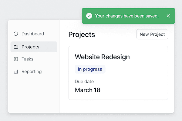
A toast appears temporarily on the screen, delivers a short message, and fades away after a few seconds. It sits out of the way of the main content and does not steal focus, which is what makes it feel lightweight rather than disruptive. That is the opposite of a modal, which deliberately blocks the screen until the user responds.
The pattern first gained popularity on Android, where the Toast class gave developers a standard way to show brief feedback. The concept quickly spread to iOS libraries, web applications, desktop software, and even video games. Today the toast is a UX convention users recognize instantly. You may see the same pattern under other names: a flash message in server-rendered frameworks, or historically a Growl-style notification on desktop. On the web it is commonly built with libraries like react-toastify.
When several events fire at once, do not stack toasts into a wall of messages. Queue them so they appear one at a time, or collapse related updates into a single toast, so the interface stays readable.
Whatever the platform, an effective toast follows three core principles:
- Unobtrusive: small, subtle, and positioned away from critical content
- Non-interactive: the user typically cannot act on it beyond letting it expire or dismissing it
- Short-lived: it disappears automatically, keeping the interface clean
Most guidance recommends keeping a toast visible for roughly three to five seconds: long enough to read, short enough to stay out of the way. Just never lock information a user needs inside a message they cannot pause or reopen, a point we return to under accessibility.
Toast Message Examples and Common Use Cases
Toasts work best for outcomes the user already expects and does not need to act on. Typical examples include:
- Action confirmations: "Settings saved," "Message sent," "Copied to clipboard"
- Background process updates: "Upload complete," "Export ready," "Sync finished"
- Lightweight guidance: a one-line onboarding tip or a "New feature available" nudge
- Non-critical status: "Reconnected," "Draft autosaved"
The common thread is that each message is helpful but optional. If a user misses it, nothing breaks. The moment a message becomes something a user must see, act on, or keep, a toast is the wrong tool, and one of the alternatives below fits better.
When to Use a Toast Message (and When Not To)
Not every event deserves a toast. Use this quick decision framework.
Use a toast message when you need to:
- Confirm a successful user action (for example, "Settings saved")
- Signal that a background process has started or completed
- Highlight a lightweight, non-critical update without disrupting the user's flow
Avoid a toast when:
- The user must take immediate action (use a snackbar with an action instead)
- The event is critical and must be acknowledged (use a modal or an alert)
- The message needs to persist (use an in-app inbox, push, or email)
In short, toast messages are best for quick feedback that reassures the user without demanding attention or action. Choosing the right notification type keeps your product feeling responsive and respectful instead of noisy.
Toast Message Design Best Practices
A few rules keep toasts helpful instead of annoying:
- Keep the copy to one line. State the outcome ("Settings saved"), not a paragraph.
- Show one toast at a time. Queue or collapse multiples so they do not stack into a wall of messages.
- Position them consistently. Pick one spot, usually top-right on web and bottom on mobile, and stay there.
- Match the pattern to the intent. If the user needs to act, use a snackbar or modal; if they need a record, use the inbox or email.
- Never hide critical information in a toast. Anything a user must see or act on belongs on a persistent surface.
Toast Alternatives: Inbox, Snackbars, Push, and Email
Toasts work well for fast, non-disruptive feedback, but they vanish. When a message needs an action, a longer life, or a permanent record, reach for one of these formats instead.
In-App Notification Centers
An in-app notification center is a centralized place, usually opened from a bell icon, where users can review everything your product has told them: confirmations, alerts, and system updates. Unlike a toast, these messages are persistent, so users can catch up on anything they missed or dismissed. Designing one users actually open, the row hierarchy, the unread signal, the empty and error states, is its own craft; our guide to designing an in-app notification center walks through it.
Advanced platforms like Courier's in-app inbox go further by syncing state across channels. If a user reads an email, Courier can automatically mark the matching in-app message as read, keeping every surface aligned. For a deeper comparison of these surfaces, see our guide to toast messages and web push notifications.
Ready to build toasts and in-app notifications together? Get started with our Toasts SDK, in-app inbox SDK, and fully unified notification experiences. 👉 Read the docs
Snackbars: Interactive, Temporary Feedback
Snackbars briefly display feedback alongside a single optional action, usually near the bottom of the screen.
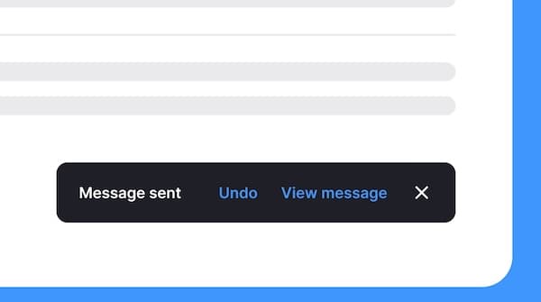
Like toasts, they are lightweight and temporary, but they give the user a chance to respond. Common examples include:
- "Item deleted. [Undo]"
- "Payment failed. [Retry]"
- "File uploaded. [View]"
Snackbars are ideal when you want to acknowledge an event while offering a quick way to reverse or continue it. Because they are small and short-lived, keep the action simple, safe, and reversible, and never use one for a critical or irreversible decision.
Push Notifications: Re-Engage Users Outside the App
Push notifications reach users even when they are not in your app. They are effective for:
- Alerting users to important updates
- Reminding them to return to the app
- Notifying them of time-sensitive events
Push shares the brevity of a toast, but its purpose is re-engagement. Because it appears outside the app, it depends on an OS-level permission the user can deny: iOS has always required explicit opt-in, and since Android 13 Android does too. Toasts and in-app inboxes, by contrast, render inside your app and never need that permission. That makes push the right tool for pulling users back after an event, promotion, or system update, and toasts the right tool for feedback while the user is already there. To see how the two work together, read our breakdown of React toast, inbox, and push notifications.
Persistent Messages: Email and SMS
Persistent messages like email and SMS are built to last. They stay accessible until the user deletes or archives them, which makes them the right choice for anything that needs to be saved or referenced later, such as:
- Appointment confirmations
- Discount offers and promo codes
- Password resets and account recovery
- Legal notices and receipts
Where a toast disappears in seconds, a persistent message gives the user a reliable record to return to.
Toast Notification Accessibility
Because toasts appear without focus and vanish quickly, they are easy to miss for anyone using a screen reader, and easy to get wrong. Two things make a toast accessible.
Announce it with an ARIA live region. A visible toast is invisible to assistive technology unless it lives in a live region. Follow the WAI-ARIA guidance: use role="status" (an implicit aria-live="polite") for success and confirmation messages so they are announced without interrupting the user, and reserve role="alert" (aria-live="assertive") for time-sensitive errors, per the W3C technique for role=alert. Choosing the right role is the difference between a helpful announcement and a jarring interruption.
Give users enough time. WCAG success criterion 2.2.1 Timing Adjustable means a toast should not disappear so fast that some users cannot read it. Keep non-trivial messages on screen long enough to read, pause auto-dismiss on hover or focus, and never put an action a user must take inside a message that times out. If information truly matters, back the toast with a persistent surface like an in-app inbox so it is not lost.
Respect motion preferences. Honor the prefers-reduced-motion setting by reducing or removing slide and fade animations for users who ask for it, so a toast never triggers discomfort.
Accessible toasts are not just compliant, they are better for everyone: clearer timing, sensible roles, and calmer motion reduce missed feedback for all users.
Adding Toast Messages to a Multi-Channel Stack with Courier
Toast messages confirm actions well, but they disappear. The teams that build complete communication stacks treat the toast as one layer in a coordinated system. The pattern: the toast fires inside the app for immediate feedback. If the user navigates away or is not in the session, the same event triggers an in-app inbox notification they can review later. For mobile users, push delivers the context to their device. For anything that needs a permanent record, such as billing events, account changes, or compliance notices, email covers it. Courier coordinates all four from a single API call.
import Courier from "@trycourier/courier";const courier = new Courier({ apiKey: "your-api-key" });await courier.send.message({message: {to: { user_id: "user-123" },template: "action-confirmed",data: {action: "Settings saved",resource: "notification preferences"}}});
That one call routes based on where the user is and what they have configured. In-app fires if they are in the session. Push fires if they are on mobile. Email catches it if neither delivers within your configured window. The routing logic lives in Courier, not spread across four separate integrations your team has to maintain.
Courier's in-app notification channel includes drop-in SDK components for React, iOS, Android, Flutter, and React Native, so the notification center, real-time delivery, and toast-equivalent UI all come from the same platform. Read-state sync across web and mobile, user preference management, digest batching, delivery analytics, and automatic failover are all included. When you are ready to wire up the in-app surface, the notify with toasts guide walks through it step by step.
Request a demo, read the docs, or get started for free with 10,000 messages per month at no cost.
Frequently Asked Questions
What is a toast message?
A toast message is a brief, auto-dismissing notification that appears inside an app to give the user immediate feedback, then disappears on its own after a few seconds without requiring any interaction. It is typically used to confirm an action, such as "Settings saved," or to surface a non-critical update.
Why is it called a toast notification?
The name comes from the way the notification "pops up" at the edge of the screen like a slice of toast from a toaster. The pattern originated as the Toast class on Android and kept the name as it spread to iOS, the web, and desktop apps.
What is the difference between a toast and a snackbar?
A toast is passive and cannot be acted on: it simply appears and fades. A snackbar, a Material Design pattern, behaves the same way but adds a single optional action like "Undo" or "Retry." Use a toast for pure confirmation and a snackbar when the user might want to respond.
What is the difference between a toast and a modal?
A toast is passive and non-blocking: it appears at the edge of the screen, does not take focus, and disappears on its own. A modal is the opposite, deliberately blocking the screen and requiring the user to respond before continuing. Use a toast for feedback the user can safely ignore, and a modal for a decision they cannot.
How long should a toast message stay on screen?
Most guidance recommends roughly three to five seconds, long enough to read but short enough to stay out of the way. For accessibility, avoid very short durations, pause auto-dismiss on hover or focus, and never place a required action inside a message that times out.
Can a toast notification be made permanent so it does not auto-dismiss?
Not really, and that is by design. A toast is meant to auto-dismiss. If a message needs to stay until the user acts on it, use a snackbar with an action, a banner, or an in-app inbox instead, so the information is not lost when the toast fades.
When should you not use a toast message?
Avoid a toast when the user must take immediate action (use a snackbar), when the event is critical and must be acknowledged (use a modal or alert), or when the message needs to persist (use an in-app inbox, push notification, or email).
Are toast notifications accessible to screen readers?
Only if you build them that way. Place the toast in an ARIA live region using role="status" for confirmations or role="alert" for urgent errors, and give users enough time to read it in line with WCAG 2.2.1 Timing Adjustable. Backing the toast with a persistent inbox ensures no one misses the message.
What is the difference between a toast and a push notification?
A toast appears inside your app for in-session feedback and vanishes quickly. A push notification is delivered by the operating system and appears outside your app, so its job is re-engagement rather than in-the-moment confirmation. Many products use both, coordinated together.
Similar resources
How to get your logo in Gmail and Apple Mail
BIMI puts your logo next to your emails in Gmail and Apple Mail, but there is no upload form. It is earned by locking your domain down. Here is the whole project: what it costs, how long it takes, and the five ways it fails silently.
HIPAA-compliant notifications: where PHI should live
A practical guide to HIPAA-compliant notifications across SMS, push, email, and an in-app inbox. One rule, applied to every channel and every place PHI gets stored, including the systems most teams forget are in scope.

Email preview tools compared: 6 that render on real devices
Most "email preview" features are simulations. These six open your email in the actual client and send back a screenshot. Here’s what each costs per preview, how much work sits between your template and the result, and which ones you can drive from code.