Better Observability and Faster Debugging with the New Logs Visualization
Thomas Schiavone
February 25, 2025
Table of contents
Easily spot issues and debug in seconds
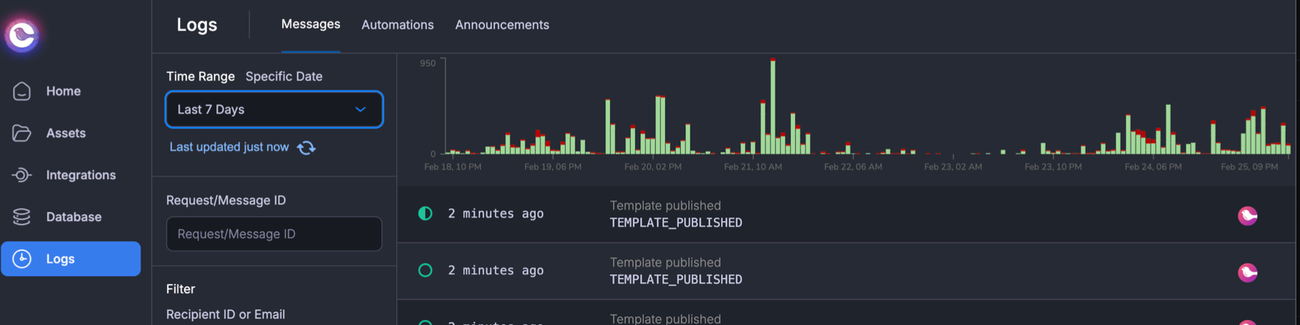
Good observability helps you understand what’s happening, but our previous logs made it hard to see the full picture. Debugging often meant searching, filtering, and manually piecing together trends. Spotting a spike in failures or a drop in message volume shouldn’t take that much effort.
The new logs histogram makes this easier. Instead of scanning rows of data, you get a real-time visual overview of message activity. Spikes, dips, and failures stand out instantly, so you can quickly diagnose issues and get back to work.
Now, trends are instantly visible. You can:
- Spot spikes and dips at a glance instead of manually searching for patterns
- Jump to a specific time range to investigate issues without adjusting multiple filters
- Quickly diagnose failure patterns without scrolling through hundreds of log entries
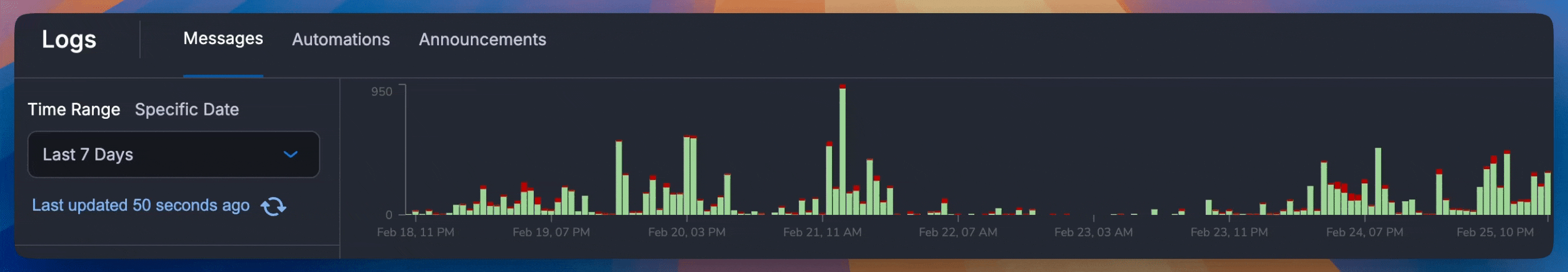
For example, if you notice a failure spike at 3:14 PM yesterday, you can zoom into that period, immediately see what happened.
How It Works
The histogram provides an overview of message activity over time, making it easy to track volume, identify trends, and spot failures.
- Clear visual indicators
- Green bars represent successful messages
- Red bars highlight failures
- Updates dynamically – The histogram reflects your selected filters, ensuring you always see relevant data.
- Adjustable time ranges – Quickly zoom in or out to analyze short-term issues or long-term trends.
- Drag a custom time range – Investigate historical issues without manually adjusting filters. Just drag your mouse over the range you want.
Whether you're debugging a real-time incident or reviewing historical trends, the histogram helps you find what you need faster—without searching through raw logs.
Try It Now
The histogram is live now in the Courier dashboard. If you’re already using Courier, head to Logs to explore your message activity with an instant visual overview.
We’d love to hear your feedback—let us know how the histogram improves your workflow or what you'd like to see next.
Similar resources

Inbox SDKs for Vue and Angular: a native in-app notification center
Courier now ships first-class inbox SDKs for Angular and Vue. Drop in a real-time notification center, toasts, and a preferences center with native components, an injectable service, and a composable, all backed by the same in-app inbox that already powers React and JavaScript apps.
By Mike Miller
June 19, 2026

What we shipped this month: May 2026 Edition
Courier shipped five launches in May 2026: AI Agent in Journeys (GA), the new Journeys API for code-driven flows, Custom Environments, Design Studio styling controls, and Courier Console v3. Each one closes a gap between writing software and shipping the messages that go with it.
By Kyle Seyler
May 20, 2026
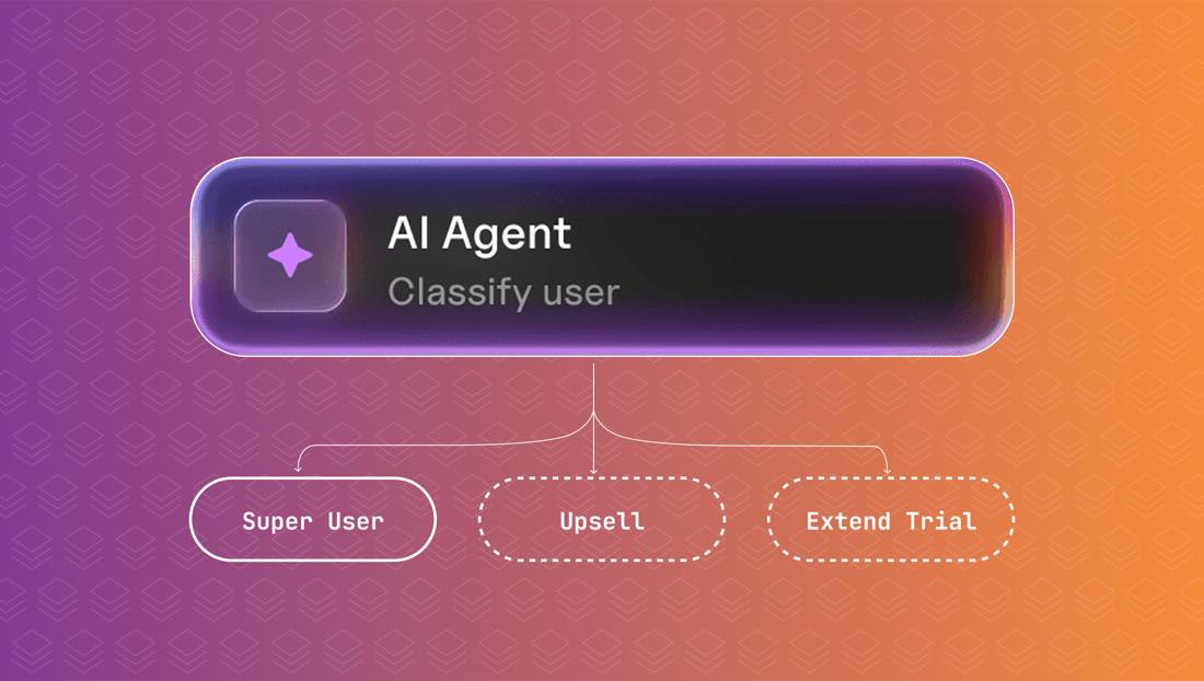
Introducing the AI Node in Courier Journeys
The AI node is a new step inside Courier Journeys that classifies users, branches on the result, and writes per-channel copy from a single prompt. Here's what it does, how to set one up, and when it's worth using over a regular condition node.
By Kyle Seyler
May 14, 2026
© 2026 Courier. All rights reserved.