How to Use The Shadow Dom To Isolate Styles on a DOM That Isnt Yours
 Riley NapierAugust 18, 2020
There have been many times in my career of building web apps and frontend experiences that I have needed to embed a widget in a DOM that I did not build or have access to. For example, embedding e-commerce widgets in a CMS or building chrome extensions to augment a given website. One of the biggest frustrations I've had is the style collision. In my development environment, all the widgets look great but the second I add the widget to a customer’s page… everything is broken!
Why does this happen?
The difficulty with embedding widgets in a DOM that you don't own, is that every DOM is going to reference different default fonts and colors. It’s rather normal for a css stylesheet to look like:
body {font-family: my-awesome-font;font-size: 16px;color: #eee;line-height: 16px;box-sizing: border-box;}
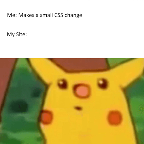
When I embed my widget into the body of this customer’s page, it will inherit the above styles. While sometimes this is ok, many times it will break the beautiful widget I designed because I designed the widget with a different font-size or padding.
Classic Solutions
Historically we have had 2 solutions to this problem.
- iFrame
- Be crazy explicit with your styles
While both solutions can work, they both have rather frustrating aspects you will have to deal with. Below we will go over a few examples of what I’ve done in the past and then talk about what this blog post is all about, the fancy new futuristic way to make composite user interfaces! The Shadow DOM!! <insert sinister laugh here>
Working with iFrames
With an IFrame, I have no control over the element’s size, so the consumer of my widget will have to accurately carve out space in their dom for my iFrame. If my widget is dynamic in size, this is going to cause all sorts of problems with scrolling and positioning.
The second issue we find with iFrames, is the communication between the iFrame and the parent. While I can now use CustomEvents, I will need to build out an event system for both the parent and the iFrame context. This can be rather frustrating if the client already has a built in SDK. It’s basically building a mini SDK for the SDK for IFrame communication.
And Finally, maybe the most simplistic issue, my consumer can’t tweak ANY of the styles in my iFrame. This can lead to inconsistent user interfaces and just a bad experience all around.
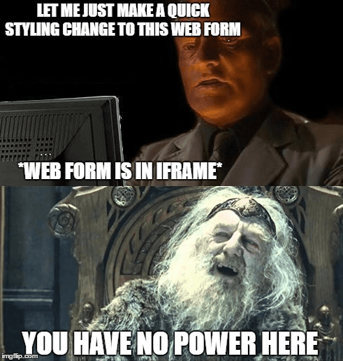
While iFrames will work, they are outdated, difficult to communicate with, and if your widget is dynamic in size, or you need any kind of customization, good luck.
CSS Specificity
The more common approach I have taken is to just be super specific with my CSS. So namespace everything!!! This can be tedious and will most likely need to be tweaked for each new client integrating your components. The QA process for pushing out an update to the widget is going to be difficult, too! There are so many ways clients can use CSS and have it break your integration.
Ok, so if I don’t want to use an iFrame or be crazy explicit about my CSS, what can I do?
Enter the Shadow DOM!
Wow, that sounds spooky… What is the Shadow DOM you ask? It’s an API for DOM encapsulation and we all know how important encapsulation is.
Shadow DOM allows hidden DOM trees to be attached to elements in the regular DOM tree — this shadow DOM tree starts with a shadow root, underneath which can be attached to any elements you want, in the same way as the normal DOM. -Using Shadow DOM
The most basic approach to creating a shadow is to attach it to any dom element:
const shadow = element.attachShadow({mode: 'open' || ‘closed’});
The mode open or closed allows you to specify whether or not the page’s JavaScript can interact with the Shadow DOM. Open meaning yes, it can interact and closed, it cannot.
After I’ve created my shadow element, I can append to it just like any normal DOM node.
const shadow = element.attachShadow({mode: 'open' || ‘closed’});const styleNode = document.createElement(“style”);style.textContent = `background: blue;font-size: 18px;`;shadow.appendChild(styleNode);const contentNode = document.createElement(“div”);contentNode.textContent = `Hello World`;shadow.appendChild(contentNode);
The above code will create a shadow node, append a node style to the Shadow DOM, and append a div saying Hello World. The style will now be isolated, only affecting the shadow tree and not contaminating the parent! Success!
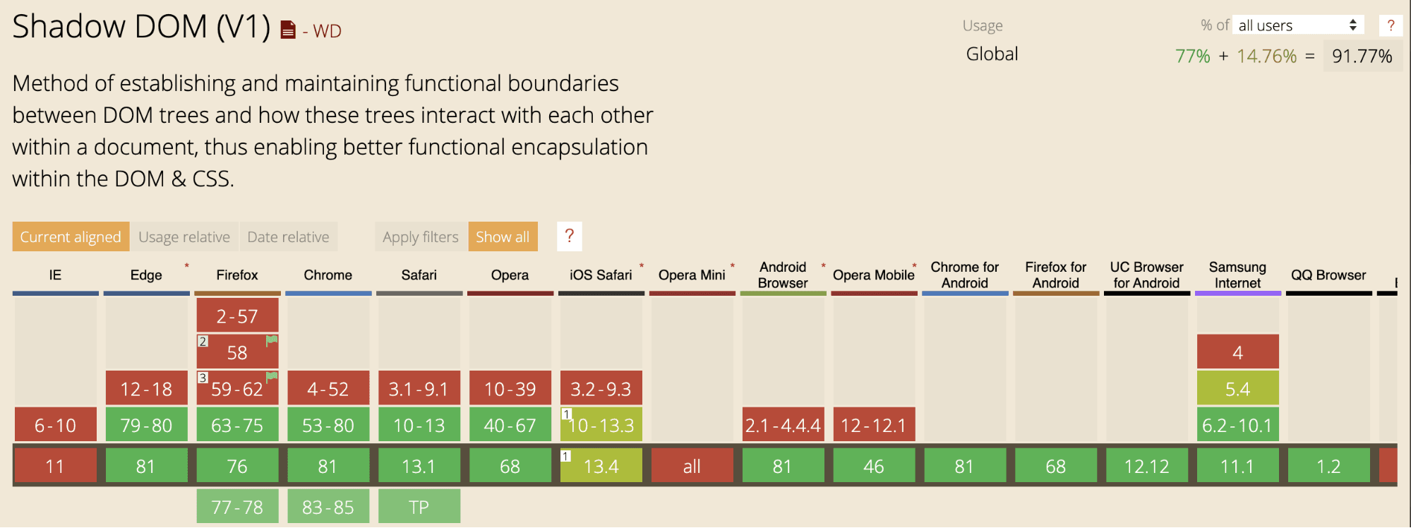
However, the above example is very verbose and simple and is showing us the bare metal implementation of the Shadow DOM. It’s only scratching the surface of what the Shadow DOM can do. It’s not all that complicated and it’s pretty well supported right now!
Shadow DOM with React
I’d like to take a quick moment to highlight a really useful package that I’ve used in the past and really gave me the feeling of “WOW, I might actually be able to use this in production”.
React Shadow makes working with the shadow dom with React easy as pie! The example I used above with react-shadow will look like this
import root from 'react-shadow';export default () => (<root.div><div>Hello World</div><style type="text/css">background: blue;font-size: 18px;</style></root.div>);
Now if that isn’t magic, I don’t know what else is! So take a step with me into the future, let’s not be afraid of our Shadow DOM, and let’s make beautiful composite user experiences together!

Check out how we used our Shadow DOM to make a beautiful composite user experience. Sign up for Courier to explore our UI.
Similar resources

How Apple's on-device AI works, and what it changes for your users
Apple's 2026 on-device models (AFM 3) are good enough to read, rank, and summarize everything that lands on your phone, locally and for free. Here's how they actually work, in plain terms, and how a model that reads every message before your users do changes what you should send.

Apple Intelligence finally got smart. Here's how it changes the notifications your users see.
Apple Intelligence's on-device models got dramatically better in iOS 27, and they now summarize, rank, and filter notifications before your users ever see them. There's no API to control that, so the words you send are the only lever you have. Here's how notification summaries work and how to write for them.
The real cost of notifications at scale
The sticker price of a notification platform is never the real price. Cost scales with both message volume and user count, and the biggest expense is often the one nobody invoices: owning and running whatever you built yourself. Here's a clear way to model what notifications cost at scale and the levers that actually control it.
© 2026 Courier. All rights reserved.