Introducing Courier Analytics: See How Your Notifications Perform
Thomas Schiavone
September 03, 2025

We're excited to launch our new Analytics page. We built it to answer the questions every team eventually runs into:
- Which notifications are we sending the most?
- Are they actually getting delivered?
- Where are users engaging—or dropping off?
Our new Analytics page gives you both.
At the overview level, you can see which templates are sent most often and whether any are failing. A simple graph makes it easy to track send volume over time and spot patterns or spikes.
In the template detail view level, you can drill into a single template to see how it performs across channels and providers. Delivery, open, click, and error rates are all laid out in one place, so you know exactly how each notification is working.
Metrics at a Glance
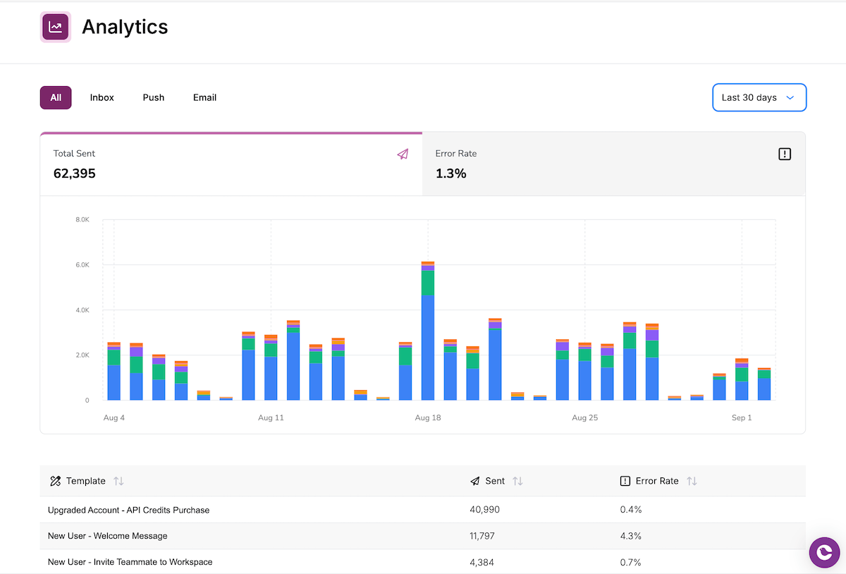
The Analytics Home page gives you the big picture of your notifications. Each template is listed with its total sends and error rate, so you can quickly see which ones matter most and which might need attention.
The graph highlights your top five templates, with everything else grouped into an “Other” category. Since most teams only have a few templates that drive the majority of their volume, this view makes it easy to focus on what matters. You can spot spikes in individual templates at a glance, while still keeping track of overall send patterns over time.
Both the graph and the table are filterable by channel—email, push, in-app, and more—so you can compare how different types of notifications are performing without losing context.
It’s the fastest way to understand the overall health of your notification system.
Go Deeper on Performance
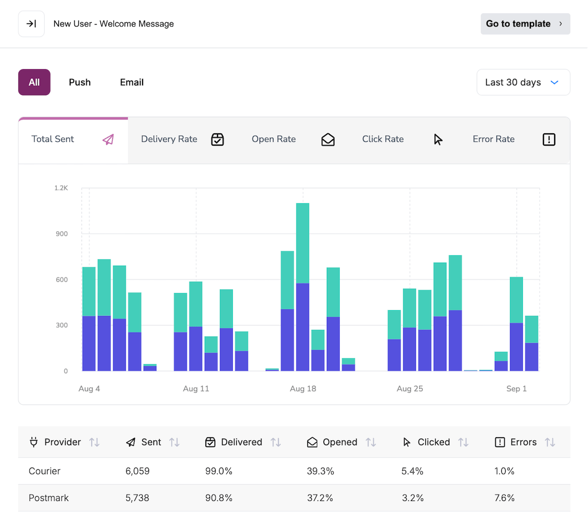
When you need to go deeper, the Template Detail view gives you a focused look at a single notification. Each template’s performance is broken down by channel and by provider, so you can see exactly where things are working and where they might need improvement.
For every template, you’ll find the key metrics:
- Number of sends
- Delivery rate
- Open rate
- Click rate
- Error rate
This makes it easy to compare providers side by side, understand how engagement differs across channels, and quickly diagnose issues when they appear. Instead of guessing why a notification isn’t landing, you have the data to know for sure.
Turning Notifications Into Insights
Your notifications are how your product communicates with users. With our new Analytics page, you can see what is being sent, how it is performing, and where things need attention.
We’re excited to launch this and continue improving it with your feedback. Let us know what would make Analytics even more useful for your team.
Similar resources

Inbox SDKs for Vue and Angular: a native in-app notification center
Courier now ships first-class inbox SDKs for Angular and Vue. Drop in a real-time notification center, toasts, and a preferences center with native components, an injectable service, and a composable, all backed by the same in-app inbox that already powers React and JavaScript apps.
By Mike Miller
June 19, 2026

What we shipped this month: May 2026 Edition
Courier shipped five launches in May 2026: AI Agent in Journeys (GA), the new Journeys API for code-driven flows, Custom Environments, Design Studio styling controls, and Courier Console v3. Each one closes a gap between writing software and shipping the messages that go with it.
By Kyle Seyler
May 20, 2026
Introducing the AI Node in Courier Journeys
The AI node is a new step inside Courier Journeys that classifies users, branches on the result, and writes per-channel copy from a single prompt. Here's what it does, how to set one up, and when it's worth using over a regular condition node.
By Kyle Seyler
May 14, 2026
© 2026 Courier. All rights reserved.