Fonts in email: what works, what breaks, and how to fix it
Thomas Schiavone
April 06, 2026
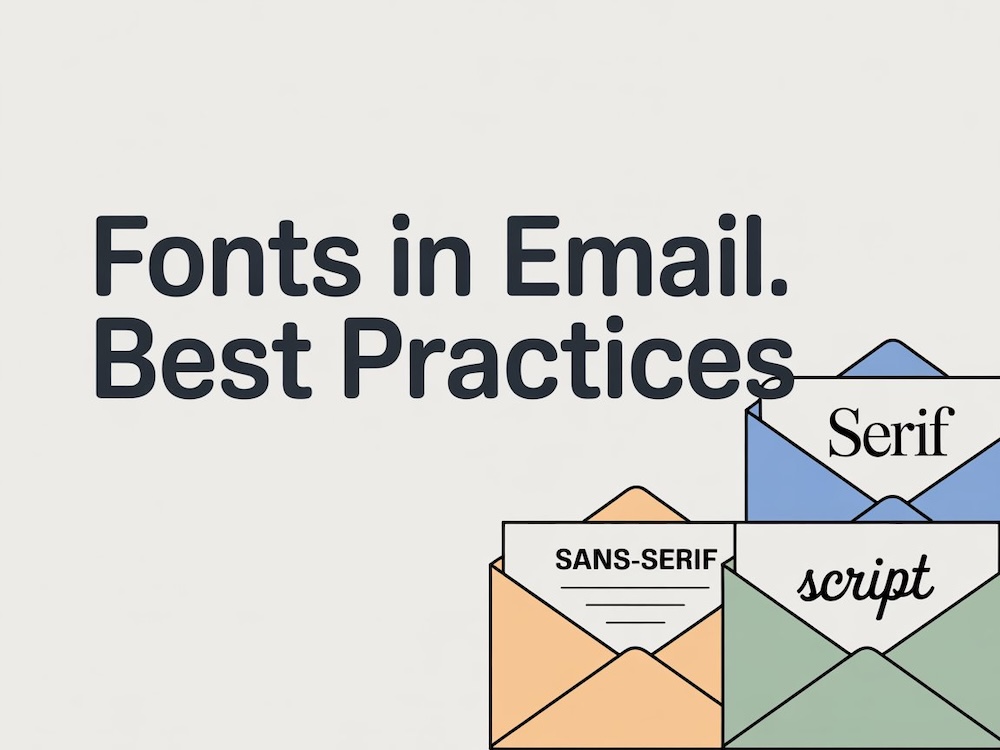
Table of contents
Why fonts in email don't work like fonts on the web
The industry standard: fallback-first, enhance where you can
Which email clients support custom fonts (and which don't)
How to implement fonts in email HTML
Readability and accessibility standards
A pre-send QA checklist for fonts
How Courier handles this for you
Wrapping up
Fonts in email: what works, what breaks, and how to fix it
Pick a font for your website and it works everywhere. Pick a font for your email and you're immediately dealing with a different reality. Fonts in email have never followed the same rules as fonts on the web. Gmail ignores your @font-face declaration. Outlook might swap in Times New Roman. Apple Mail renders your custom typeface perfectly. Your users see three different versions of the same email.
This isn't a new problem, but it's one that trips up even experienced teams because the rules aren't obvious. Email clients don't follow browser standards. They each have their own rendering engine, their own CSS support, and their own opinions about what fonts to show.
This guide covers the practical standard for handling fonts in email: how to build fallback stacks that hold up, where custom fonts actually work, what to do about the clients where they don't, and how to QA all of it before you hit send.
Why fonts in email don't work like fonts on the web
On the web, you declare a font with CSS, point to a hosted file, and browsers load it. It's been reliable for over a decade. Email doesn't work that way.
Every email client is its own rendering environment. The same HTML might pass through Gmail's web interface (which strips <style> blocks and ignores @font-face), Outlook for Windows (which uses Microsoft Word's rendering engine), Apple Mail (which supports most modern CSS), and dozens of others. Each one makes its own decisions about what CSS to keep, what to strip, and what to override.
That fragmentation means your font choice isn't really a design decision. It's a compatibility decision. Three things make it tricky:
- Inconsistent
@font-facesupport. Some clients load custom fonts. Others strip the declaration entirely and fall back to their own default. - Different default fonts per client. Gmail defaults to Roboto on Android and Arial on desktop. Apple Mail uses Helvetica. Outlook uses Calibri. If your fallback stack doesn't account for this, the client picks for you.
- Layout shifts from fallback fonts. A fallback with a different x-height or character width than your primary font can change line wraps, push content below the fold, or compress spacing in ways you didn't design for.
The takeaway: if you want your emails to look intentional across clients, you need to design for what happens when your preferred font doesn't load. Because in most inboxes, it won't.
The industry standard: fallback-first, enhance where you can
Look at the guidance from Litmus, Campaign Monitor, Email on Acid, and the support data on Can I Email. The pattern across all of them is the same.
Teams that ship reliable email at scale don't pick one perfect font and hope for the best. They build a fallback-first strategy: start with fonts you know will render everywhere, then layer in custom fonts as a bonus for clients that support them.
Here's what that looks like in practice:
- Start with email-safe system fonts as your baseline. These are fonts pre-installed on virtually every operating system: Arial, Helvetica, Georgia, Verdana, Times New Roman, Courier New. They're not exciting, but they're universal.
- Add a custom web font at the front of the stack for clients that support it. Apple Mail, iOS Mail, and a handful of others will load it. Everyone else gets the fallback.
- End every stack with a generic family. Always close with
sans-serif,serif, ormonospaceso you're never leaving the final choice to the client. - Test in the clients your audience actually uses. Your open data tells you where to focus.
You'll sometimes hear this called a "web-safe font" strategy. That term comes from old web standards and refers to fonts commonly installed across operating systems. In the email world, the better mental model is email-safe fonts: the subset that reliably renders across major email clients, not browsers.
Which email clients support custom fonts (and which don't)
Support changes over time, so always check a current source like Can I Email before making decisions. That said, the high-level patterns have been stable for years:
| Client family | @font-face support | Notes |
|---|---|---|
| Apple Mail (macOS) | Yes | Solid support since macOS 12.2+ |
| iOS Mail | Yes | Reliable on iOS 10.3+ |
| Gmail (all platforms) | No | Strips @font-face, overrides with its own defaults |
| Outlook for Windows | No | Uses Word's rendering engine, ignores web fonts |
| Outlook for Mac | Yes | Supports @font-face since 2011 |
| Outlook.com (web) | No | Strips custom font declarations |
| Yahoo Mail | No | Strips @font-face |
| Samsung Mail | Partial | Some support on Android 8.0+ |
| Thunderbird | Yes | Full support on desktop |
The practical implication: if your audience skews toward Apple devices, custom fonts can genuinely improve brand expression. If you're sending to a mixed audience (most B2B senders), the majority of opens will come from clients that ignore your custom font entirely.
That's not a reason to skip custom fonts. It's a reason to make sure your fallback looks great, too.
How to implement fonts in email HTML
There are three methods for loading custom fonts in email. Each has different levels of client support.
@font-face (recommended for email)
This gives you the most control. You declare the font family, weight, style, and source directly, and you can specify the woff2 format, which has the widest support among clients that accept custom fonts.
Copied!
Then reference it in a fallback stack on every text element:
Copied!
<link> and @import
Both of these pull from an external stylesheet, most commonly Google Fonts. Google Fonts are free to use in email, and their licenses explicitly cover it. They're simpler to set up, but have slightly narrower email client support and can introduce loading delays.
Copied!
Copied!
If you use either of these, watch out for an Outlook quirk: some versions will fall back to Times New Roman instead of your declared fallbacks. The @font-face method avoids this, which is one reason it's preferred.
Build your fallback stack with intention
A font stack isn't a list of random alternatives. Each entry should be chosen deliberately:
- Match the style class. Sans-serif primary gets sans-serif fallbacks. Serif primary gets serif fallbacks.
- Match the x-height. Fonts with similar x-heights produce fewer layout shifts when the fallback kicks in.
- Keep line-height explicit. Don't rely on inherited or default values. Set
line-heighton every text block so spacing stays consistent regardless of which font loads.
Here are example stacks for common styles:
| Style | Stack |
|---|---|
| Sans-serif | 'Inter', 'Segoe UI', Helvetica, Arial, sans-serif |
| Serif | 'Lora', Georgia, 'Times New Roman', Times, serif |
| Monospace | 'JetBrains Mono', 'Courier New', Courier, monospace |
Handle Outlook explicitly
Outlook for Windows deserves special attention. It uses Microsoft Word's rendering engine, which means it ignores most CSS you'd expect to work. For fonts specifically, Outlook can default to Times New Roman when it encounters font declarations it doesn't understand.
The standard fix is an MSO conditional comment that forces a safe font stack for Outlook:
Copied!
Not glamorous. Very effective.
Readability and accessibility standards
Email typography has one job before all others: be readable. If your subscribers can't comfortably read your content, nothing else about your font strategy matters.
These are the practical defaults that align with WCAG guidance and industry best practices:
- Body font size: 14px minimum, 16px recommended. Some teams go to 18px for mobile.
- Line height: 1.4 to 1.5 times the font size for body copy. Tighter spacing feels cramped on screens.
- Heading scale: 28 to 32px on desktop, 24 to 26px on mobile. Always set
line-heightexplicitly on headings. - Color contrast: meet WCAG AA minimums (4.5:1 for body text, 3:1 for large text). Strong contrast isn't optional.
- Visual hierarchy: use size, weight, and color differences to create clear distinction between headings, body, and secondary text.
A few things to avoid:
- Decorative fonts for body copy. They're hard to read at small sizes and harder to read on mobile.
- Image-only emails as a font workaround. Locking text in images breaks screen readers, fails when images are blocked, and kills accessibility.
- Relying on font-weight alone for hierarchy. Not all clients render weights consistently. Combine weight with size and color.
Use media queries to refine sizing on mobile:
Copied!
A pre-send QA checklist for fonts
You don't need a 30-minute QA process for every email. But you do need a repeatable check that catches font issues before they reach inboxes.
Before every send:
- Every text block has an explicit
font-familywith a fallback stack. - Body text meets your size and line-height targets.
- The email previews correctly in Gmail, Outlook, and Apple Mail (at minimum).
- Mobile rendering looks right at 375px width.
- Dark mode doesn't break text contrast or hide content.
- Headings still create clear hierarchy when the primary font doesn't load.
Common failures this catches:
- A CTA button drops below the fold because the fallback font is slightly wider.
- Body copy looks cramped because the fallback has a larger x-height than expected.
- Outlook renders everything in Times New Roman because the font declaration method doesn't play well with MSO.
- Thin font weights become nearly invisible on certain screens.
Catching these in QA takes minutes. Fixing them after a send takes an apology email.
How Courier handles this for you
Everything in this guide boils down to one workflow: pick a font, build a fallback stack, and test it. Courier's notification designer now handles that workflow automatically.
When you design an email in Courier, you choose from a curated set of email-safe fonts that render reliably across major clients. The designer auto-selects compatible fallback fonts for you, so every email template ships with a proper stack out of the box. No hand-coding font-family declarations, no guessing which fallbacks match your primary font's x-height.
If you want to go beyond system fonts, there's a library of 40 Google web fonts available as well. Pick one, and Courier auto-generates the fallback stack the same way. Clients that support web fonts get your custom typeface. Everyone else gets a matched fallback. Progressive enhancement, handled for you.
And if you have opinions about which fallbacks to use (you probably do), you can override the auto-selection and pick your own from the email-safe font set. You get full control without having to write the CSS yourself.
Wrapping up
The industry standard for fonts in email comes down to one principle: design for the fallback first, then enhance where you can.
Custom fonts can absolutely strengthen your brand in the inbox. Apple Mail and iOS Mail will render them beautifully. But the majority of your audience is probably opening email in a client that ignores custom fonts entirely, and your emails need to look intentional there, too.
Build a solid fallback stack. Set readable defaults for size, line-height, and contrast. Handle Outlook explicitly. Test before you send. That's the standard, and it's the standard because it works.
Similar resources
Human-in-the-loop for AI payment agents: building approval notifications that work
AI agents need human approval before taking consequential actions: financial commitments, irreversible changes, decisions that affect other people. This post covers how to design those checkpoints and build the notification infrastructure: multi-channel delivery, live context, escalation, and a back-and-forth question loop between reviewers and the agent.
By Eric Lee
May 26, 2026
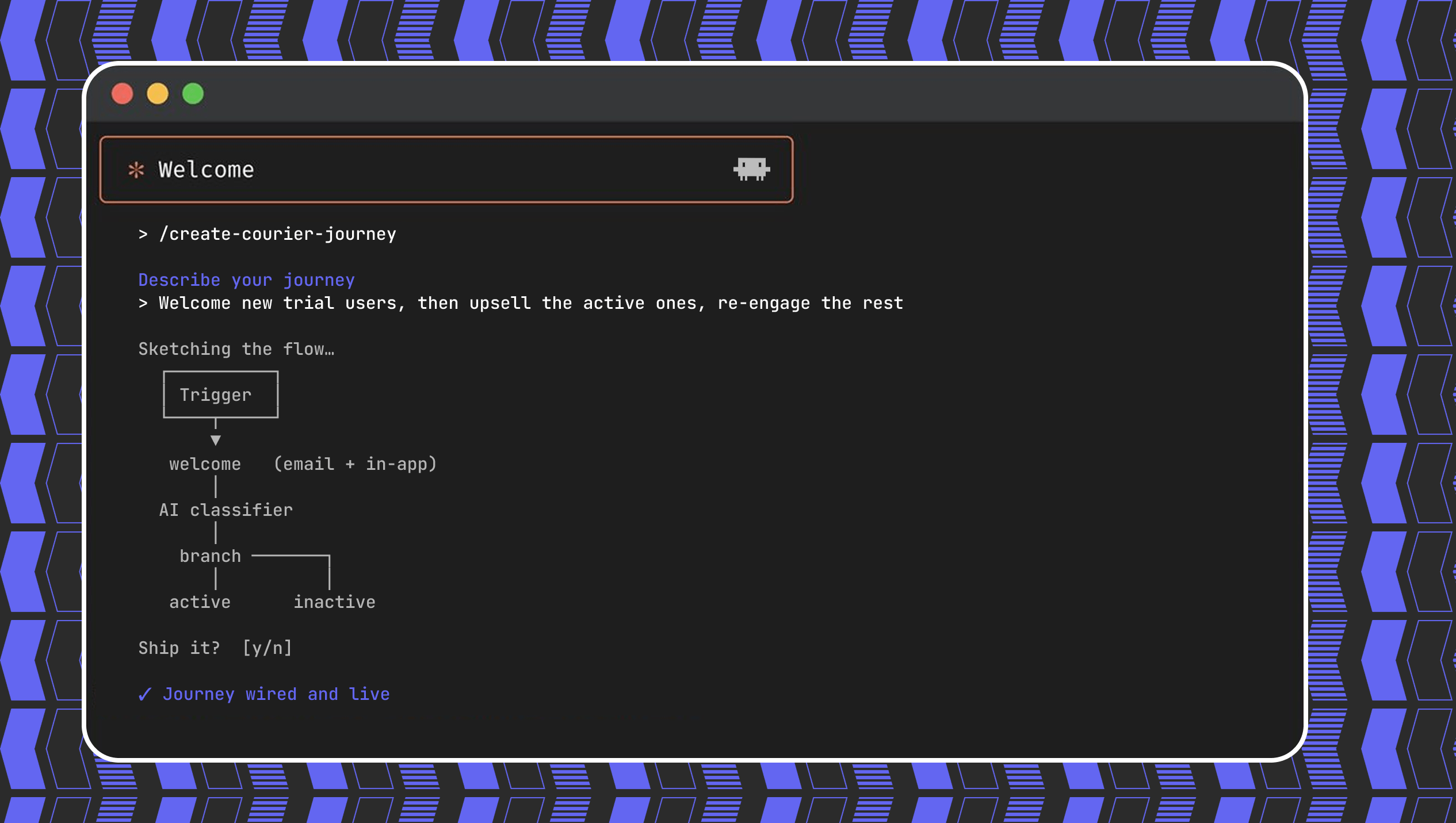
Create a customer journey from AI coding agent
Use Courier's Journey API to create multistep customer engagement workflows from your coding agent of choice. Describe the kind of journey you'd like to create, answer a few questions, and publish to the platform.
By Kyle Seyler
May 20, 2026

CocoaPods end of life: here's what to do
CocoaPods has been the default iOS dependency manager for more than a decade. On December 2, 2026, its central registry becomes read-only. Here's what that actually means for native iOS, React Native, and Flutter apps.
By Mike Miller
May 14, 2026
© 2026 Courier. All rights reserved.