Journey Mapping: How to Master the Art of Interrupting

Ryland Webb
July 29, 2021

Notifications are good for user experience. There, I said it. The word “notification” might conjure images of annoying interruptions for your users, but it should also remind them of moments where they were quietly guided to a more desirable experience. Notifications can guide users through key setup steps in onboarding, reward a positive interaction, and encourage exploration. They can stretch a product into an omnichannel experience and allow global brands to speak to each user as an individual. But notifications are only valuable to the user experience if they’re designed by the user experience - and it’s alarming how often this is ignored.
Think about every push notification that’s duplicated in-app instead of being converted to a digest, and every gratuitous red circle you see on a mobile app just to find an impersonal event alert or system update in your inbox. Notification UX should be an extension of the core product UX but many brands fail to make the connection between the two. It’s possible this product was rolling out the door and the notification “strategy” was just a box the product team needed to check. Unfortunately, a failure to consider the complexity of notification UX could have huge consequences for the rest of the product. Poorly timed notifications are interruptions and impersonal messages are spam. Too many bad notifications can frustrate users, stall their progress, and even lead them to abandon your product entirely.
Fortunately there are many positive examples to look towards when designing your notification strategy. Even as I write this, I’m involved in positive interactions with four different brands. On my phone, I see an adorable photo of my dog covered by a push notification for a New York Times article I indicated I might be interested in when I signed up, a like on a recent Instagram post, a new post from a Medium blog I follow, and an alert that I’ve been signed out of my mobile banking app. I’m receiving all of these notifications because of an action I’ve initiated, so I’m not surprised to be seeing any of them (except for maybe the Instagram like, hardy-har-har). If I chose to open this NYTimes article about farm fisheries, smart reporting would allow the Times to identify that this is a topic I’m still interested in and I would expect them to alert me when similar stories are posted in the future.
It shouldn’t come as a surprise that these push notifications increase each of these brand’s retention rates.These apps are reaching out to me when I’m outside of their product, and I’m more likely to open their product because of the personalized messaging I’m seeing. Localytics observed that mobile apps with in-app messaging have a 30% better chance of retaining users than apps without. Push notifications are also known to lift this retention rate and have a higher response rate than emails. Furthermore, best practice states users are more likely to be nurtured from new to advanced if they’re fed a balanced diet of omnichannel notifications.
So how should you go about designing your notifications? Before you hit send, sit down and ask the following questions. As a proof of concept, I’ll run through this exercise with you. I work as a product designer for Courier, which is working on a single platform for designing, orchestrating, and routing notifications over users’ favorite channel providers for email, SMS, chat, mobile push, and more. So I’ll be running through these questions with one of the personas we design for.
Who is your user?
Who is the user we’re targeting and what’s driving their journey? It’s important you establish the persona and goal and stick with that so your insights are clearer and more actionable.
You can do this with any persona at any stage in their customer journey. For our Courier POC, I’ll try designing notifications for Amanda, a recently onboarded user who is still setting up parts of her account. She would like to see value in the product before she becomes a regular user.
Why are they here?
Pull out the post-its and ask why this user is on this journey in the first place. Odds are, there will be a wide range in responses covering everything from high-level goals to small pain points. Try to group all the similar ideas together so you can make as cohesive a story as possible. In the case of our recently onboarded persona, Amanda, she might have signed up for Courier because she was having difficulty with Cross-functional collaboration, single-channel routing, and editing copy in the code.
Tying these pain points to a higher level goal will help ensure your user story is cohesive and clear. For instance, if I saw Amanda’s list of issues, I might say Amanda’s looking to simplify notification management for her entire team. Together, her scenario might read something like this:
“Amanda and her team are frustrated by their inability to edit the copy in their notification code. Furthermore, they feel a sense of dread everytime they need to send an existing notification to a new channel or share a build with a teammate. As her team grows, she’s looking for a platform that will simplify the management of their existing system and easily scale to meet their needs.”
What are they thinking and feeling?
Now I can take this story and map how Amanda is thinking and feeling during her Courier onboarding. Based on her back story, we can hypothesize that Amanda will begin to see value in Courier when she sees her teammates sending multi-channel notifications. Therefore, I can plot her journey to that moment and think about the messaging we should show her along the way.
Whether you’re doing this with a team or solo, I’d recommend keeping the post-its and markers out so that this brainstorm feels collaborative and easy to adjust. As you ask what Amanda is thinking and feeling during each step of her journey, you should also start identifying where she may run into confusion or frustration. Where does the journey have potential growing pains? Where might things not work as expected? What is Amanda’s current solution to this pain? What is the impact of this pain point? Is it painful enough that it might cause Amanda to abandon your product entirely?
At each step of the journey, you should indicate which channel your user is using. Are they using desktop or mobile? Are they even using your product at a certain step? In our featured example, we can assume Amanda will complete her initial onboarding steps in Courier - signing up, inviting teammates, creating a first notification - but other steps in her journey, like learning that a teammate joined or hearing that a teammate successfully made an edit to her template, will likely occur when she’s outside the product. How can we craft a notification to give the validation and assurance she needs without becoming an interruption?
I’d recommend charting a sentiment line as you go through this exercise so you can fully visualize the highest highs and the lowest lows in the current journey. Even if the sentiment line looks pretty flat throughout, that’s an opportunity to design a notification that will lift the mood.
Where would notifications be valuable?
You’ll want to take a step back and absorb your user journey at a high level. Where are the areas of greatest confusion? Where is the journey falling short of expectations? Are there any user needs that haven’t been met?
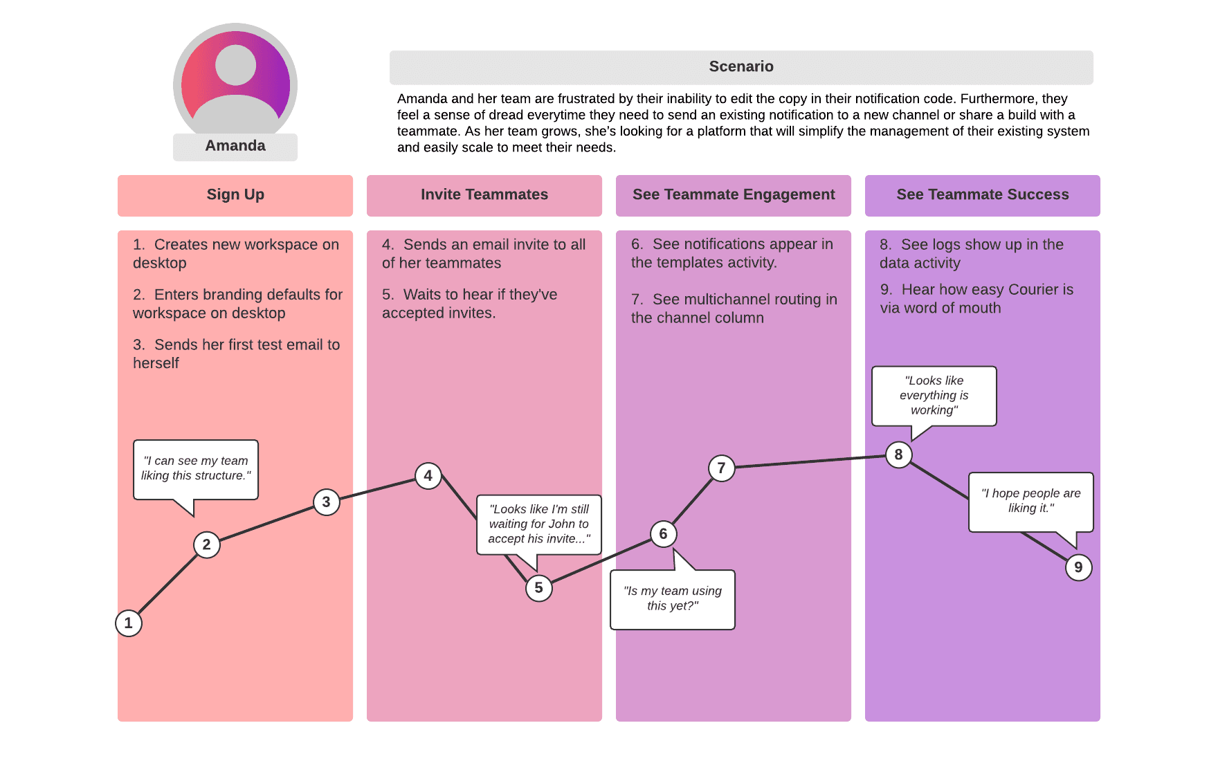
In Amanda’s case, we notice dips in the sentiment line and possible confusion in steps 5, 6, and 9. Thanks to this exercise, we can identify these steps as blindspots in the journey that can be improved by notifications. In steps 5 and 6, we can add in-app notifications that alert her when her invitations were accepted, and her new teammates are designing, editing, and sending notifications. We’ll also want to point her to her in-app preferences where she can snooze or opt out of these notifications so they don’t become too overwhelming. In step 9, we should create an email that shows her team trends on a weekly or monthly basis so that she can feel confident that Courier is helping her team scale. The combination of all of these notifications should improve Amanda’s experience and increase the likelihood we shepherd her to the “a-ha” moment that will make her a regular user of our product.
If you’ve finished all these steps, you’ve just built a journey map. It won’t guarantee perfect messaging in every notification, but it’ll point your team in the right direction. By taking the time to walk a mile in your user’s shoes, you can feel confident that you are only providing messaging where it’s wanted. From here, we can implement these notifications and test different messaging to see which speaks to Amanda the best.
At the end of the day, notifications are good for the user experience, but only if they’re informed by the user experience. Hopefully this serves as a gentle reminder to build the bridge between the two. Check out this guide on User Requirements when thinking about notification design.
Try Courier out for yourself. Sign up and start sending out delightful notifications.
Similar resources
Embed a notification preferences center with one web component
Courier's new @trycourier/courier-ui-preferences package ships a <courier-preferences> Web Component that drops a complete notification preferences center into any web app, framework or not. Users opt in and out of topics, choose which channels deliver each one (email, push, SMS, and more), and set per-topic digest schedules. It supports light and dark theming, custom channel labels, and reuses your existing Courier Inbox auth. React developers get the same UI bundled in @trycourier/courier-react v9.2.0 as the CourierPreferences component, no extra install needed.
5 Best Platforms for Product Messages in 2026
Product messages are a requirement for every SaaS product, but most teams outgrow their initial setup fast. You start with one email provider, add push, then SMS, and suddenly you're maintaining multiple integrations with no shared routing, no preference management, and every copy change requires a deploy. This guide compares five platforms that solve different versions of this problem: Courier for cross-channel messaging with AI tooling, Resend for developer-friendly transactional email, Customer.io for marketing-adjacent journeys, Supabase for built-in auth emails, and Novu for open-source self-hosted infrastructure.
What's the Difference Between Omnichannel & Multichannel
Most teams say "omnichannel" when they mean "multichannel," and in most cases the distinction doesn't matter much. But if you truly want to provide an exceptional customer engagement experience you should know the difference. Both involve sending messages across email, push, SMS, Slack, and in-app. They terms diverge when those channels know about each other. Multichannel means you can reach users on multiple channels. Omnichannel means those channels share state, so a user who reads a push notification won't get the same message via email an hour later. This guide breaks down the real distinctions, when the difference actually matters, and which messaging platforms deliver true omnichannel coordination.
© 2026 Courier. All rights reserved.