

Inbox
The full inbox component.
Popup menu
The inbox as an icon-button popup.
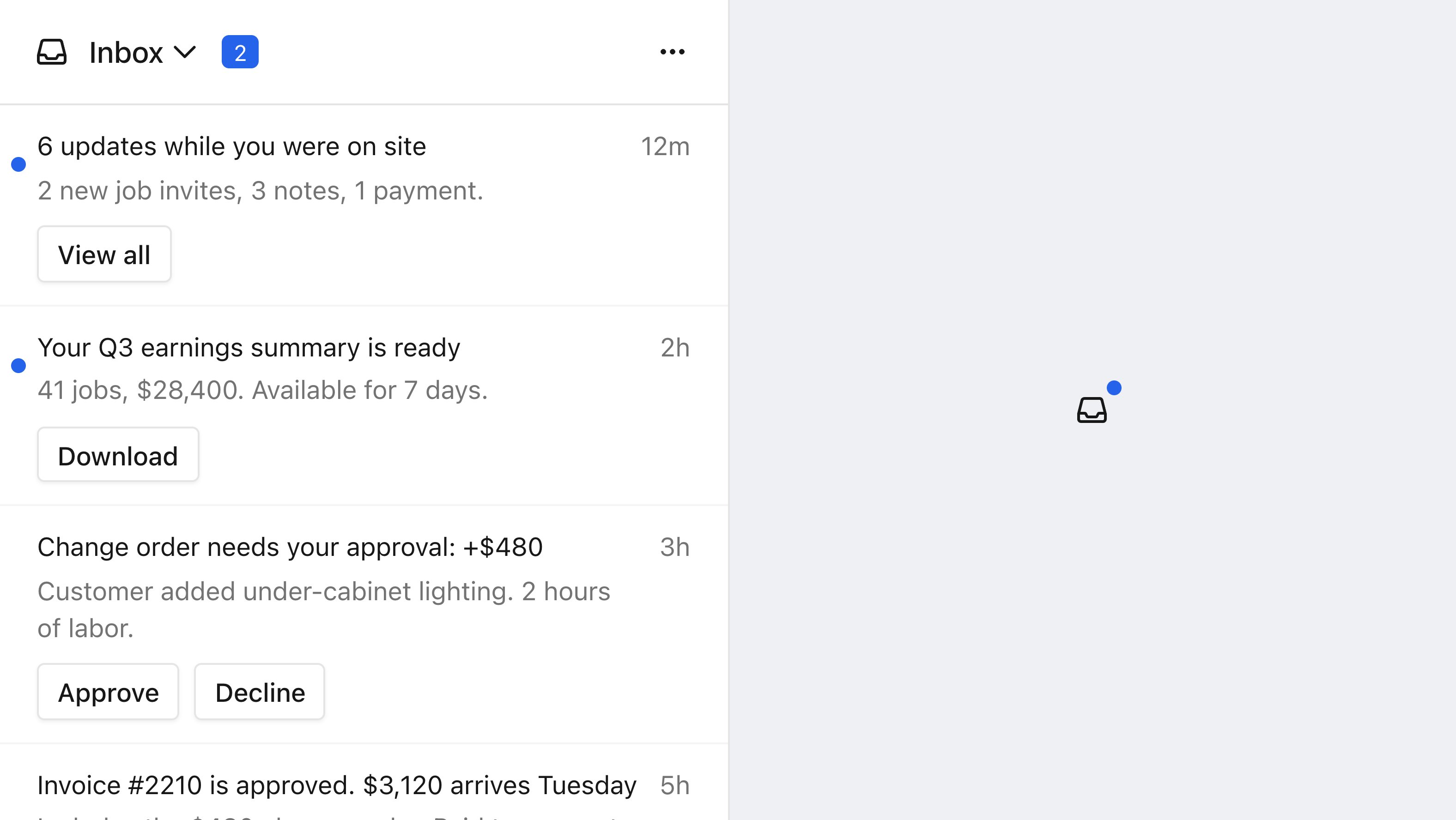
Both layouts in the default theme: the full inbox on the left, the popup's icon button on the right.
jwt in these snippets with your Courier API key. For the full flow, scope strings, and token refresh, see .
Prerequisites
- A message sent to that user on the
inboxchannel
Set up
1
Install the SDK
Install the SDK for your framework.On mobile, the SDK also needs native project setup before it renders: , , , and .
2
Authenticate and render
Call
signIn with a userId and a JWT from your backend, then mount the inbox component.CourierInbox fills its container’s width and takes its height from the parent, so size the parent or set a height. For a fixed-size widget, use the popup menu below.Render as a popup menu
On the web SDKs, the inbox can render as a popup menu instead of an inline list. The icon button opens the panel and carries an unread badge. Its default icon is an inbox glyph, themeable throughtheme.popup.button.icon.svg. Authentication is identical: keep the same signIn and swap the component. Popup menus are not available on mobile.
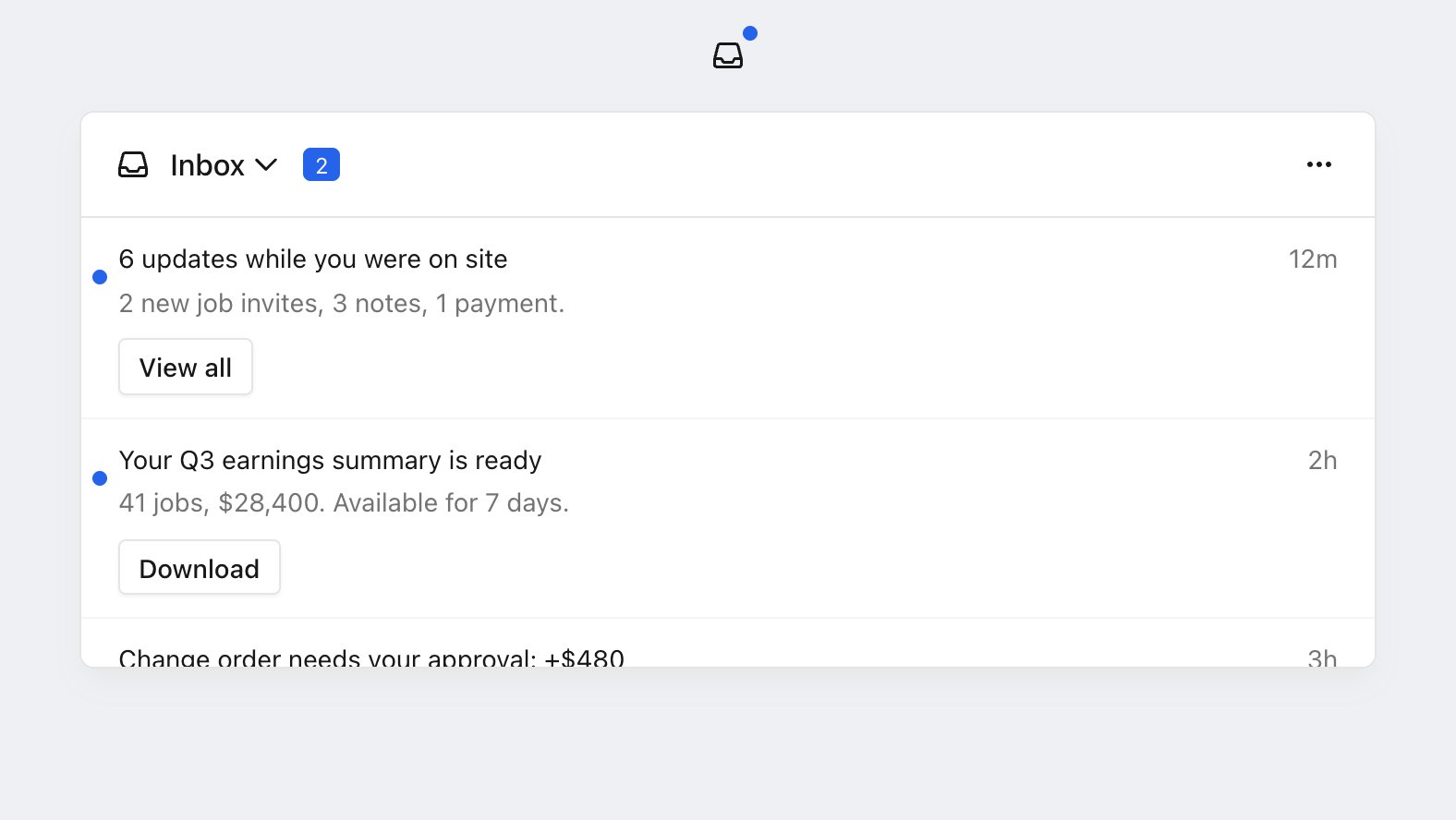
The inbox as a popup menu: an icon button with an unread badge, and the panel it opens.
Every platform, including mobile, exposes the message data and actions directly, so shows how to build your own.
Size and position the popup
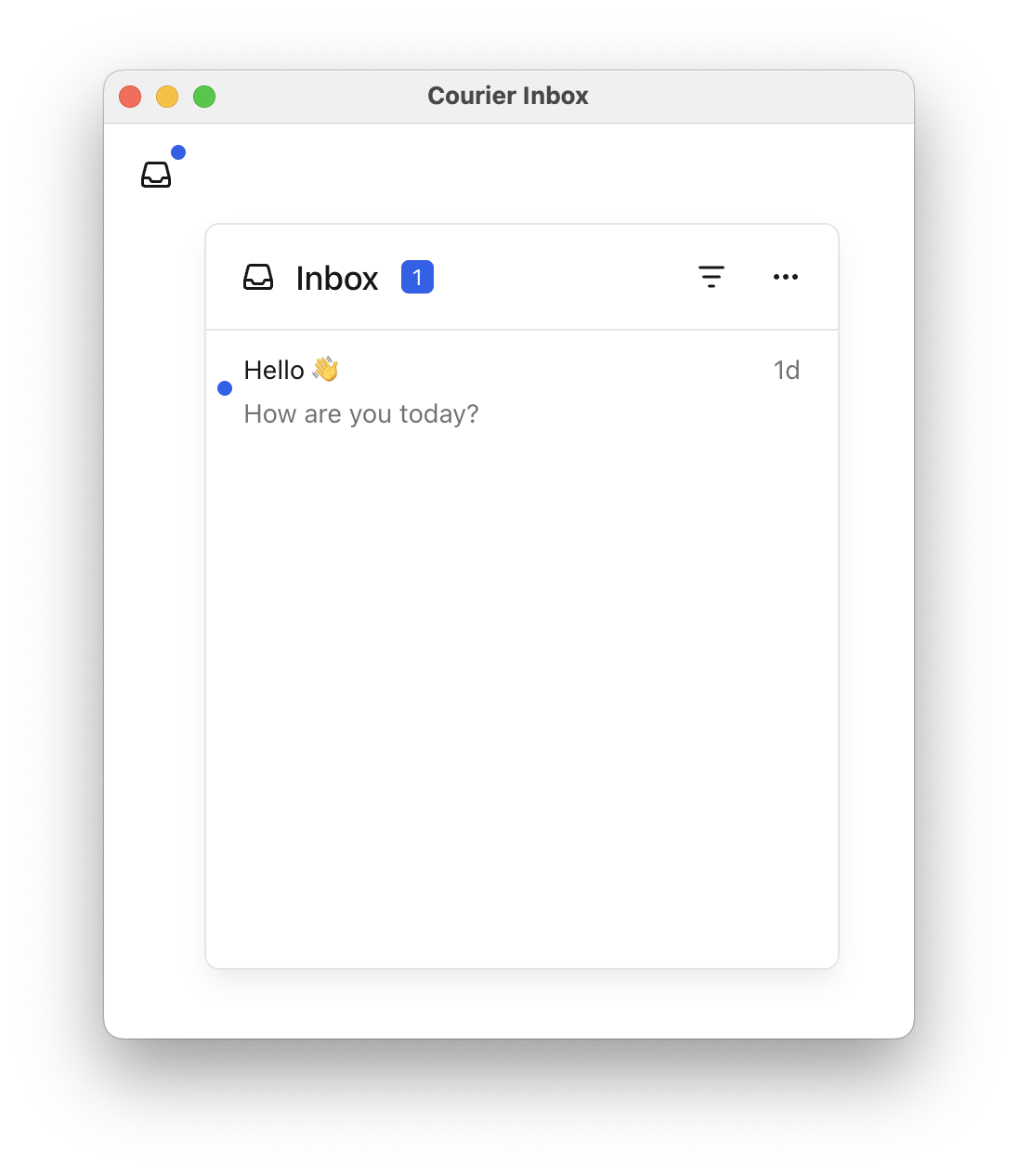
The popup menu at three different alignments, widths, and offsets.
popupAlignment picks which corner the panel opens from, and the four CSS offsets nudge it from there. Set only the offsets that the alignment uses: a top-* alignment reads top, a bottom-* alignment reads bottom, and the horizontal half reads left or right to match.
popupAlignment is ignored rather than rejected, and the panel keeps the alignment it had. Check the spelling against the nine values if a change appears to do nothing.
Give the inline inbox a height
<CourierInbox /> defaults to height="auto" and grows with its messages. In a fixed-height container that means the page scrolls instead of the list, so set a height when the inbox sits inside a panel or sidebar.
Content Security Policy.
The inbox calls Courier directly from the browser, so a site with a CSP has to allow these.
The inbox calls Courier directly from the browser, so a site with a CSP has to allow these.
connect-src needs https://api.courier.com, https://inbox.courier.com, wss://realtime.courier.io, and wss://realtime.courier.com. On the EU region, use https://api.eu.courier.com, https://inbox.eu.courier.io, and wss://realtime.eu.courier.io. The components style themselves inline, so style-src needs 'unsafe-inline'.Hosted preference center.
If you embed the hosted preference center in an iframe,
If you embed the hosted preference center in an iframe,
frame-src needs https://view.notificationcenter.app.Verify
1
Sign in and open the inbox
Sign in a user and open the screen that renders the inbox.
2
Send a test message
to that user on the
inbox channel.3
Confirm it appears
The message appears in the inbox in real time, and the unread count updates.
exp and scopes.