

Theme
Theme the preferences center withlightTheme / darkTheme (a CourierPreferencesTheme). Set mode to "light", "dark", or "system".
The default is "system", which follows the user’s OS setting.
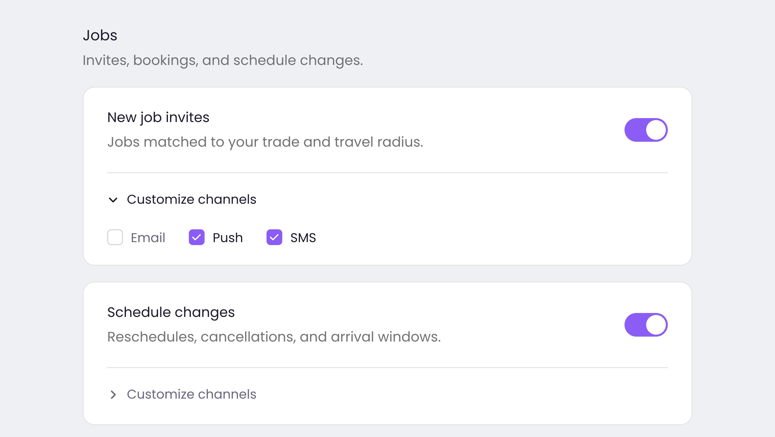
The Courier preferences center with a custom theme.
CourierPreferencesTheme, identical across React, Vue, Angular, and the Web Components, so it is documented once below. The native SDKs have their own: , , , and .
CourierPreferencesTheme reference
Every property is optional. SetprimaryColor alone and it carries the accent through the toggles, radios, and chips, which is usually the whole change.
section, topic, digest, channelChip) with a single primaryColor on top, while
the inbox theme is a popup and inbox tree. A theme object written for one is not
partially valid for the other. It applies nothing.
Two fields exist but do nothing today: loading.font, kept for compatibility because the
loading state renders as a skeleton, and the deprecated CourierPreferencesStatusTheme.
Custom UI
The preferences component has no render slots yet, so use the preferences client below instead, on any platform.
CourierPreferences, read and write topics through the preferences client. The same methods exist on every platform. Web frameworks expose them through useCourier() (React/Vue) or the injected service (Angular). Everywhere else uses Courier.shared.client.preferences:
Methods behind the component
The component reads and writes throughcourier.shared.preferences, so a UI you build
yourself calls the same client. useCourier() returns the client in React.
putUserPreferenceTopic replaces the topic’s routing rather than merging into it. Send
hasCustomRouting and the full customRouting array together, because omitting a channel
removes it.