

Theme
Theme toasts withlightTheme / darkTheme (a CourierToastTheme). Set mode to "light", "dark", or "system". The default is "system", which follows the user’s OS setting.
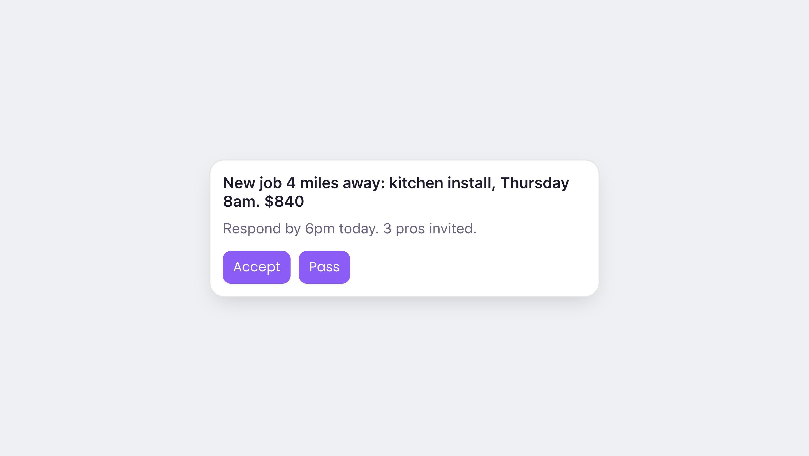
A Courier toast with a custom theme.
A toast item has a default border:
1px solid #E5E5E5 in light mode, 1px solid #3A3A3A in dark. Override it with item.border.CourierToastTheme reference
Every property is optional, and it is a shallower object than the inbox theme: oneitem key, not a tree of popup and inbox.
actions carries a default at its top level and one override per style. Fields set
directly on actions apply to every action button. The button, secondary, tertiary,
and link keys layer over that, each for actions asking for that look. So set shared
padding once on actions, and only the colours per variant.
Setting icon.visible to false drops the icon and the space it reserved, for toasts that
read better as text alone.
The built-in toast is web-only, so there is no native toast theme. On iOS, Android, Flutter, and React Native, listen for new messages and style your own UI. See .
Custom UI
On the web SDKs, toasts support the same custom rendering as the inbox.Replace the toast item
Swap the toast item for your own element while the SDK keeps managing the feed:Show your own popup
Skip the component: subscribe to the datastore and react to new messages withonMessageAdd. The datastore comes from @trycourier/courier-ui-inbox on every framework. Only the lifecycle wiring differs.