

Theme
Theme the inbox withlightTheme / darkTheme (a CourierInboxTheme), and set mode to "light", "dark", or "system". The default is "system", which follows the user’s OS setting.
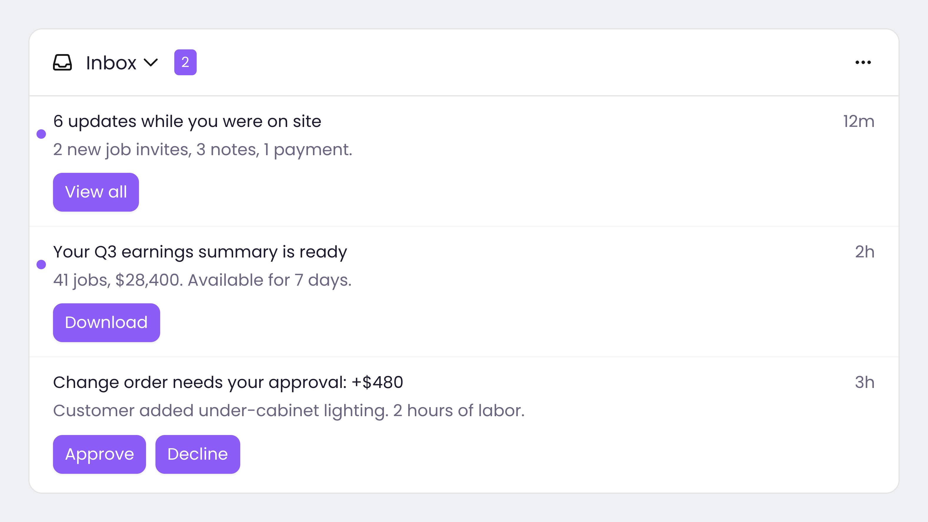
A Courier Inbox with a custom theme.
setLightTheme / setDarkTheme, or set the light-theme / dark-theme attributes with a JSON string.
Full theme reference. The web theme object (CourierInboxTheme) is identical across React, Vue, Angular, and the Web Components, so it is documented once in . The native SDKs have their own: , , , and .
Start from a default theme
The web SDKs export the two themes they ship,defaultLightTheme and defaultDarkTheme,
plus mergeTheme to layer your overrides onto one of them.
mergeTheme takes a mode string, "light" or "dark", as its first argument. It picks
the matching default itself. Passing defaultLightTheme there type-checks against nothing
useful and merges onto the dark defaults, which shows up as a theme that looks right in one
mode and wrong in the other.
Merging is not required. A theme passed straight to lightTheme already merges over the
defaults field by field, so reach for mergeTheme only when you need the resolved object,
such as reading a default colour to compute another.
CourierInboxTheme reference
Every property is optional, and the object is identical on every web SDK.Handle interaction
Respond to interactions with your own callbacks instead of the SDK’s default navigation. Every platform exposes the same two interactions:- Message click fires when a user taps a message. Receives the
messageand itsindex. - Action click fires when a user taps a message’s action button. Receives the tapped
actionalongside themessageandindex.
onMessage*) or outputs (messageClick). The payload is a single object: { message, index }, or { message, action, index } for actions. The web component exposes matching onMessage* methods, or message-* DOM events with the same payload on event.detail. On iOS, Android, Flutter, and React Native they are constructor arguments, view parameters, or setters, with positional arguments. Action click passes the action first, then the message and index.
Long press
Every platform reports a long press, web included. It fires only on devices that send touch events, so a desktop pointer never triggers it and you still need a click handler for the same intent.inbox.list.item.menu.enabled to false suppresses the gesture entirely, so the callback
never fires and nothing reports why. Two theme fields tune it:
The hold threshold is 650ms and is not themeable. A recognized long press suppresses the
click that would otherwise follow it, so the two handlers never both run.
Scroll
iOS and Android report the list’s scroll offset, so you can shrink a header or hide a badge as the reader moves. The web SDKs have no equivalent: listen on the scrolling element yourself.UIScrollView on iOS and a dp value on Android.
Custom UI
Theming changes how the built-in inbox looks. To change what it renders, see . It covers both levels: replacing individual slots such as the list item or header, and reading the message data and actions to build the UI yourself.FAQ
How do I match the inbox to my brand?
How do I match the inbox to my brand?
Supply a
lightTheme and darkTheme as CourierInboxTheme values and set colors, typography, and spacing there. See Theme and your platform’s SDK reference for the full field list.Can I force light or dark instead of following the OS?
Can I force light or dark instead of following the OS?
Set
mode to "light" or "dark". Leave it as "system" (the default) to follow the user’s OS setting. See Theme.Can I render my own message rows?
Can I render my own message rows?
See Custom UI: replace parts of the built-in inbox on the web SDKs, or build the whole UI yourself on any platform.
What is the difference between replacing parts and building my own UI?
What is the difference between replacing parts and building my own UI?
keeps the built-in inbox and swaps individual slots, on the web SDKs only. replaces the whole thing and works on every platform, including mobile.
Can I replace parts of the inbox on mobile?
Can I replace parts of the inbox on mobile?
Not yet, that is a web-SDK feature. On mobile, theme the built-in component or from the listener.
Do I still get real-time sync with a custom UI?
Do I still get real-time sync with a custom UI?
The SDK keeps the feed synced and calls your renderer or listener on every change. See .