Metrics tab showing a stacked bar chart of daily sends and a per-template breakdown table
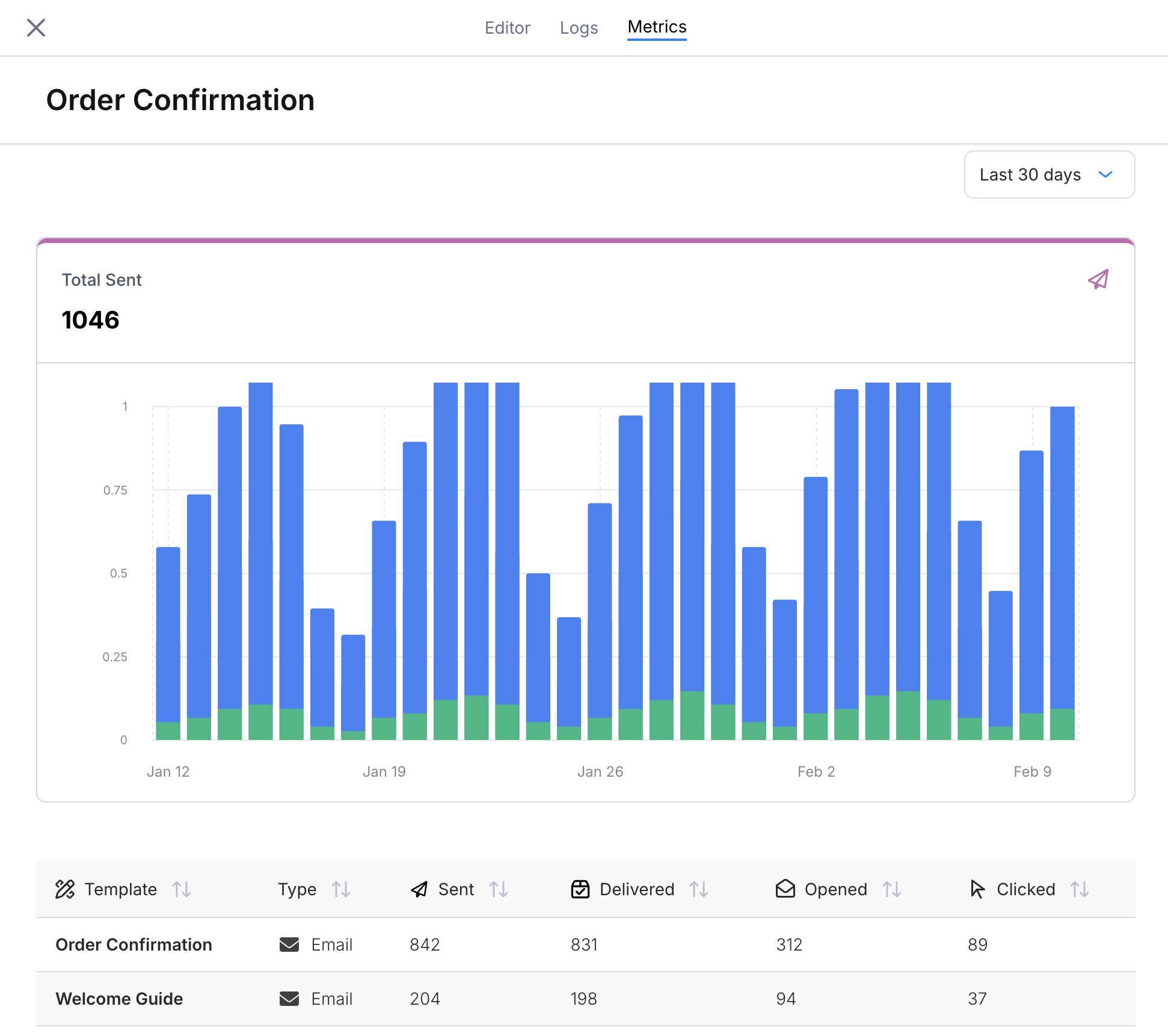
Send Volume Chart
The top panel displays Total Sent as a stacked bar chart over time. Each bar represents one day, and each color corresponds to a journey template (one per send node). The total count above the chart is the sum across all templates in the selected time range.Template Breakdown Table
Below the chart, a table lists every template associated with the journey’s send nodes.
Columns with insufficient data display
--.
Template Detail Drawer
Click any row in the table to open a detail drawer on the right side of the screen. The drawer shows metrics for that individual template with five chart tabs:- Total Sent — send volume over time (bar chart)
- Delivery Rate — percentage delivered over time (line chart)
- Open Rate — percentage opened over time (line chart)
- Click Rate — percentage clicked over time (line chart)
- Error Rate — percentage of sends that errored over time (line chart)
Templates from older published versions that no longer exist in the current draft appear with an “Inactive” prefix. This lets you track metrics for templates that were removed in a later version.
Time Range
Use the dropdown in the top-right corner to filter the chart and table to a specific window:- Last 7 days
- Last 30 days
- Last 90 days