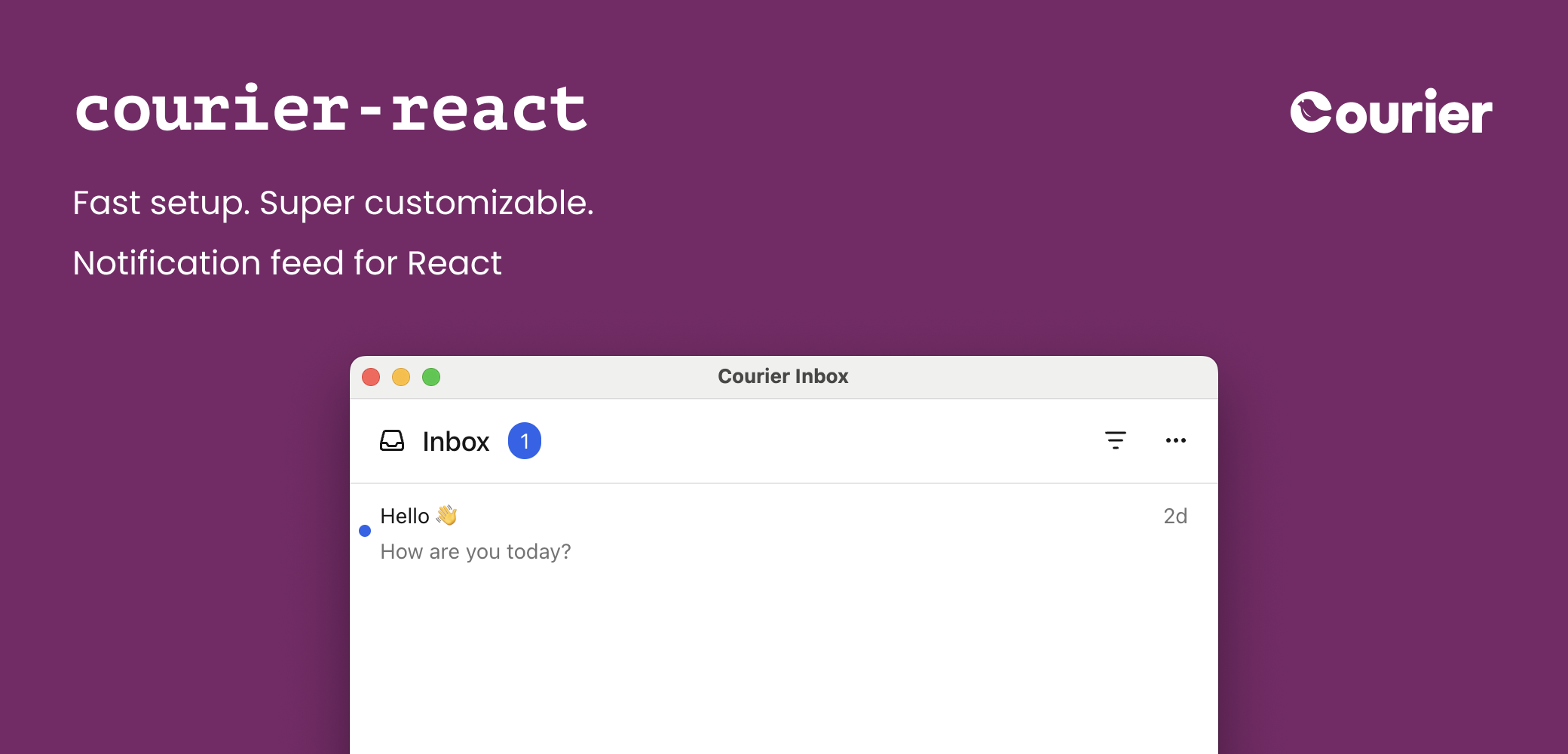
The Courier React SDK provides ready-made components and programmatic hooks for building notification experiences:
<CourierInbox /> — full-featured inbox for displaying and managing messages<CourierInboxPopupMenu /> — popup menu version of the inbox<CourierToast /> — toast notifications for time-sensitive alertsuseCourier() — hook for programmatic access and custom UIs
Installation Available on
Courier publishes two React packages: @trycourier/courier-react for React 18+ and @trycourier/courier-react-17 for React 17.
npm install @trycourier/courier-react
This is the latest version of the Courier React SDK, recommended for new and existing apps. If you’re coming from an earlier version of the Courier React SDK, check out the
v8 migration guide for what’s changed,
how to upgrade your app, and links to documentation for past versions of the React SDK. Authentication To use the SDK, you need to generate a JWT (JSON Web Token) for your user. This JWT should always be generated by your backend server, never in client-side code.
Your client calls your backend
When your app needs to authenticate a user, your client
should make a request to your own backend (ex. GET https://your-awesome-app.com/api/generate-courier-jwt).
Your backend calls Courier
Your backend returns the JWT to your client
Having received the JWT from Courier, your backend should return it to your client and pass it to the Courier SDK.
Development testing with cURL To quickly test JWT generation for development only, you can call the Issue Token Endpoint directly.
Do not call the Issue Token API from client-side code. Always keep your Courier API keys secure.
curl -X POST https://api.courier.com/auth/issue-token \
  -H 'Authorization: Bearer $YOUR_API_KEY' \
  -H 'Content-Type: application/json' \
  -d '{
    "scope": "user_id:$YOUR_USER_ID inbox:read:messages inbox:write:events",
    "expires_in": "1 day"
  }'
Quick Start Get up and running with Courier React in minutes. This minimal example shows how to add the inbox component to your app.
import { useEffect } from "react" ; import { CourierInbox , useCourier } from "@trycourier/courier-react" ; export default function App () { const courier = useCourier (); useEffect (() => { // Generate a JWT for your user on your backend server const jwt = "eyJhbGciOiJIUzI1NiIsInR5cCI6IkpXVCJ9..." ; // Authenticate the user courier . shared . signIn ({ userId: $YOUR_USER_ID , jwt: jwt , }); }, []); return < CourierInbox /> ; }
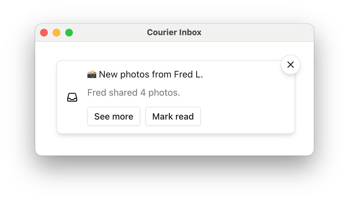
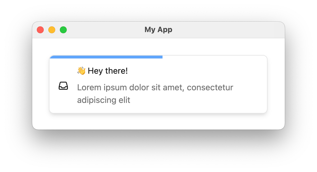
Inbox Component <CourierInbox />import { useEffect } from "react" ; import { CourierInbox , useCourier } from "@trycourier/courier-react" ; export default function App () { const courier = useCourier (); useEffect (() => { const jwt = "eyJhbGciOiJIUzI1NiIsInR5cCI6IkpXVCJ9..." ; courier . shared . signIn ({ userId: $YOUR_USER_ID , jwt }); }, []); return < CourierInbox /> ; }
If you’re using tenants , scope requests to a particular
tenant by passing its ID to signIn: courier . shared . signIn ({ userId: "my-user-id" , jwt , tenantId: "my-tenant-id" });
For the full reference of sign in parameters, see the Courier JS docs . <CourierInboxPopupMenu />import { useEffect } from "react" ; import { CourierInboxPopupMenu , useCourier } from "@trycourier/courier-react" ; export default function App () { const courier = useCourier (); useEffect (() => { const jwt = "eyJhbGciOiJIUzI1NiIsInR5cCI6IkpXVCJ9..." ; courier . shared . signIn ({ userId: $YOUR_USER_ID , jwt }); }, []); return ( < div style = { { padding: "24px" } } > < CourierInboxPopupMenu /> </ div > ); }
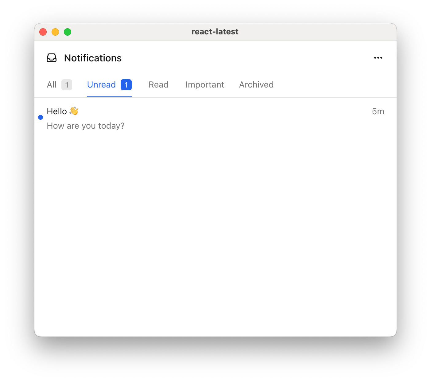
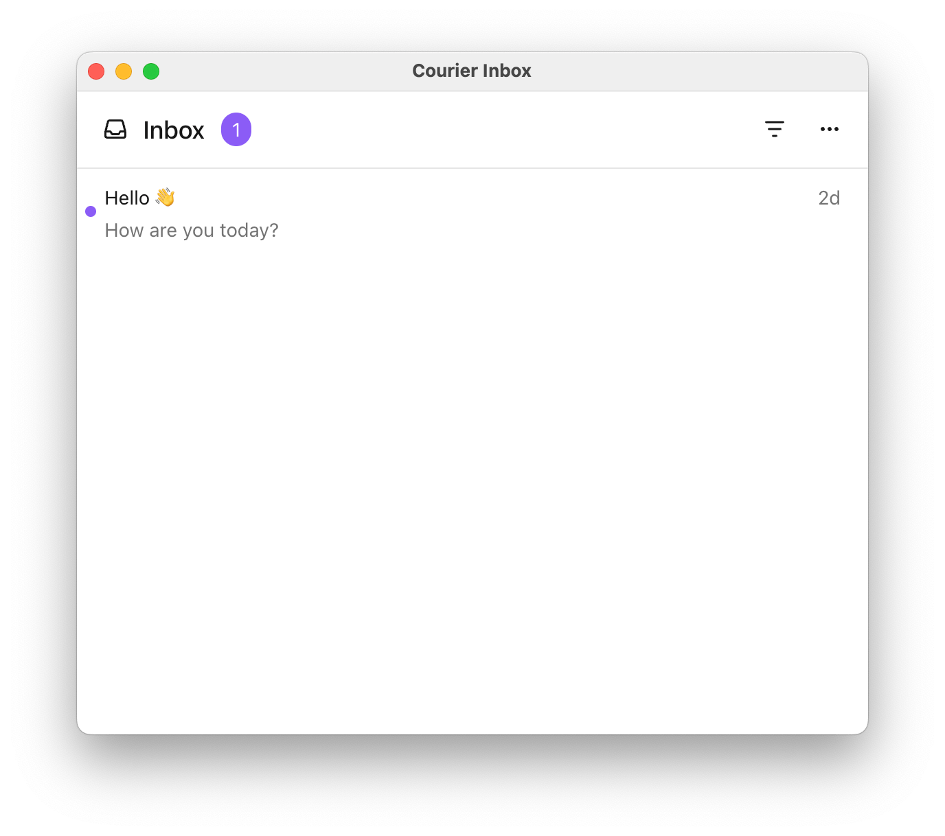
Tabs and Feeds Tabs and feeds organize and filter messages in the inbox. A feed is a container that groups related tabs together. Each tab applies filters to show relevant messages.
If there is only one feed, the feed selection dropdown is hidden. If a feed has only one tab, the tab bar is hidden and the unread count appears next to the feed.
Filter options for each tab:
Filter Property Type Description tagsstring[]Messages that have any of the specified tags archivedbooleanWhether to include archived messages (defaults to false if unset) status'read' | 'unread'Filter by read/unread status
import { useEffect } from "react" ; import { CourierInbox , useCourier , type CourierInboxFeed , } from "@trycourier/courier-react" ; export default function App () { const courier = useCourier (); useEffect (() => { const jwt = "eyJhbGciOiJIUzI1NiIsInR5cCI6IkpXVCJ9..." ; courier . shared . signIn ({ userId: $YOUR_USER_ID , jwt }); }, []); const feeds : CourierInboxFeed [] = [ { feedId: 'notifications' , title: 'Notifications' , tabs: [ { datasetId: 'all-notifications' , title: 'All' , filter: {} }, { datasetId: 'unread-notifications' , title: 'Unread' , filter: { status: 'unread' } }, { datasetId: 'important' , title: 'Important' , filter: { tags: [ 'important' ] } }, { datasetId: 'archived' , title: 'Archived' , filter: { archived: true } } ] } ]; return < CourierInbox feeds = { feeds } /> ; }
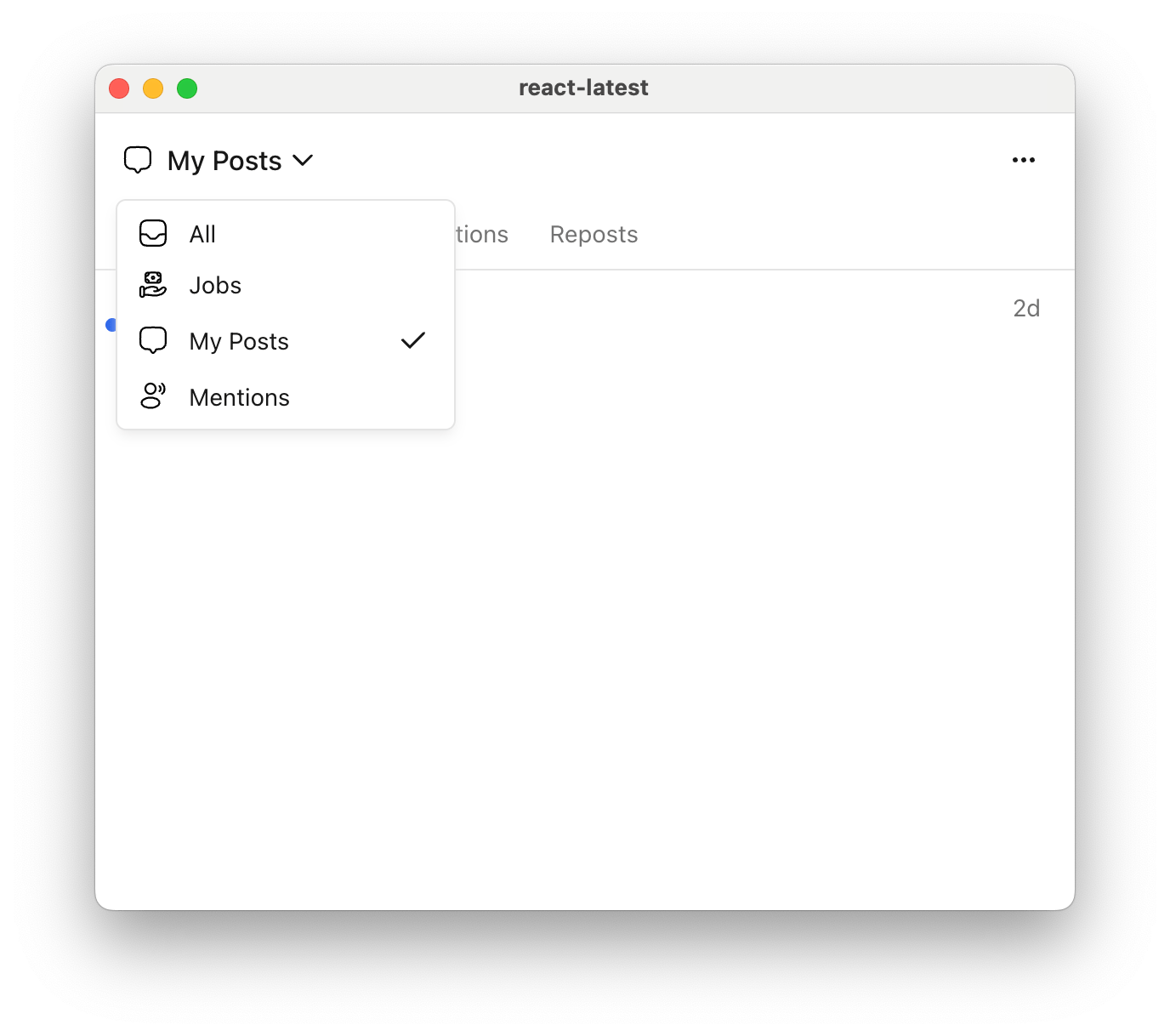
You can also define multiple feeds to organize messages into different categories. Each feed appears as a selectable option in the inbox header.
Show Multiple feeds example
const feeds : CourierInboxFeed [] = [ { feedId: 'all' , title: 'All' , tabs: [{ datasetId: 'all' , title: 'All' , filter: {} }] }, { feedId: 'jobs' , title: 'Jobs' , tabs: [{ datasetId: 'jobs' , title: 'Jobs' , filter: { tags: [ 'job' ] } }] }, { feedId: 'my-posts' , title: 'My Posts' , tabs: [ { datasetId: 'all-my-posts' , title: 'All' , filter: {} }, { datasetId: 'comments' , title: 'Comments' , filter: { tags: [ 'comment' ] } }, { datasetId: 'reactions' , title: 'Reactions' , filter: { tags: [ 'reaction' ] } }, { datasetId: 'reposts' , title: 'Reposts' , filter: { tags: [ 'repost' ] } } ] }, { feedId: 'mentions' , title: 'Mentions' , tabs: [{ datasetId: 'mentions' , title: 'Mentions' , filter: { tags: [ 'mention' ] } }] } ];
Handle Clicks and Presses Callback Prop Type Signature onMessageClick(props: CourierInboxListItemFactoryProps) => voidonMessageActionClick(props: CourierInboxListItemActionFactoryProps) => voidonMessageLongPress(props: CourierInboxListItemFactoryProps) => void
onMessageLongPress is only applicable on devices that support touch events.
import { useEffect } from "react" ; import { CourierInbox , useCourier , type CourierInboxListItemFactoryProps , type CourierInboxListItemActionFactoryProps } from "@trycourier/courier-react" ; export default function App () { const courier = useCourier (); useEffect (() => { const jwt = "eyJhbGciOiJIUzI1NiIsInR5cCI6IkpXVCJ9..." ; courier . shared . signIn ({ userId: $YOUR_USER_ID , jwt }); }, []); return ( < CourierInbox onMessageClick = { ({ message , index } : CourierInboxListItemFactoryProps ) => { alert ( `Message clicked at index ${ index } : \n ${ JSON . stringify ( message , null , 2 ) } ` ); } } onMessageActionClick = { ({ message , action , index } : CourierInboxListItemActionFactoryProps ) => { alert ( `Action clicked: ${ JSON . stringify ( action , null , 2 ) } ` ); } } onMessageLongPress = { ({ message , index } : CourierInboxListItemFactoryProps ) => { alert ( `Message long pressed at index ${ index } ` ); } } /> ); }
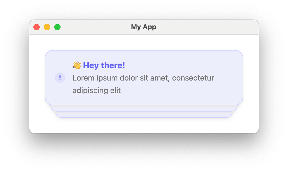
Styles and Theming Customize the inbox to match your app with a theme object. You can customize fonts, icons, text, and more.
import { CourierInbox , type CourierInboxTheme } from "@trycourier/courier-react" ; export default function App () { // Authentication code... const theme : CourierInboxTheme = { inbox: { header: { filters: { unreadIndicator: { backgroundColor: "#8B5CF6" } }, }, list: { item: { unreadIndicatorColor: "#8B5CF6" }, }, }, }; return < CourierInbox lightTheme = { theme } darkTheme = { theme } mode = "light" /> ; }
Theme utilities: defaultLightTheme / defaultDarkTheme provide the default inbox themes, and mergeTheme(baseTheme, overrideTheme) merges two themes with the override taking precedence.
import { defaultLightTheme , mergeTheme , type CourierInboxTheme } from "@trycourier/courier-react" ; const customTheme : CourierInboxTheme = { inbox: { list: { item: { unreadIndicatorColor: "#8B5CF6" } } }, }; const mergedTheme = mergeTheme ( defaultLightTheme , customTheme );
The full CourierInboxTheme type is below. Every property is optional; only override what you need. It covers the popup trigger button, the inbox window (header, feeds, tabs, actions), the message list (items, scrollbar, menus), and loading/empty/error states.
CourierInboxTheme Reference
export type CourierInboxTheme = { popup ?: { button ?: { icon ?: { color ?: string ; svg ?: string }; backgroundColor ?: string ; hoverBackgroundColor ?: string ; activeBackgroundColor ?: string ; unreadDotIndicator ?: { backgroundColor ?: string ; borderRadius ?: string ; height ?: string ; width ?: string ; }; }; window ?: { backgroundColor ?: string ; borderRadius ?: string ; border ?: string ; shadow ?: string ; animation ?: { transition ?: string ; initialTransform ?: string ; visibleTransform ?: string ; }; }; }; inbox ?: { header ?: { backgroundColor ?: string ; shadow ?: string ; border ?: string ; feeds ?: { button ?: { selectedFeedIconColor ?: string ; font ?: { family ?: string ; weight ?: string ; size ?: string ; color ?: string }; changeFeedIcon ?: { color ?: string ; svg ?: string }; unreadCountIndicator ?: { font ?: { family ?: string ; weight ?: string ; size ?: string ; color ?: string }; backgroundColor ?: string ; borderRadius ?: string ; padding ?: string ; }; hoverBackgroundColor ?: string ; activeBackgroundColor ?: string ; transition ?: string ; }; menu ?: { backgroundColor ?: string ; border ?: string ; borderRadius ?: string ; shadow ?: string ; animation ?: { transition ?: string ; initialTransform ?: string ; visibleTransform ?: string ; }; list ?: { font ?: { family ?: string ; weight ?: string ; size ?: string ; color ?: string }; selectedIcon ?: { color ?: string ; svg ?: string }; hoverBackgroundColor ?: string ; activeBackgroundColor ?: string ; divider ?: string ; }; }; tabs ?: { borderRadius ?: string | { topLeft ?: string ; topRight ?: string ; bottomLeft ?: string ; bottomRight ?: string ; }; transition ?: string ; default ?: { backgroundColor ?: string ; hoverBackgroundColor ?: string ; activeBackgroundColor ?: string ; font ?: { family ?: string ; weight ?: string ; size ?: string ; color ?: string }; indicatorColor ?: string ; indicatorHeight ?: string ; unreadIndicator ?: { font ?: { family ?: string ; weight ?: string ; size ?: string ; color ?: string }; backgroundColor ?: string ; borderRadius ?: string ; padding ?: string ; }; }; selected ?: { backgroundColor ?: string ; hoverBackgroundColor ?: string ; activeBackgroundColor ?: string ; font ?: { family ?: string ; weight ?: string ; size ?: string ; color ?: string }; indicatorColor ?: string ; indicatorHeight ?: string ; unreadIndicator ?: { font ?: { family ?: string ; weight ?: string ; size ?: string ; color ?: string }; backgroundColor ?: string ; borderRadius ?: string ; padding ?: string ; }; }; }; }; tabs ?: { borderRadius ?: string | { topLeft ?: string ; topRight ?: string ; bottomLeft ?: string ; bottomRight ?: string ; }; transition ?: string ; default ?: { backgroundColor ?: string ; hoverBackgroundColor ?: string ; activeBackgroundColor ?: string ; font ?: { family ?: string ; weight ?: string ; size ?: string ; color ?: string }; indicatorColor ?: string ; indicatorHeight ?: string ; unreadIndicator ?: { font ?: { family ?: string ; weight ?: string ; size ?: string ; color ?: string }; backgroundColor ?: string ; borderRadius ?: string ; padding ?: string ; }; }; selected ?: { backgroundColor ?: string ; hoverBackgroundColor ?: string ; activeBackgroundColor ?: string ; font ?: { family ?: string ; weight ?: string ; size ?: string ; color ?: string }; indicatorColor ?: string ; indicatorHeight ?: string ; unreadIndicator ?: { font ?: { family ?: string ; weight ?: string ; size ?: string ; color ?: string }; backgroundColor ?: string ; borderRadius ?: string ; padding ?: string ; }; }; }; actions ?: { button ?: { icon ?: { color ?: string ; svg ?: string }; backgroundColor ?: string ; hoverBackgroundColor ?: string ; activeBackgroundColor ?: string ; }; markAllRead ?: { icon ?: { color ?: string ; svg ?: string }; text ?: string }; archiveAll ?: { icon ?: { color ?: string ; svg ?: string }; text ?: string }; archiveRead ?: { icon ?: { color ?: string ; svg ?: string }; text ?: string }; animation ?: { transition ?: string ; initialTransform ?: string ; visibleTransform ?: string ; }; menu ?: { backgroundColor ?: string ; border ?: string ; borderRadius ?: string ; shadow ?: string ; animation ?: { transition ?: string ; initialTransform ?: string ; visibleTransform ?: string ; }; list ?: { font ?: { family ?: string ; weight ?: string ; size ?: string ; color ?: string }; selectedIcon ?: { color ?: string ; svg ?: string }; hoverBackgroundColor ?: string ; activeBackgroundColor ?: string ; divider ?: string ; }; }; }; }; list ?: { backgroundColor ?: string ; scrollbar ?: { trackBackgroundColor ?: string ; thumbColor ?: string ; thumbHoverColor ?: string ; width ?: string ; height ?: string ; borderRadius ?: string ; }; item ?: { unreadIndicatorColor ?: string ; backgroundColor ?: string ; hoverBackgroundColor ?: string ; activeBackgroundColor ?: string ; transition ?: string ; title ?: { family ?: string ; weight ?: string ; size ?: string ; color ?: string }; subtitle ?: { family ?: string ; weight ?: string ; size ?: string ; color ?: string }; time ?: { family ?: string ; weight ?: string ; size ?: string ; color ?: string }; archiveIcon ?: { color ?: string ; svg ?: string }; divider ?: string ; actions ?: { backgroundColor ?: string ; hoverBackgroundColor ?: string ; activeBackgroundColor ?: string ; border ?: string ; borderRadius ?: string ; shadow ?: string ; font ?: { family ?: string ; weight ?: string ; size ?: string ; color ?: string }; }; menu ?: { enabled ?: boolean ; backgroundColor ?: string ; border ?: string ; borderRadius ?: string ; shadow ?: string ; animation ?: { transition ?: string ; initialTransform ?: string ; visibleTransform ?: string ; }; longPress ?: { displayDuration ?: number ; vibrationDuration ?: number }; item ?: { hoverBackgroundColor ?: string ; activeBackgroundColor ?: string ; borderRadius ?: string ; read ?: { color ?: string ; svg ?: string }; unread ?: { color ?: string ; svg ?: string }; archive ?: { color ?: string ; svg ?: string }; unarchive ?: { color ?: string ; svg ?: string }; }; }; }; }; loading ?: { animation ?: { barColor ?: string ; barHeight ?: string ; barBorderRadius ?: string ; duration ?: string ; }; divider ?: string ; }; empty ?: { title ?: { font ?: { family ?: string ; weight ?: string ; size ?: string ; color ?: string }; text ?: string ; }; button ?: { font ?: { family ?: string ; weight ?: string ; size ?: string ; color ?: string }; text ?: string ; shadow ?: string ; border ?: string ; borderRadius ?: string ; backgroundColor ?: string ; hoverBackgroundColor ?: string ; activeBackgroundColor ?: string ; }; }; error ?: { title ?: { font ?: { family ?: string ; weight ?: string ; size ?: string ; color ?: string }; text ?: string ; }; button ?: { font ?: { family ?: string ; weight ?: string ; size ?: string ; color ?: string }; text ?: string ; shadow ?: string ; border ?: string ; borderRadius ?: string ; backgroundColor ?: string ; hoverBackgroundColor ?: string ; activeBackgroundColor ?: string ; }; }; }; };
Popup alignment and dimensions Vertical Alignment Options Top "top-right", "top-center", "top-left"Center "center-right", "center-center", "center-left"Bottom "bottom-right", "bottom-center", "bottom-left"
< CourierInboxPopupMenu popupAlignment = "top-left" popupWidth = "340px" popupHeight = "400px" top = "44px" left = "44px" />
Fixed height: <CourierInbox /> has a default height of auto. Set a fixed height with the height prop:< CourierInbox height = "50vh" />
Custom Elements You can customize individual parts of the inbox by passing render props. Each render prop receives typed props and returns a ReactNode.
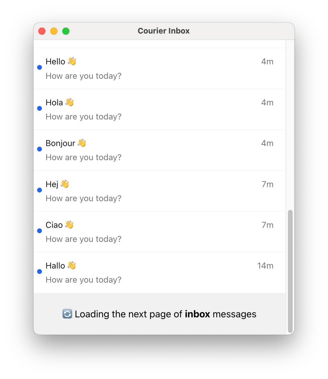
Render Prop Type Signature renderListItem(props: CourierInboxListItemFactoryProps) => ReactNoderenderHeader(props: CourierInboxHeaderFactoryProps) => ReactNoderenderMenuButton(props: CourierInboxMenuButtonFactoryProps) => ReactNoderenderLoadingState(props: CourierInboxStateLoadingFactoryProps) => ReactNoderenderEmptyState(props: CourierInboxStateEmptyFactoryProps) => ReactNoderenderErrorState(props: CourierInboxStateErrorFactoryProps) => ReactNoderenderPaginationItem(props: CourierInboxPaginationItemFactoryProps) => ReactNode
You can also use React refs (CourierInboxElement, CourierInboxPopupMenuElement) for programmatic access to component methods like removeHeader().
Subsequent pages of messages are loaded automatically when the user scrolls to the bottom of the inbox,
so the pagination component may only be visible briefly.
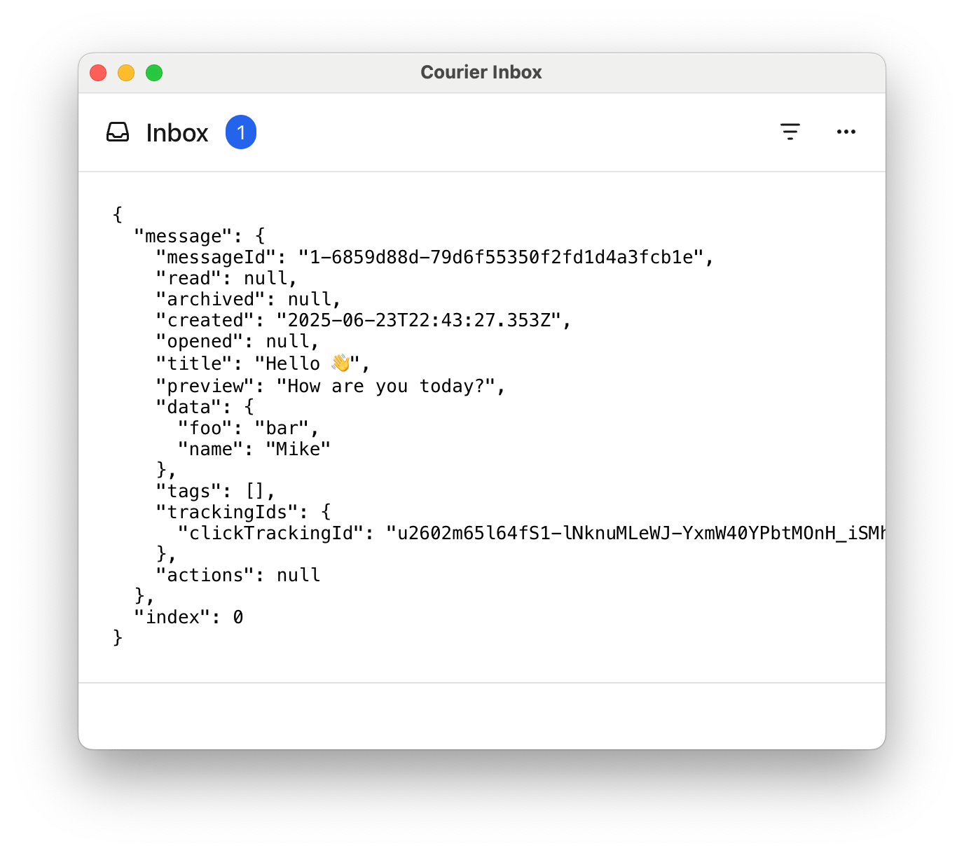
Show Custom list item example
import { CourierInbox , type CourierInboxListItemFactoryProps } from "@trycourier/courier-react" ; const CustomListItem = ({ message , index } : CourierInboxListItemFactoryProps ) => ( < pre style = { { padding: "24px" , borderBottom: "1px solid #e0e0e0" , margin: "0" } } > { JSON . stringify ({ message , index }, null , 2 ) } </ pre > ); export default function App () { // Authentication code... return ( < CourierInbox renderListItem = { ( props : CourierInboxListItemFactoryProps ) => < CustomListItem { ... props } /> } /> ); }
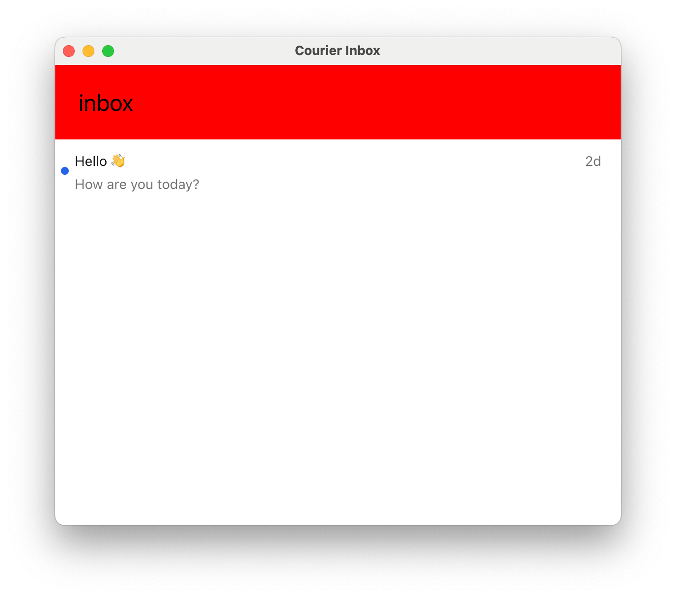
Show Custom header example
import { CourierInbox , type CourierInboxHeaderFactoryProps } from "@trycourier/courier-react" ; const CustomHeader = ( props : CourierInboxHeaderFactoryProps ) => { const selectedFeed = props . feeds . find ( feed => feed . isSelected ); const selectedTab = selectedFeed ?. tabs . find ( tab => tab . isSelected ); return ( < div style = { { background: "red" , fontSize: "24px" , padding: "24px" , width: "100%" } } > Feed: { selectedFeed ?. title ?? 'None' } | Tab: { selectedTab ?. title ?? 'None' } | Unread: { selectedTab ?. unreadCount ?? 0 } </ div > ); }; export default function App () { // Authentication code... return < CourierInbox renderHeader = { ( props ) => < CustomHeader { ... props } /> } /> ; }
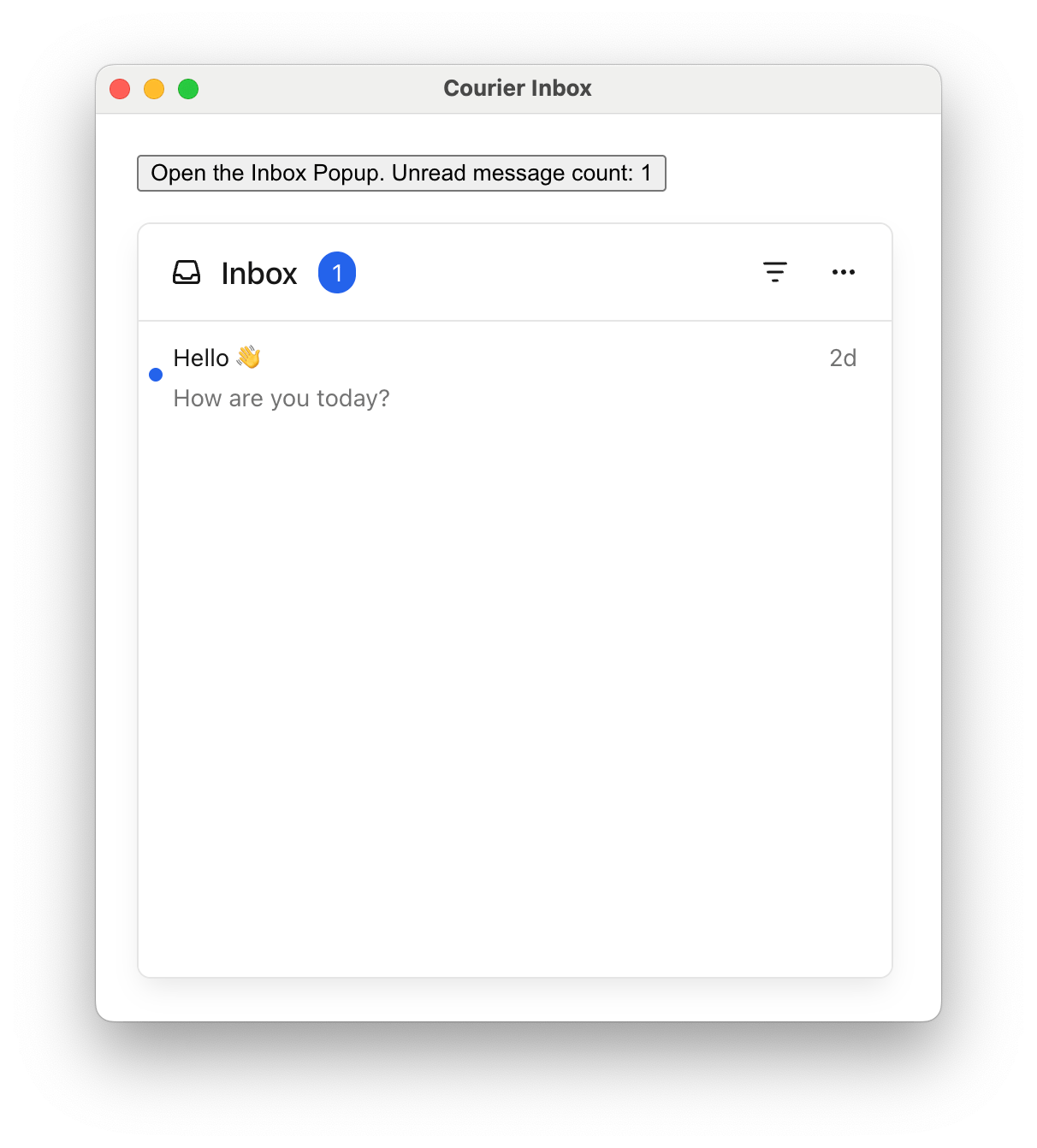
Show Custom popup menu button example
import { CourierInboxPopupMenu , type CourierInboxMenuButtonFactoryProps } from "@trycourier/courier-react" ; const CustomMenuButton = ({ unreadCount } : CourierInboxMenuButtonFactoryProps ) => ( < button > Open Inbox ( { unreadCount } unread) </ button > ); export default function App () { // Authentication code... return ( < CourierInboxPopupMenu renderMenuButton = { ( props ) => < CustomMenuButton { ... props } /> } /> ); }
Show Custom loading, empty, error, and pagination states
import { CourierInbox } from "@trycourier/courier-react" ; export default function App () { // Authentication code... return ( < CourierInbox renderLoadingState = { ({ datasetId }) => ( < div style = { { padding: "24px" , textAlign: "center" } } > Loading { datasetId } ... </ div > ) } renderEmptyState = { ({ datasetId }) => ( < div style = { { padding: "24px" , textAlign: "center" } } > No messages in { datasetId } </ div > ) } renderErrorState = { ({ datasetId , error }) => ( < div style = { { padding: "24px" , textAlign: "center" } } > Error: { error . message } </ div > ) } renderPaginationItem = { ({ datasetId }) => ( < div style = { { padding: "24px" , textAlign: "center" } } > Loading more... </ div > ) } /> ); }
Show Element ref example (removeHeader)
import { useEffect , useRef } from 'react' ; import { CourierInbox , useCourier , type CourierInboxElement } from '@trycourier/courier-react' ; export default function App () { const courier = useCourier (); const inboxRef = useRef < CourierInboxElement >( null ); useEffect (() => { courier . shared . signIn ({ userId: $YOUR_USER_ID , jwt: "..." }); }, []); useEffect (() => { if ( inboxRef . current ) { inboxRef . current . removeHeader (); } }, [ inboxRef . current ]); return < CourierInbox ref = { inboxRef } /> ; }
Toast Component <CourierToast />Toasts are short-lived notifications that notify users and prompt them to take action.
The Toast component is connected to the feed of Courier Inbox messages.
Toasts are synced with the Inbox message feed. You can use both components together to provide persistent and temporary notifications.
import { useEffect } from "react" ; import { CourierToast , useCourier } from "@trycourier/courier-react" ; export default function App () { const courier = useCourier (); useEffect (() => { const jwt = "eyJhbGciOiJIUzI1NiIsInR5cCI6IkpXVCJ9..." ; courier . shared . signIn ({ userId: $YOUR_USER_ID , jwt }); }, []); return < CourierToast /> ; }
Some initialization for toasts is asynchronous. If your app displays toasts immediately when
the component is mounted, consider using the onReady callback (see props table below) to wait
until the component is fully initialized.
Handle Clicks Callback Prop Type Signature onToastItemClick(props: CourierToastItemClickEvent) => voidonToastItemActionClick(props: CourierToastItemActionClickEvent) => void
If a message contains actions , toast items
include a button for each. Use onToastItemActionClick to handle those clicks.
< CourierToast onToastItemClick = { ({ message } : CourierToastItemClickEvent ) => { console . log ( "Toast clicked:" , message ); } } onToastItemActionClick = { ({ message , action } : CourierToastItemActionClickEvent ) => { window . open ( action . href ); } } />
type CourierToastItemClickEvent = { message : InboxMessage ; toastItem : CourierToastItem | HTMLElement ; }; type CourierToastItemActionClickEvent = { message : InboxMessage ; action : InboxAction ; };
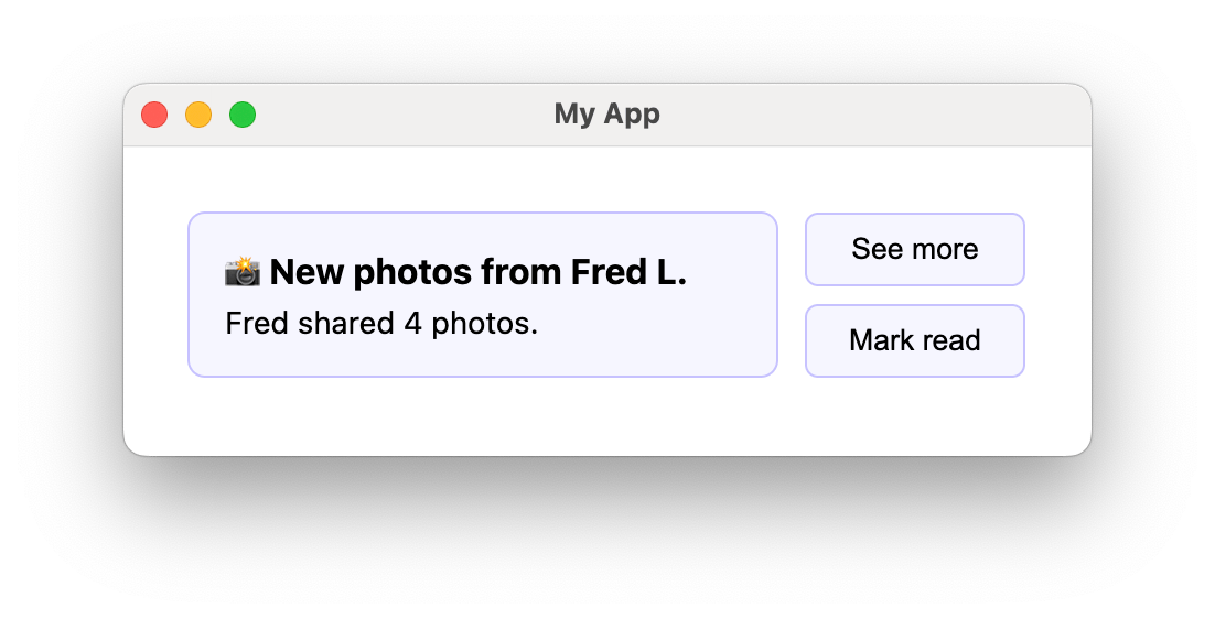
Styles and Theming import { CourierToast , type CourierToastTheme } from "@trycourier/courier-react" ; export default function App () { // Authentication code... const theme : CourierToastTheme = { toast: { item: { title: { color: "#6366f1" , weight: "bold" }, backgroundColor: "#edeefc" , border: "1px solid #cdd1ff" , borderRadius: "15px" , }, }, }; return < CourierToast lightTheme = { theme } mode = "light" /> ; }
Toast theme utilities: defaultToastLightTheme / defaultToastDarkTheme for defaults, and mergeToastTheme(baseTheme, overrideTheme) to merge.
Show type CourierToastTheme
type CourierToastTheme = { item ?: { backgroundColor ?: string ; hoverBackgroundColor ?: string ; autoDismissBarColor ?: string ; title ?: { family ?: string ; weight ?: string ; size ?: string ; color ?: string ; }; body ?: { family ?: string ; weight ?: string ; size ?: string ; color ?: string ; }; icon ?: { color ?: string ; svg ?: string ; }; dismissIcon ?: { color ?: string ; svg ?: string ; }; shadow ?: string ; border ?: string ; borderRadius ?: string ; actions ?: { backgroundColor ?: string ; hoverBackgroundColor ?: string ; activeBackgroundColor ?: string ; border ?: string ; borderRadius ?: string ; shadow ?: string ; font ?: { family ?: string ; weight ?: string ; size ?: string ; color ?: string ; }; }; }; };
Custom Elements Render Prop Type Signature renderToastItemContent(props: CourierToastItemFactoryProps) => ReactNode — customize the content area onlyrenderToastItem(props: CourierToastItemFactoryProps) => ReactNode — fully replace each toast item
Show Custom toast content example
import { CourierToast , type CourierToastItemFactoryProps } from "@trycourier/courier-react" ; const CustomToastContent = ({ message } : CourierToastItemFactoryProps ) => ( < div style = { { padding: "16px" } } > < strong style = { { display: "block" , marginBottom: "4px" } } > { message . title } </ strong > < p style = { { margin: 0 , fontSize: "14px" , color: "#6b7280" } } > { message . body } </ p > </ div > ); export default function App () { // Authentication code... return < CourierToast renderToastItemContent = { ( props ) => < CustomToastContent { ... props } /> } /> ; }
Show Fully custom toast item example
import { CourierToast , type CourierToastItemFactoryProps } from "@trycourier/courier-react" ; const CustomToastItem = ({ message , dismiss } : CourierToastItemFactoryProps ) => ( < div style = { { display: "flex" , alignItems: "center" , gap: "12px" , marginBottom: "8px" } } > < div style = { { flex: 1 , padding: "16px" , background: "#f6f6fe" , border: "1px solid #c6c2ff" , borderRadius: "8px" } } > < strong style = { { display: "block" , marginBottom: "4px" } } > { message . title } </ strong > < p style = { { margin: 0 , fontSize: "14px" } } > { message . body } </ p > </ div > < div style = { { display: "flex" , flexDirection: "column" , gap: "8px" , minWidth: "100px" } } > { message . actions ?. map (( action , index ) => ( < button key = { index } onClick = { () => window . open ( action . href ) } style = { { padding: "8px 12px" , background: "#f6f6fe" , border: "1px solid #c6c2ff" , borderRadius: "8px" } } > { action . content } </ button > )) } </ div > </ div > ); export default function App () { // Authentication code... return < CourierToast renderToastItem = { ( props ) => < CustomToastItem { ... props } /> } /> ; }
CourierToast Props Prop Name Type Default Description styleCSSProperties{ position: "fixed", width: "380px", top: "30px", right: "30px", zIndex: 999 }Styles applied to the toast component. lightThemeCourierToastThemeundefinedTheme for light mode. darkThemeCourierToastThemeundefinedTheme for dark mode. mode"light" | "dark" | "system""system"Theme mode. autoDismissbooleanfalseEnable auto-dismiss with countdown bar. autoDismissTimeoutMsnumber5000Timeout in ms before auto-dismiss. dismissButton"visible" | "hidden" | "hover" | "auto""auto"Dismiss button visibility. "auto" shows always if autoDismiss is false, on hover if true. onToastItemClickfnundefinedCallback when a toast is clicked. onToastItemActionClickfnundefinedCallback when a toast action button is clicked. renderToastItemfnundefinedCustom render for entire toast items. renderToastItemContentfnundefinedCustom render for toast item content only. onReady(ready: boolean) => voidundefinedCallback when the component is ready to receive messages.
Enabling autoDismiss adds a countdown bar to each toast and automatically removes it after the timeout. The countdown bar color is theme-able via autoDismissBarColor in CourierToastTheme.
< CourierToast autoDismiss = { true } autoDismissTimeoutMs = { 7000 } />
Using onReady: If toasts display immediately on mount or custom render functions don’t apply correctly, use onReady to wait for full initialization before authenticating:const [ toastReady , setToastReady ] = useState ( false ); useEffect (() => { if ( toastReady ) { courier . shared . signIn ({ userId: $YOUR_USER_ID , jwt }); } }, [ toastReady ]); return < CourierToast onReady = { setToastReady } renderToastItem = { ( props ) => < CustomToast { ... props } /> } /> ;
useCourier Hook The useCourier() hook provides programmatic access to Courier functionality for building custom UIs or integrating Courier features into existing components.
When to use hooks vs components:
Components (<CourierInbox />, <CourierToast />): Quick integration with default UIHooks (useCourier()): Custom UIs, programmatic control, advanced state managementBoth together : Use hooks for state management while components handle rendering
Hook return value: { shared : Courier . shared , // Direct access to Courier instance auth : { userId ?: string , signIn : ( props : CourierProps ) => void , signOut : () => void }, inbox : { // Methods load : ( props ?: { canUseCache ?: boolean , datasetIds ?: string [] }) => Promise < void > , fetchNextPageOfMessages : ( props : { datasetId : string }) => Promise < InboxDataSet | null > , setPaginationLimit : ( limit : number ) => void , registerFeeds : ( feeds : CourierInboxFeed []) => void , listenForUpdates : () => Promise < void > , readMessage : ( message : InboxMessage ) => Promise < void > , unreadMessage : ( message : InboxMessage ) => Promise < void > , clickMessage : ( message : InboxMessage ) => Promise < void > , archiveMessage : ( message : InboxMessage ) => Promise < void > , unarchiveMessage : ( message : InboxMessage ) => Promise < void > , openMessage : ( message : InboxMessage ) => Promise < void > , readAllMessages : () => Promise < void > , // Reactive state feeds : Record < string , InboxDataSet > , totalUnreadCount ?: number , error ?: Error }, toast : { addMessage : ( message : InboxMessage ) => void , removeMessage : ( message : InboxMessage ) => void , error ?: Error } }
Complete example — authentication, inbox setup, real-time updates, and displaying messages:You must call inbox.listenForUpdates() after authentication to enable real-time message updates. Without this, the inbox only shows messages from the initial load.
import { useEffect } from "react" ; import { useCourier , type InboxMessage , defaultFeeds } from "@trycourier/courier-react" ; export default function App () { const { auth , inbox } = useCourier (); useEffect (() => { auth . signIn ({ userId: $YOUR_USER_ID , jwt: "eyJhbGciOiJIUzI1NiIsInR5cCI6IkpXVCJ9..." , }); loadInbox (); }, []); async function loadInbox () { inbox . registerFeeds ( defaultFeeds ()); await inbox . listenForUpdates (); await inbox . load (); } return ( < div > < div > Total Unread: { inbox . totalUnreadCount ?? 0 } </ div > < ul > { inbox . feeds [ 'all_messages' ]?. messages . map (( message : InboxMessage ) => ( < li key = { message . messageId } style = { { backgroundColor: message . read ? 'transparent' : '#fee2e2' , padding: '8px' , marginBottom: '4px' } } > { message . title } </ li > )) } </ ul > </ div > ); }
Inbox methods: Method Description inbox.load(props?)Load messages. Optional { canUseCache, datasetIds }. inbox.fetchNextPageOfMessages({ datasetId })Fetch next page. Returns InboxDataSet | null. inbox.setPaginationLimit(limit)Set messages per page. inbox.registerFeeds(feeds)Register feeds and tabs with the datastore. inbox.listenForUpdates()Start WebSocket connection for real-time updates. Required after auth. inbox.readMessage(message)Mark as read. inbox.unreadMessage(message)Mark as unread. inbox.archiveMessage(message)Archive. inbox.unarchiveMessage(message)Unarchive. inbox.clickMessage(message)Track click event (analytics). inbox.openMessage(message)Mark as opened. inbox.readAllMessages()Mark all as read.
Toast methods: Method Description toast.addMessage(message)Add a message to the toast stack. toast.removeMessage(message)Remove a message from the toast stack.
Error handling: Check inbox.error and toast.error for error states:const { inbox } = useCourier (); if ( inbox . error ) return < div > Error: { inbox . error . message } </ div > ;
Advanced Next.js and SSR Courier Inbox and Toast support Next.js but only render client-side. In Next.js 13+, add 'use client'
"use client" import { CourierInbox } from "@trycourier/courier-react" ; export default function Page () { // Authentication code... return < CourierInbox /> ; }
Troubleshooting
Inbox not updating in real-time
Make sure you’ve called inbox.listenForUpdates() after authentication. This establishes the WebSocket connection required for real-time updates. await auth . signIn ({ userId , jwt }); inbox . registerFeeds ( defaultFeeds ()); await inbox . listenForUpdates (); // Required for real-time await inbox . load ();
Possible causes:
Not authenticated — ensure signIn() has been called
Feeds not registered — call registerFeeds() before load()
Network errors — check inbox.error for details
JWT expired — generate a new token
Invalid JWT : Ensure the JWT is generated correctly on your backendExpired JWT : JWTs have an expiration time; generate a new oneMissing scopes : Ensure your JWT includes inbox:read:messages and inbox:write:eventsWrong user ID : Verify the userId matches the user the JWT was issued for
Import types directly from the package: import { useCourier , type InboxMessage , type CourierInboxFeed } from '@trycourier/courier-react' ;
React 17 vs React 18 package mismatch
Ensure you’re using the correct package:
React 18+: @trycourier/courier-react
React 17: @trycourier/courier-react-17
Best Practices
JWT Security : Always generate JWTs server-side. Cache on the client, refresh before expiration (standard: '1d'), include only necessary scopes.Performance : Use canUseCache: true (default) for cached data. Use datasetIds to load only needed datasets. Set appropriate setPaginationLimit() values. The hook’s reactive state updates automatically; avoid triggering unnecessary re-renders.Testing : Mock useCourier() in tests to return test data:
jest . mock ( '@trycourier/courier-react' , () => ({ useCourier : () => ({ inbox: { feeds: { 'all_messages' : { messages: mockMessages } }, totalUnreadCount: 5 } }) }));
TypeScript Types type InboxMessage = { messageId : string ; title ?: string ; body ?: string ; read ?: string ; // ISO timestamp opened ?: string ; // ISO timestamp archived ?: string ; // ISO timestamp tags ?: string []; trackingIds ?: { clickTrackingId ?: string ; openTrackingId ?: string ; }; actions ?: InboxAction []; data ?: Record < string , unknown >; }
type InboxDataSet = { id : string ; messages : InboxMessage []; unreadCount : number ; canPaginate : boolean ; paginationCursor : string | null ; }
Show type CourierInboxFeed
type CourierInboxFeed = { feedId : string ; title : string ; iconSVG ?: string ; tabs : CourierInboxTab []; }
Show type CourierInboxTab
type CourierInboxTab = { datasetId : string ; title : string ; filter : CourierInboxDatasetFilter ; }
Show type CourierInboxDatasetFilter
type CourierInboxDatasetFilter = { tags ?: string []; archived ?: boolean ; status ?: 'read' | 'unread' ; }
All filter properties are AND’d together. For example, { tags: ['important'], status: 'unread' } shows messages that have the ‘important’ tag AND are unread. Show type CourierToastItemFactoryProps
type CourierToastItemFactoryProps = { message : InboxMessage ; autoDismiss : boolean ; autoDismissTimeoutMs : number ; dismiss : () => void ; }