Dark mode email design: a primer for every major email client
 Thomas SchiavoneAugust 21, 2026
You built an email that looks great. Someone opens it on an iPhone at 11pm with dark mode on, and your logo is a white smear, your footer text is invisible, and your button is now beige.
Nothing broke. Their email client rewrote your colors, and it did that because you never told it not to.
Dark mode in email is three behaviors, not one. Your client either leaves your colors alone, partially inverts them, or rewrites every one including your buttons. You can control the first, influence the second, and mostly not touch the third. Which you get depends on the client and on whether your HTML opted in.
If an agent is writing your email HTML, the rules to paste into its context are at the bottom: dark mode rules for HTML email.
Which email clients your dark mode work has to cover
Litmus's July 2026 Email Client Market Share report, calculated from over a billion opens, puts Apple at 62.26% of opens (Apple Mail on Mac, iPhone, and iPad, including Mail Privacy Protection opens), Gmail at 27.03%, and Outlook at 5.83%. Nearly 90% of opens are Apple or Gmail. The same report puts dark mode usage at over 25% of the user base.
Outlook's 5.83% earns more QA time than it looks like it should. It skews toward business inboxes, so a B2B list runs several times higher, and classic Outlook on Windows is the one client with no dark mode controls at all.
That sets the order of work: Apple Mail on an iPhone, the Gmail app on an iPhone, then Outlook. Apple Mail does exactly what your CSS says once you opt in. Gmail ignores your CSS and applies its own transformation. Outlook is two products with two different answers. Apple Mail is the only one where dark mode is a design decision you make. Everywhere else it is a resilience problem.
The three ways email clients change your colors
| Behavior | What happens | Where you see it |
|---|---|---|
| No color change | Your colors render as authored. A light email stays light, sitting inside a dark app | Apple Mail (without dark styles), Gmail on desktop web, Yahoo Mail, AOL |
| Partial inversion | Light backgrounds go dark and dark text goes light. Already-dark elements like buttons keep their color | Outlook.com, new Outlook, Outlook mobile, Gmail app on Android |
| Full inversion | Every color gets rewritten, including dark backgrounds and CTA fills | Classic Outlook on Windows, Windows Mail, Gmail app on iOS |
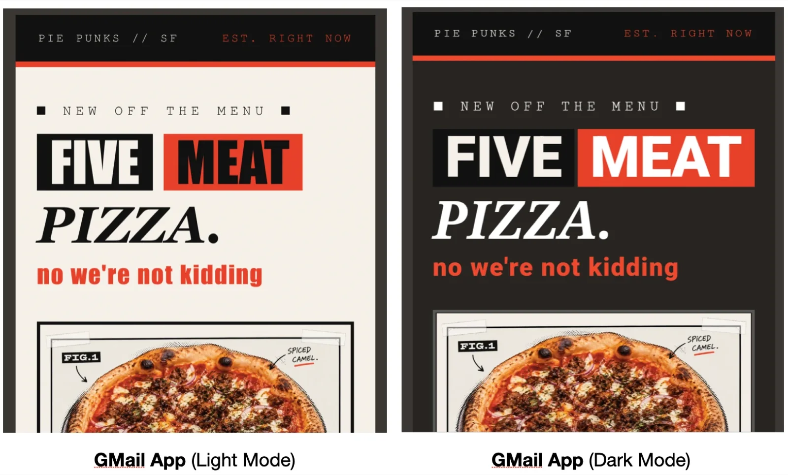
Left: Gmail in light mode on iOS, which is the email as authored. Right: Gmail in dark mode on Android, which applies a partial inversion.
Four separate things happened to that email.
The parts that worked. The page background flipped from #f6f0e9 to #282421, and the live text flipped with it. The square glyphs, the "new off the menu" label, and "PIZZA." all went from near-black to cream. The brand red survived untouched in both the rule and the subhead.
The part that vanished. The black header bar never moved. It is #111111 in both, because Gmail's partial inversion leaves already-dark elements alone. In light mode that bar is a hard edge against cream. In dark mode it is near-black on near-black, so the strongest shape in the layout quietly disappears.
The part that stopped matching. The pizza photo kept its own paper background, because inversion does not touch image pixels. A photo that blended into the page is now a bright slab floating in a dark email, and the "FIG.1" and "SPICED CAMEL." labels baked into it stay black on cream while every live word around them turned cream on dark.
The part that got worse. "MEAT" was #111111 on the brand red, which measures 4.65:1. Gmail flipped it to white on the same red, which measures 4.07:1. The headline did not become more readable in dark mode. It became less.
Which of the three a client does shifts between app releases, so the only way to know what your email does is to open it on real devices. That is what Courier's device preview is for, currently in private beta: pick your targets, run one preview, and get the same template back from each client in both appearances.
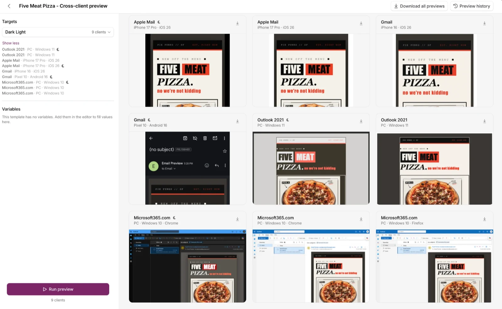
One run across nine targets. Apple Mail on an iPhone 17 Pro, Gmail on an iPhone 16 and a Pixel 10, Outlook 2021 on Windows 11, and Microsoft365.com, each in light and dark.
That grid is the rest of this article in one screen. One HTML file comes back light from some clients and dark from others, and every difference between those tiles has a cause the sections below name.
What Apple Mail does in dark mode
Apple Mail renders email in WebKit, and WebKit has a documented position on this. From Apple's WebKit dark mode announcement: Safari and WebKit do not auto-darken web content, and documents have to opt in. Apple Mail inherits that. It is not sitting there trying to invert your palette.
What it is doing is drawing your email inside a dark app. If you never set a background color, there is nothing to draw, so Mail's own dark background shows through. Your inline color: #333333 text is still dark gray, and it is now dark gray on near-black. That is the single most common Apple Mail dark mode failure, and it has nothing to do with inversion. It is an unset background.
The opt-in almost nobody ships
Apple Mail requires an explicit opt-in before your prefers-color-scheme styles do anything at all. Rémi Parmentier, who maintains Can I Email, documented this in email-bugs #104: every version of Apple Mail on macOS and iOS needs either the supported-color-schemes meta tag or the color-scheme CSS property before dark mode styling applies. That is the opposite of how the web works, where the declaration is optional and only affects default UA styling.
The notation moved over time. Apple Mail 12 (macOS Mojave) wanted the meta tag. Apple Mail 13 (Catalina) and later want the CSS property:
:root {color-scheme: light dark;}
Ship both notations. They cost nothing and they cover old and new clients:
<meta name="color-scheme" content="light dark"><meta name="supported-color-schemes" content="light dark">
Without that opt-in, you can write a perfect dark palette inside @media (prefers-color-scheme: dark) and Apple Mail will render none of it. It is dead code.
The pure white bug
Once you are inside the media query, avoid #ffffff. email-bugs #65 documents Apple Mail ignoring background-color: #ffffff inside a prefers-color-scheme block while accepting #fffffe. This is where the standard "avoid pure white and pure black" advice comes from, and it is not superstition. Use #fffffe and #0e0e0e instead of #ffffff and #000000 and the whole class of problem goes away.
What Apple Mail on iOS supports
Per Can I Email, Apple Mail on iOS supports @media (prefers-color-scheme) from iOS 13, and the color-scheme CSS property from iOS 16.1 (on the root element only). The <meta name="color-scheme"> tag is recorded as unsupported on iOS, though the last test on record is iOS 12.4, so treat that as untested rather than settled. The CSS property is the reliable switch either way.
Newer builds give you something better. light-dark() works in Apple Mail from iOS 17.5.1 and macOS with Safari 17.5 or later, and in Thunderbird 128. It lets you declare both values in one line:
.body-text {color: light-dark(#1a1a1a, #e8eaed);}
It works nowhere else, so use it as progressive enhancement on top of a media query, not instead of one.
What Gmail does, and why you can't style it
Gmail supports none of the dark mode toolkit. Can I Email records Gmail as not supporting prefers-color-scheme on desktop web, iOS, Android, or mobile web. Same for the color-scheme CSS property, the color-scheme meta tag, and light-dark(). CSS custom properties are half-supported in a way that makes them useless here: Gmail accepts the var() function but strips the declaration. CSS filter is unsupported, so inversion tricks are out too.
Gmail is not reading your intent. It applies its own color transformation, and the aggressiveness depends on which app you are in. Gmail on desktop web leaves email bodies alone. The Android app does a partial inversion, which is what the screenshot above shows: the page went dark, the live text flipped, and the already-black header stayed put. Litmus classifies the iOS app as the harshest of the three, a full inversion that rewrites dark backgrounds and CTA fills too.
Two Gmail behaviors surprise people:
A dark email can get lightened. When Gmail rolled out dark mode, developers logged emails that were already dark being converted toward a light theme, including a Netflix email in email-bugs #68. Designing dark to play it safe can backfire in the exact client you were worried about.
Images are not always safe. The same thread shows Gmail running a color filter over PNG artwork, turning the white bands in Duolingo's flag icons grey and blue. "Put it in an image" is not a reliable escape hatch.
The blend mode hack
One technique does force colors back. Rémi Parmentier's Gmail dark mode fix with CSS blend modes nests a mix-blend-mode: screen wrapper and a mix-blend-mode: difference wrapper over a one-color linear-gradient() background. Gmail leaves gradients alone, and the blend math pushes darkened text back toward white.
Three conditions. It keeps white text white and no other color survives the math. It needs a Google account, because the Gmail app with a non-Google account strips <style> elements. And it repairs one failure rather than giving you a theme. For most senders the better Gmail strategy is resilience: a palette that reads correctly whether or not it gets rewritten.
What Outlook does, and why classic Windows is the hard one
Outlook is not one client. Classic Outlook for Windows and everything else Microsoft ships need separate handling.
Classic Outlook on Windows
Classic Outlook renders HTML with the Microsoft Word engine, and Can I Email records no @media (prefers-color-scheme) support in any version from 2003 through 2019. There is no dark mode API to write against. Set the Office theme to Black and Outlook recolors the message itself, on its own terms.
Microsoft's position is that there is no supported way to stop it. A Microsoft Q&A answer on preventing Outlook from overriding colors lists what does not work: !important on inline styles, <meta name="color-scheme" content="light only">, mso conditional comments, and prefers-color-scheme blocks. The recolor happens after your CSS, so specificity is not the lever.
One partial workaround exists: Outlook does not recolor images. A background image, even a 1x1 pixel tile set to repeat, can carry a color through the transformation. Reliability varies by build, so use it to protect one critical element like a logo lockup, not as a layout strategy.
The escape hatch belongs to the reader, not to you. Microsoft's dark mode documentation describes a per-message toggle, where a sun button switches the message background to white and a moon button switches it back. Classic Outlook also has a "Never change the message background color" setting that keeps every message light while the app stays dark. A real share of dark-theme Outlook readers never see a recolored version of your email, so put the effort into the light design rather than fighting a dark one you cannot reach.
Outlook.com, new Outlook, and Outlook mobile
These support the media query. Can I Email records prefers-color-scheme working in Outlook.com from July 2019, Outlook for macOS from 2019, Outlook for iOS from 2020, and Outlook for Android from March 2023. They apply a partial inversion: light backgrounds and dark text change where contrast requires it, and already-dark elements keep their color.
They also hand you a second hook. When Outlook.com changes a color, it stores the original value in a data attribute: data-ogsc for a style color, data-ogac for a color attribute, data-ogsb for a style background, and data-ogab for a bgcolor attribute. Parmentier's write-up on emails reacting to Outlook.com dark mode documents the pattern, including the trigger: Outlook.com modifies elements that fall below a 4.5:1 contrast ratio against its dark background.
Two gotchas. Attribute selector support is thin, so repeat the attribute on every selector in a group:
/* Works */[data-ogsc] .body-text, [data-ogsc] .footer-text { color: #e8eaed !important; }/* Silently fails */[data-ogsc] .body-text, .footer-text { color: #e8eaed !important; }
And because even that is unreliable, the sturdier pattern is to put a white background on a wrapper, let Outlook change the wrapper, then style its descendants:
[data-ogsb] .card { background-color: #16181d !important; }
Name that class for the inner element, not the wrapper. If you put it on the wrapper, Outlook stamps the attribute on that same element and the selector can never match itself.
Which Outlook your readers are actually in
Do not plan around classic Outlook going away. Microsoft's migration guide, updated February 2026, has new Outlook for Windows still in the opt-in stage and off by default, and classic installations supported until at least 2029. Your hardest dark mode client is not on a deprecation clock that helps you.
New Outlook is a Chromium WebView2 app on the Outlook.com rendering path, which is why it behaves like Outlook.com rather than like classic. Can I Email has no separate row for it, so treat that as a shared-codebase inference and confirm on a real install if new Outlook is a big share of your list.
The clients that break your media query
Several webmail clients do not ignore prefers-color-scheme so much as actively break it. Can I Email records Yahoo Mail and AOL rewriting the query into a nonsense @media (_filtered_a), HEY rewriting it to @media (false), and Fastmail rewriting it to @media all at run time when it applies, which fires your dark styles in light mode. Proton Mail supports the color-scheme property on desktop web but not the media query.
None of them invert your colors either, so a light email renders as a light email inside a dark app.
Dark mode support by email client
Samsung Email (6.1 and later) and Thunderbird (128 and later) both support the media query, and belong in your test set if either shows up in your open data. Everything covered above, in one place:
| Client | Respects your dark CSS | What it does on its own | How to target it |
|---|---|---|---|
| Apple Mail, iOS 13+ | Yes, after you opt in | Dark chrome shows through unset backgrounds | color-scheme plus prefers-color-scheme |
| Apple Mail, macOS 10.14+ | Yes, after you opt in | Same | color-scheme plus prefers-color-scheme |
| Gmail app, iOS | No | Most aggressive of the three Gmail surfaces | Blend mode hack, Google accounts only |
| Gmail app, Android | No | Partial inversion, though Litmus and Email on Acid classify it differently | Blend mode hack, Google accounts only |
| Gmail, desktop web | No | Leaves email bodies alone | Nothing |
| Classic Outlook, Windows | No | Recolors the message, no sender opt-out | Nothing, beyond background images |
| Outlook.com and new Outlook | Yes | Partial inversion below 4.5:1 contrast | prefers-color-scheme plus [data-ogsc] family |
| Outlook, iOS | Yes (2020+) | Partial inversion | prefers-color-scheme plus [data-ogsc] family |
| Outlook, Android | Yes (2023-03+) | Partial inversion | prefers-color-scheme plus [data-ogsc] family |
| Outlook, macOS | Yes (2019+) | Partial inversion | prefers-color-scheme plus [data-ogsc] family |
| Yahoo Mail, AOL | No, query is rewritten | No inversion | Nothing |
| Fastmail | Query becomes @media all when it applies | No inversion | Nothing reliable |
| HEY | No, query becomes @media (false) | No inversion | Nothing |
| Proton Mail, desktop web | color-scheme only, no media query | No inversion | Nothing reliable |
| Samsung Email | Yes (6.1+) | Not documented, test it | prefers-color-scheme |
| Thunderbird | Yes (128+) | No inversion | prefers-color-scheme, light-dark() |
Support data from Can I Email, read August 2026.
Eight design rules that survive color inversion
The goal is not a dark version of your email. It is an email that reads correctly in three states: your light design, your dark design, and a machine-generated dark one you did not author.
1. Set an explicit background color on every container. Body, wrapper table, every td holding content. The highest-value change on this list: unset backgrounds are what make text vanish in Apple Mail.
2. Never ship #ffffff or #000000. Use #fffffe for white and #0e0e0e to #16181d for your dark surface. That dodges the Apple Mail media query bug and gives inversion algorithms less reason to treat your color as a default worth rewriting.
3. Pick brand colors that pass contrast in both directions. A mid-tone blue that clears 4.5:1 on white often falls under 3:1 on near-black. Make the dark-mode variant a lighter, less saturated version of the same hue instead of reusing the light-mode value.
4. Stop shipping transparent PNG logos with dark ink. Clients do not reliably recolor image pixels, so dark type on transparency disappears. In order of reliability: an opaque plate that reads on both backgrounds, a light stroke, or two files swapped in the media query.
5. Do not bake text into images. Inversion touches HTML colors, not the words inside your hero JPEG, so baked-in text keeps its original background and floats as a bright rectangle in a dark email.
6. Give buttons a fill dark enough to survive. Partial inversion leaves already-dark backgrounds alone, so a mid-to-dark fill often survives where a pale one gets rewritten. Set the link color inline, then again in your dark block with !important.
7. Replace hairline dividers and drop the shadows. A #eeeeee border is invisible on a dark surface, so use a mid-tone around #4a4a4a to #5f6368. Box shadows read as muddy blocks on dark; use a one-pixel border where you need separation.
8. Do not put pure white text on pure black. That pairing causes halation, where text appears to bloom and vibrate. Off-white such as #e8eaed on a near-black surface reads more easily and still clears the 4.5:1 minimum in WCAG 2.2 contrast (minimum).
A dark mode email boilerplate
This covers the clients you can actually reach: the Apple Mail opt-in, the media query, the Outlook.com attribute hooks, and an image swap that does not rely on <picture>.
<html><head><meta charset="utf-8"><meta name="viewport" content="width=device-width, initial-scale=1"><meta name="color-scheme" content="light dark"><meta name="supported-color-schemes" content="light dark"><meta name="x-apple-disable-message-reformatting"><style>:root { color-scheme: light dark; }/* Apple Mail, iOS Mail, Outlook.com, new Outlook, Outlook mobile,Samsung Email, Thunderbird */@media (prefers-color-scheme: dark) {.body-bg { background-color: #16181d !important; }.card-bg { background-color: #21242b !important; }.text-primary { color: #e8eaed !important; }.text-muted { color: #9aa0a6 !important; }.divider { border-color: #4a4a4a !important; }.btn { background-color: #6b5cff !important; }.btn a { color: #fffffe !important; }/* Logo swap, no <picture> needed */.logo-light { display: none !important; }.logo-dark { display: block !important; width: 160px !important;max-height: inherit !important; overflow: visible !important; }}/* Outlook.com and new Outlook. Outlook stamps the attribute on the element itchanged, so hook an ancestor and style its descendants. The outer .body-bg isthe stamped element itself, so leave it to Outlook and control what is inside. */[data-ogsb] .card-bg { background-color: #21242b !important; }[data-ogsb] .text-primary { color: #e8eaed !important; }[data-ogsb] .text-muted { color: #9aa0a6 !important; }[data-ogsb] .btn { background-color: #6b5cff !important; }</style></head><body class="body-bg" bgcolor="#fffffe" style="background-color:#fffffe;margin:0;"><table role="presentation" width="100%" cellpadding="0" cellspacing="0" border="0"class="body-bg" bgcolor="#fffffe" style="background-color:#fffffe;"><tr><td align="center" class="card-bg" bgcolor="#fffffe" style="background-color:#fffffe;padding:32px;"><!-- Default logo sits on an opaque plate so it survives Gmail and classicOutlook, which never reach the media query below. Never a baretransparent PNG with dark ink. --><img src="logo-plated.png" width="160" alt="Acme" class="logo-light"style="display:block;border:0;"><div class="logo-dark" style="display:none;width:0;max-height:0;overflow:hidden;"aria-hidden="true"><img src="logo-light-ink.png" width="160" alt="" style="display:block;border:0;"></div><p class="text-primary" style="color:#1a1a1a;font-size:16px;line-height:24px;">Your order shipped.</p><table role="presentation" cellpadding="0" cellspacing="0" border="0"><tr><td class="btn" bgcolor="#4f46e5" style="background-color:#4f46e5;border-radius:6px;"><a href="https://example.com/track"style="display:block;padding:12px 24px;color:#fffffe;font-size:16px;text-decoration:none;">Track your order</a></td></tr></table><table role="presentation" width="100%" cellpadding="0" cellspacing="0" border="0"style="margin:24px 0;"><tr><td class="divider" height="1"style="border-top:1px solid #e4e4e7;font-size:0;line-height:0;"> </td></tr></table><p class="text-muted" style="color:#6b7280;font-size:13px;line-height:20px;">You are receiving this because you placed an order.</p></td></tr></table></body></html>
Four things worth noticing. Every element carries both a bgcolor attribute and an inline background-color, because some clients read one and not the other. Every dark rule carries !important, because it has to beat an inline style.
The dark logo is wrapped in a collapsed div rather than a <picture> element, since Gmail replaces <picture> and <source> with <u></u> tags and Apple Mail on macOS now strips <picture> in some cases. The default logo is the plated one on purpose: Gmail and classic Outlook never reach that media query, so whatever you ship as the default is what a quarter of your list sees on a darkened background.
And the [data-ogsb] rules are descendant selectors on purpose. Outlook stamps the attribute onto the element whose color it changed, not onto a parent, so [data-ogsc] .text-primary would try to match a .text-primary inside another changed element and almost never fire. Hook the outer wrapper that Outlook darkened, then restyle everything beneath it. The wrapper itself needs no rule, because Outlook already turned it dark.
Both palettes clear WCAG AA. Body text is 17.4:1 light and 12.9:1 dark, the footer is 4.8:1 and 5.9:1, and the button label is 6.3:1 and 4.6:1. The button is the tight one, so if you swap #6b5cff for a lighter accent, re-check it.
Nothing here helps in the Gmail apps or classic Outlook on Windows. Those are handled by the eight design rules, not by CSS.
Hand this to the agent building your email
If an agent is writing or editing your HTML, most dark mode failures are avoidable by giving it the rules up front. Copy this into its context.
# Dark mode rules for HTML email## Opt in- Add `:root { color-scheme: light dark; }` to a `<style>` block in the head.- Include `<meta name="viewport" content="width=device-width, initial-scale=1">`.- Also add `<meta name="color-scheme" content="light dark">` and`<meta name="supported-color-schemes" content="light dark">`.- Without the CSS opt-in, Apple Mail ignores every dark mode rule in the file.## Colors- Never use `#ffffff` or `#000000`. Use `#fffffe` for white, `#16181d` for the dark surface.- Dark mode body text `#e8eaed`, muted text `#9aa0a6`. Never white on black.- Every text and background pair must clear 4.5:1 in both palettes.- Do not use CSS custom properties for color. Gmail strips the declaration.## Containers- Set a background color on `<body>`, the wrapper table, and every content `<td>`.- Set it twice: as a `bgcolor` attribute and as an inline `background-color`.- Never leave a background unset. Apple Mail's dark chrome shows through and hides dark text.## Dark styles- Put overrides in `@media (prefers-color-scheme: dark)`.- End every override with `!important`. It has to beat an inline style.- For Outlook.com, repeat the overrides prefixed with `[data-ogsb]`, as descendantselectors: `[data-ogsb] .card`, `[data-ogsb] .text-primary`. Outlook stamps theattribute on the element it changed, so hook the outer wrapper it darkened andrestyle what is inside. The wrapper itself needs no rule.- Repeat the attribute on every selector in a group: `[data-ogsb] .a, [data-ogsb] .b`.A bare `.b` in the group silently kills the whole rule.## Images- No transparent PNG logos with dark ink. Use an opaque plate or a light stroke.The default, always-visible logo must be the safe one: Gmail and classic Outlooknever reach the media query, so they render whatever the default is.- Never put text inside an image. Color inversion does not touch image pixels.- To swap a logo, ship the light-mode `<img>` visible and wrap the dark-mode one in acollapsed `div` (`display:none;width:0;max-height:0;overflow:hidden`), then flip bothinside the media query. Do not use `<picture>`. Gmail replaces it with `<u></u>`.- Give the hidden variant `alt=""` and `aria-hidden="true"` so it is not announced twice.## Borders and shadows- Replace hairline borders like `#eeeeee` with a mid-tone around `#4a4a4a`.- Drop box shadows. Use a one-pixel border where you need separation.- Put dividers in a single-cell table, not a bare `div`. Classic Outlook drops div borders.## Where none of this applies- Gmail supports none of it and rewrites colors on its own. Both outcomes must be readable.- Classic Outlook on Windows supports none of it and has no workaround.- Use `light-dark()` only on top of a media query. It works in recent Apple Mailand Thunderbird and nowhere else.## Before you finish- No `#ffffff` or `#000000` anywhere in the file.- Every dark mode rule ends in `!important`.- Every container carries both a `bgcolor` attribute and an inline background.
Courier's MCP server and Courier Skills give an agent the same template and brand objects the dashboard writes, so these rules apply whether the agent is editing raw HTML or a Courier template.
A pre-send dark mode checklist
-
:root { color-scheme: light dark; }plus both meta tags are present - Every container has an explicit background, as both attribute and inline style
- No
#ffffffor#000000anywhere in the file - Every dark mode rule ends in
!important - Logo reads on a light and a dark background, with no transparent dark ink
- No text baked into images, and every image has real alt text
- Body text and link text clear 4.5:1 in both palettes
- Button fill and button label are both set explicitly in both palettes
- Dividers and borders are visible in both palettes
- Opened on a real iPhone in Apple Mail with system dark mode on
- Opened on a real iPhone in the Gmail app with system dark mode on
- Opened in Outlook.com with dark mode toggled
- Opened in classic Outlook on Windows with the Office theme set to Black, if you have B2B readers
Static previews are a first pass, and they lag real client builds. Dark mode is where that gap hurts most, because the behavior you are testing belongs to the client rather than to your HTML, so a snapshot from an older app version can pass an email that fails on a phone.
Setting dark mode styles in Courier
If you send through Courier, the dark mode work lives in two places.
Brands hold your shared email shell, and you can add custom CSS in a <style> element in the brand's <head>, which works for both the visual designer and custom MJML or Handlebars templates. Courier exposes stable class names on every email element, so you have selectors to target: .c--email-header, .c--email-body, .c--email-footer, .c--block-text, .c--block-action, .c--text-h1, and more. Two rules from the CSS classes doc matter here. Every rule needs !important, because Courier renders through MJML and MJML compiles to inline styles. And because MJML nests each block inside wrapper tables, your target is usually a child of the class rather than the element carrying it, so reach for the universal selector:
:root { color-scheme: light dark; }@media (prefers-color-scheme: dark) {.c--email-body * { background-color: #16181d !important; }.c--block-text * { color: #e8eaed !important; }.c--text-h1 * { color: #fffffe !important; }.c--email-footer * { color: #9aa0a6 !important; }/* Re-assert every block that owns a fill, or the blanket rule above flattens it.A class plus an element selector outranks `.c--email-body *`, so these win. */.c--block-action td, .c--block-action a { background-color: #6b5cff !important; }.c--block-action a { color: #fffffe !important; }.c--block-quote td { background-color: #21242b !important; }}
The re-assertion block is the part to get right. .c--email-body * is the only way to reach MJML's nested cells, but it hits every one of them, including the cell holding your button. Without those last three rules the CTA flattens into the page and the quote block loses its tint. List one override per block type that carries its own background.
Write that once in the brand and every template using that brand picks it up, which is the point of doing it at the brand level instead of per template. Verify it in the preview tab before you publish, since the exact nesting depends on which blocks a template uses.
For anything the block editor cannot express, template blocks let you drop raw HTML, CSS, and Handlebars into a template, which is where the blend mode wrapper or a hand-built dark component would go.
Then run it through the device preview shown near the top of this post. Brand CSS is the part you control. The preview is how you find out what each client did with it.
Dark mode is also part of the same QA pass as your typography. If your body copy falls back to a different stack in one client and then gets recolored in another, you will find both problems in the same test. Fonts in email covers that half.
Wrapping up
Dark mode in email comes down to five decisions:
- Opt in with
color-schemeso Apple Mail reads your dark styles at all, which covers the majority of opens. - Set explicit backgrounds everywhere, so nothing inherits an app's dark chrome by accident.
- Design a palette that survives an inversion you did not write, because Gmail and classic Outlook will not read your CSS.
- Add the
[data-ogsc]family next to your media query so Outlook.com and new Outlook follow the same palette. - Confirm on a real iPhone in Apple Mail and the Gmail app, and in Outlook with the Office theme set to Black.
Get those five right and dark mode stops being a rendering surprise.
Frequently asked questions
Does Gmail support dark mode CSS in email?
No. Can I Email records Gmail as not supporting @media (prefers-color-scheme), the color-scheme CSS property, the color-scheme meta tag, or light-dark() on desktop web, iOS, Android, or mobile web. Gmail applies its own color transformation instead, and it varies by app: desktop web leaves email bodies alone, the Android app does a partial inversion, and the iOS app is the most aggressive. You cannot theme Gmail, so design a palette that survives being rewritten.
Why is my text invisible in Apple Mail dark mode?
Almost always an unset background color. Apple Mail draws your email inside a dark app, so any container without an explicit background lets that dark chrome show through while your inline dark text stays dark. Set a background color on the body, the wrapper table, and every content cell, as both a bgcolor attribute and an inline background-color.
Do I need the color-scheme meta tag for dark mode email?
Yes, and you need the CSS property too. Apple Mail requires an explicit opt-in before any prefers-color-scheme styles apply, which is the opposite of how browsers work. Apple Mail 12 wanted the supported-color-schemes meta tag, and Apple Mail 13 and later want :root { color-scheme: light dark; }. Ship both. Without the opt-in your dark palette never renders in Apple Mail.
Why should I avoid #ffffff and #000000 in email?
Apple Mail ignores background-color: #ffffff inside a prefers-color-scheme block, documented in email-bugs #65, while #fffffe works. Pure values also make inversion algorithms more likely to treat your color as a default worth rewriting. Use #fffffe and something in the #0e0e0e to #16181d range instead.
Does the Gmail app on iOS handle dark mode differently from Android?
Yes. Litmus classifies the Gmail app on iOS as a full color inversion, which rewrites even dark backgrounds and CTA fills, and the Android app as a partial inversion that leaves already-dark elements alone. Email on Acid has classified Android as a full inversion, so the charts disagree and behavior changes between app releases. Test the same email on both.
How do I keep my logo visible in dark mode?
Do not ship a transparent PNG with dark ink, because clients do not reliably recolor image pixels. Put the mark on a small opaque plate that reads on both backgrounds, add a light stroke or padded halo, or serve two files and toggle them inside your media query with display: none !important. Use a collapsed wrapper div rather than <picture>, since Gmail replaces <picture> with <u></u> and Apple Mail on macOS strips it in some cases.
Should I design a fully dark email instead?
No. A dark-designed email is not safe in the client you are most worried about. When Gmail launched dark mode, developers logged already-dark emails being converted toward a light theme, including a Netflix email in email-bugs #68. A light design with an authored dark variant and inversion-resistant colors covers more cases than going dark by default.
What does data-ogsc do?
When Outlook.com or new Outlook changes a color for contrast in dark mode, it stores the original value in a data attribute: data-ogsc for a style color, data-ogac for a color attribute, data-ogsb for a style background, and data-ogab for a bgcolor attribute. You can style against those attributes to react to Outlook's own dark mode toggle. Repeat the attribute on every selector in a group, because Outlook's attribute selector support does not handle grouped selectors.
How do I stop Outlook from inverting colors in dark mode?
In classic Outlook for Windows, you cannot. Microsoft's own guidance is that no supported method exists, and the things people try do not work: !important on inline styles, <meta name="color-scheme" content="light only">, mso conditional comments, and prefers-color-scheme blocks. The recolor runs after your CSS. The one partial workaround is that Outlook does not recolor images, so a background image can hold a color, with reliability that varies by build. Readers can undo it themselves with the per-message sun button or the "Never change the message background color" setting. In Outlook.com, new Outlook, and Outlook mobile you do have control, through prefers-color-scheme and the [data-ogsc] attribute family.
Does Outlook support prefers-color-scheme?
It depends which Outlook. Can I Email records support in Outlook.com from July 2019, Outlook for macOS from 2019, Outlook for iOS from 2020, and Outlook for Android from March 2023. Classic Outlook for Windows supports it in no version from 2003 through 2019, because it renders with the Microsoft Word engine. New Outlook for Windows is a Chromium WebView2 app sharing the Outlook.com rendering path, so it behaves like Outlook.com.
How much email is opened in dark mode?
Litmus's July 2026 Email Client Market Share report puts dark mode usage at over 25% of the user base, calculated from over a billion opens. That share is high enough that dark mode belongs in every pre-send check, and because Apple accounts for 62.26% of opens in the same report, most of that testing time belongs on an iPhone.
Can I use light-dark() in email?
Only as progressive enhancement. light-dark() works in Apple Mail from iOS 17.5.1 and macOS with Safari 17.5 or later, and in Thunderbird 128, and nowhere else. Write your @media (prefers-color-scheme: dark) block first, then layer light-dark() on top if you want the shorter syntax for those clients.
Similar resources
Test Courier emails end to end with your AI agent
Give your coding agent an AgentMail inbox, and it can test your Courier emails the way a user would: send the change, check what arrives, review how it renders, and fix what it finds before the change reaches Production.
Let your agent check every email before it ships
Courier Device Preview gives your coding agent real screenshots from Outlook, Gmail, and Apple Mail. Here's the prompt and workflow to have it check every email, fix the draft, and check again before you publish.
React Native solved a problem nobody had. Use Flutter.
Shopify moved back to Swift and Kotlin because coding agents made two codebases affordable. That kills React Native's reason to exist. It does not touch Flutter's, and the canvas is why.