How to Design an In-App Notification Center: UX tips and examples
 Emily LaneJuly 23, 2026
A notification center has one job: give people a calm, trustworthy place to catch up on what they missed, without burying them in it. The bell, the badge, the dropdown of rows, that part is quick to build. What makes one people actually open, and keep opening, comes down to a lot of small design choices.
This guide walks through those choices element by element, from the row and the unread state to grouping, real-time updates, and the empty and error states, then shows three ways to build them with Courier Inbox. It's written for the designers, PMs, and front-end engineers who shape that surface.
TLDR
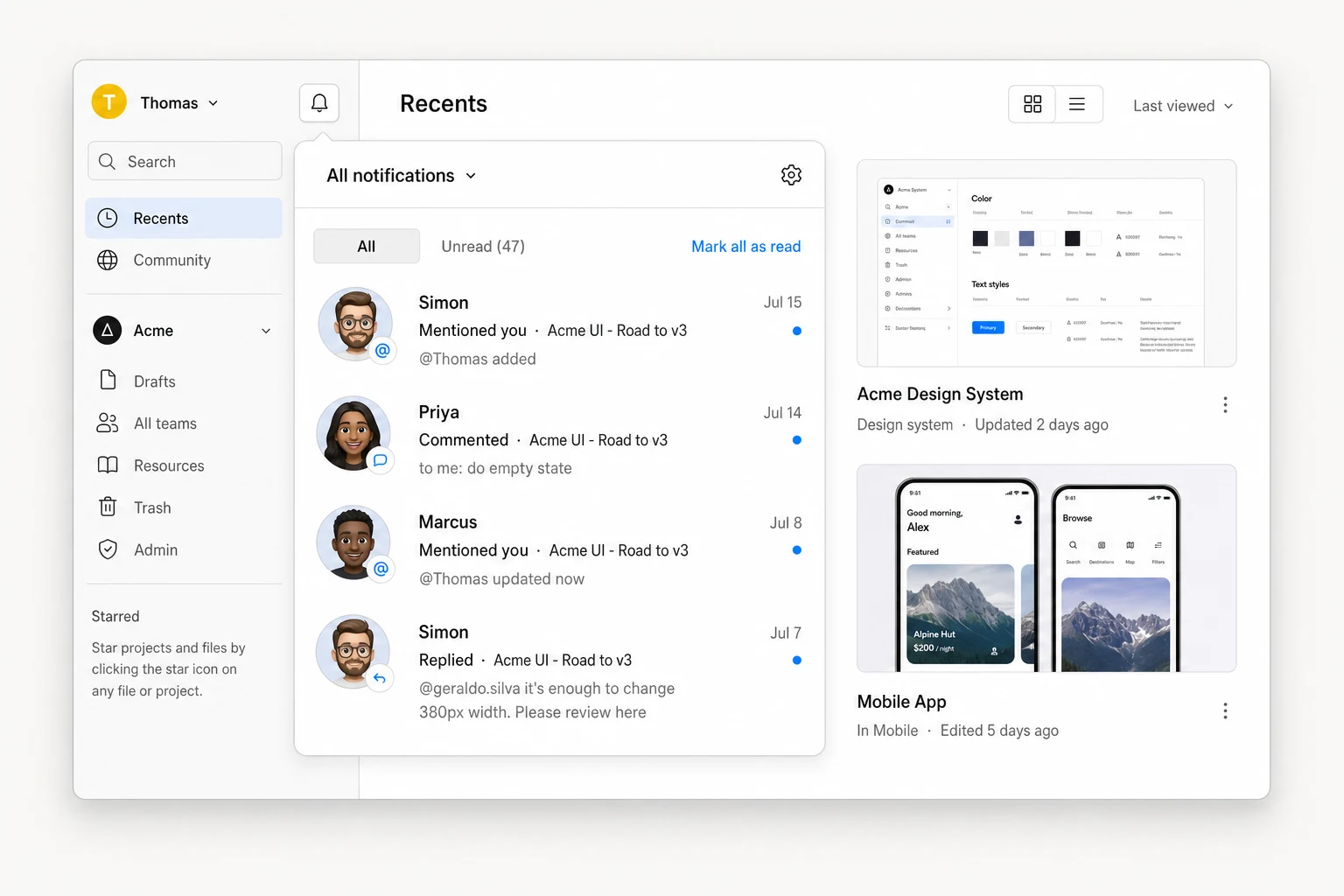
A good in-app notification center is designed for scanning, not reading. That means a badge that means something, rows with a strict title, body, and timestamp hierarchy, one quiet unread signal, and grouping so a busy feed stays legible. The states most teams treat as afterthoughts, empty, loading, and error, are where the polish actually shows.
Courier Inbox lets you hit that bar at three depths: theme the built-in components to match your brand, swap individual pieces like the row with render props, or go fully headless with the useCourier() hook and build any layout on Courier's real-time and state layer.
Anatomy of a notification center
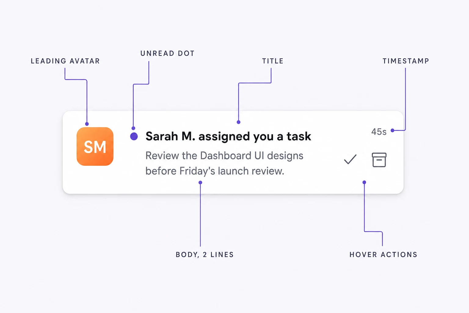
An in-app notification center is the in-product home for a user's notifications: the bell, the feed behind it, and the read state that ties them together. Every one is the same handful of parts, arranged well or badly:
- The entry point: a bell or button, usually with an unread badge, that lives in your nav.
- The header: a title, an unread count, filters or tabs, and bulk actions like "mark all read."
- The list: the feed itself, one row per notification.
- The row: a leading icon or avatar, a title, a short body, a timestamp, an unread indicator, and (on hover or long-press) per-item actions.
- The states: what shows while loading, when there's nothing to show, and when something breaks.
The rest of this guide is about getting each of these right.
The design decisions that make a notification center work
Design the row for scanning, not reading
People scan a feed for the one thing that matters, then leave, so a row has to answer "what is this, and do I care?" at a glance. Give it a strict hierarchy: a leading icon or avatar that signals type or sender before any text is read, a title that stands on its own, a body clamped to one or two lines so rows stay uniform, and a relative timestamp (2h, Yesterday). Add a button only for a real action ("Approve," "View invoice"), never for symmetry.
Unread is the feed's most important signal and the easiest to overdo. One small dot and a slightly heavier title is enough; a dot plus a tint plus bold text plus a left border is four ways of saying one thing. Mark read on open, and give people an easy "mark as unread" for anything worth returning to.
Tame the volume before the feed becomes noise
Volume is the enemy of every notification center. Start at the badge: cap it (9+, not 247) and make "unread" mean "worth acting on," not "technically new." A badge that's always lit teaches people to stop looking.
Inside the feed, three tools keep a busy list legible. Time grouping ("Today," "Yesterday") instantly orders a long feed. Bundling collapses repeats into one row ("Maya and 8 others reacted" beats nine) and is the highest-impact fix for noise, as much a content decision as a UI one. Tabs ("All," "Unread," "Mentions") separate notifications that differ in kind. Underneath, per-category and per-channel preferences let people tune what arrives at all; a feed nobody can turn down is one they learn to ignore.
Bundling can also happen before delivery. Courier's batching and digests collapse a burst of events into one grouped notification, so the feed receives a single "10 new comments" instead of ten separate rows in the first place.
Make it live, and put actions where the hand is
Real-time is what separates a notification center from an email folder: when something arrives while the app is open, the feed updates and the badge ticks up with no refresh. For time-sensitive events, pair the feed with a toast, a small popup that surfaces the notification as it lands, then leaves. Toasts say "now," the inbox says "later," so keep toasts rare enough to matter.
Make the feed something people act on. Put the two actions they reach for most, mark read/unread and archive, where the hand already is: on hover on desktop, on swipe on touch. Bulk actions go in the header. And keep every action instant by updating optimistically and reconciling in the background; a center that waits for a round-trip to clear a dot feels broken even when it works.
Design the empty, loading, and error states
These are the states teams skip, and where polish shows. An empty panel reads as broken; "You're all caught up" with a light illustration reads as finished, and it's the first thing a new user sees. Loading should hold the layout still with skeleton rows shaped like real ones. An error state needs a way out: what happened, in plain language, and a retry, not a raw stack trace.
Make it robust: accessible, dark, and responsive
Your notification center will be used in dark mode, on small screens, and with a keyboard or screen reader, so design for all three up front. Dark mode isn't an inverted palette: unread states, dividers, and shadows each need their own dark values to hold the hierarchy. On a narrow screen the dropdown becomes a full-screen sheet, tap targets grow to at least 44px, and hover actions move to tap or swipe. For accessibility: WCAG AA contrast in both modes, every row and action keyboard-operable with visible focus, the bell labeled with its unread count, and new arrivals announced through a polite live region that respects prefers-reduced-motion.
Native apps add their own conventions (system integration, push, platform list patterns), but every decision above holds regardless of platform.
Before you ship: a design checklist
Principles are easy to agree with and easy to forget under deadline. Run this against the real thing, with real data, before it goes out:
- Load a realistic backlog, not three demo rows. A busy week (fifty or so notifications) is where a flat feed turns into a wall and you find out whether you need time grouping or bundling. Scroll performance at hundreds or thousands is a separate question that pagination or virtualization handles.
- Empty it. Is the empty state intentional, or does it look broken?
- Break it. Kill the network and confirm the error state is human and offers a retry.
- Count past nine. Does the badge cap (
9+) or does it render247? - Tab through it. Can you reach and trigger every action with the keyboard, with visible focus?
- Check contrast in both modes. Do muted timestamps still pass AA in light and dark?
- Drop to a phone-width viewport. Does the dropdown become a usable full-screen sheet, and are tap targets at least 44px?
- Watch a live one arrive. Does the feed update on its own, and does anything time-sensitive toast without stealing focus?
If it survives all eight, you've built a notification center people will actually open.
Three ways to build it in Courier Inbox
Those principles are vendor-agnostic. Courier Inbox lets you apply them at three levels of control, a spectrum from out-of-the-box to fully custom. The trade-off is consistent: the more of the UI you take over, the more design freedom you get, and the more markup you own and maintain. What doesn't change is the hard part underneath, sign-in, the real-time connection, pagination, and read state, which Courier handles at every level.
| Approach | How much you customize | Effort to build and maintain | Best when |
|---|---|---|---|
| 1 · Theme it | Colors, fonts, radius, spacing | Very low | The default layout works and you just need it on-brand |
| 2 · Extend the blocks | Swap the parts you pick: the row, header, or empty state | Low | The layout is close, but a piece (usually the row) needs custom markup or actions |
| 3 · Headless | The entire UI, any layout you can imagine | Medium to high | You need something nothing like a default inbox and want it fully custom |
Start as far up the table as you can, and drop down only where the defaults get in your way. Most teams theme (level one) and reach for render props (level two) on the row. Level three is there when you need it, but most companies never do; the teams that reach for it usually want something fully custom by design. You can mix all three in the same app.
Level 1: Theme the out-of-the-box components
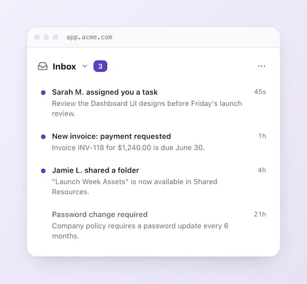
Courier's components work out of the box; the fastest path is to theme them. A CourierInboxTheme is a single object that mirrors the structure of the inbox. You target a region by following the nesting and set only the properties you want to change. Everything you leave out falls back to the default, so a theme is usually small.
import { CourierInbox, type CourierInboxTheme } from "@trycourier/courier-react";

const theme: CourierInboxTheme = {
  inbox: {
    header: {
      tabs: {
        selected: {
          unreadIndicator: {
            backgroundColor: "#5A40C7", // unread badge on the selected tab
          },
        },
      },
    },
    list: {
      backgroundColor: "#ffffff",
      item: {
        unreadIndicatorColor: "#5A40C7", // unread dot on each row
      },
    },
  },
};

return <CourierInbox lightTheme={theme} darkTheme={theme} mode="light" />;
Three props drive theming:
lightThemeanddarkThemedefine each mode independently. Pass the same object to both if you only want one look.modepicks which renders:"light","dark", or"system"to follow the user's OS setting. Shipping both modes is a few extra lines here, not a rebuild.
Beyond color, the theme also covers fonts, icons, and text, so you can match your typography and even reword built-in labels. Check the CourierInboxTheme reference for the full set of tokens.
Start from the default and override
If you'd rather tweak the built-in look than define a theme from scratch, import defaultLightTheme and merge your overrides on top with mergeTheme. Your values win; everything else stays default.
import {
  CourierInbox,
  defaultLightTheme,
  mergeTheme,
  type CourierInboxTheme,
} from "@trycourier/courier-react";

const overrides: CourierInboxTheme = {
  inbox: {
    list: {
      item: {
        unreadIndicatorColor: "#5A40C7",
      },
    },
  },
};

const theme = mergeTheme(defaultLightTheme, overrides);

return <CourierInbox lightTheme={theme} mode="light" />;
There's a matching defaultDarkTheme for dark mode, and defaultToastLightTheme / defaultToastDarkTheme with a mergeToastTheme helper for styling toasts the same way.
Fit it to its container
By default the inbox sizes to its content. Pin it to a fixed height when it lives in a sidebar or dashboard panel:
return <CourierInbox height="600px" lightTheme={theme} />;For the bell-and-dropdown pattern, swap in <CourierInboxPopupMenu />, which gives you the button, the unread badge, and the popup for free. Control where it opens and how big it is with popupAlignment, popupWidth, and popupHeight:
import { CourierInboxPopupMenu } from "@trycourier/courier-react";

return (
  <CourierInboxPopupMenu
    popupAlignment="top-right"
    popupWidth="420px"
    popupHeight="560px"
  />
);
A theme gets you brand-matched in an afternoon. When you need pixel-level control over how a notification looks, move to render props.
Level 2: Extend Courier's building blocks
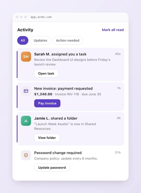
Render props let you take Courier's building blocks and extend them: replace individual parts of the inbox, the row, the header, the empty state, with your own React components while Courier keeps doing the heavy lifting (real-time updates, read state, pagination, and actions). You get design freedom exactly where you want it and keep the defaults everywhere else.
The one that matters most is the row. renderListItem receives each message and lets you return whatever markup you like. This is where the "design the row for scanning" principle becomes code:
import {
  CourierInbox,
  type CourierInboxListItemFactoryProps,
} from "@trycourier/courier-react";

function NotificationRow({ message }: CourierInboxListItemFactoryProps) {
  const isUnread = !message.read;

  return (
    <div
      style={{
        display: "flex",
        gap: 12,
        padding: "14px 16px",
        alignItems: "flex-start",
        background: isUnread ? "#F7F5FF" : "transparent",
      }}
    >
      {/* Leading icon encodes the type before any text is read */}
      <div
        aria-hidden
        style={{
          width: 36,
          height: 36,
          borderRadius: 10,
          background: "#EDE9FE",
          display: "grid",
          placeItems: "center",
          flexShrink: 0,
        }}
      >
        🔔
      </div>

      <div style={{ minWidth: 0, flex: 1 }}>
        <div
          style={{
            fontWeight: isUnread ? 600 : 500,
            color: "#171717",
            fontSize: 14,
          }}
        >
          {message.title}
        </div>
        {/* Clamp the body so every row is the same height */}
        <div
          style={{
            color: "#525252",
            fontSize: 13,
            lineHeight: 1.4,
            display: "-webkit-box",
            WebkitLineClamp: 2,
            WebkitBoxOrient: "vertical",
            overflow: "hidden",
          }}
        >
          {message.body}
        </div>
      </div>

      {/* One quiet unread signal, not four */}
      {isUnread && (
        <span
          aria-label="Unread"
          style={{
            width: 8,
            height: 8,
            borderRadius: "50%",
            background: "#5A40C7",
            flexShrink: 0,
            marginTop: 6,
          }}
        />
      )}
    </div>
  );
}

export default function App() {
  // Courier authentication and other component code...

  return (
    <CourierInbox
      renderListItem={(props: CourierInboxListItemFactoryProps) => (
        <NotificationRow {...props} />
      )}
    />
  );
}
The same pattern covers the other parts you'll want to own:
renderHeaderreplaces the header. Use it for a custom title, your own filter chips, or an unread pill that matches your design system. It receives the feeds with their selection state and unread counts.renderEmptyState,renderLoadingState, andrenderErrorStatecover the three states most teams skip. This is where the "empty is a design opportunity" principle lives: return an illustration and a friendly line instead of a blank panel.renderMenuButton(on the popup menu) replaces the bell so it matches the rest of your nav, and gives you the unread count to render your own badge.
Here's a finished empty state, intentional rather than blank:
import {
  CourierInbox,
  type CourierInboxStateEmptyFactoryProps,
} from "@trycourier/courier-react";

function EmptyState(_: CourierInboxStateEmptyFactoryProps) {
  return (
    <div style={{ textAlign: "center", padding: "48px 24px", color: "#525252" }}>
      <div style={{ fontSize: 40, marginBottom: 12 }}>📭</div>
      <div style={{ fontWeight: 600, color: "#171717", marginBottom: 4 }}>
        You're all caught up
      </div>
      <div style={{ fontSize: 13 }}>
        New notifications will show up here as they arrive.
      </div>
    </div>
  );
}

return (
  <CourierInbox
    renderEmptyState={(props) => <EmptyState {...props} />}
  />
);
You can also organize the feed with tabs and feeds (the "grouping" principle) without any custom rendering, by passing a feeds array that defines filtered views like All, Unread, and Mentions. That's configuration, not code you maintain.
Level 3: Go fully headless for total customization
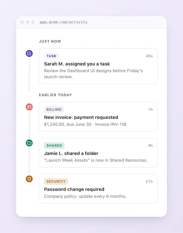
When you need a feed that looks nothing like the default, notifications inline in a timeline, a command-palette-style overlay, a custom mobile sheet, drop the components entirely and use useCourier(). The hook exposes the same data and actions the components use, so you build the UI and Courier handles everything behind it.
import { useCourier, type InboxMessage } from "@trycourier/courier-react";

function CustomFeed() {
  const { inbox } = useCourier();
  const messages = inbox.feeds["all_messages"]?.messages ?? [];

  return (
    <div>
      <header style={{ display: "flex", justifyContent: "space-between" }}>
        <h2>Notifications</h2>
        <button onClick={() => inbox.readAllMessages()}>Mark all read</button>
      </header>

      {messages.map((message: InboxMessage) => (
        <button
          key={message.messageId}
          onClick={() => inbox.clickMessage(message)}
          style={{ fontWeight: message.read ? 400 : 600 }}
        >
          {message.title}
        </button>
      ))}
    </div>
  );
}
You get reactive state (inbox.totalUnreadCount, inbox.feeds) and the full set of actions (inbox.readMessage(message), inbox.archiveMessage(message), inbox.readAllMessages(), and more). Everything the principles above ask for, optimistic updates, grouping, custom actions, is yours to arrange, without rebuilding the real-time and state layer underneath.
Putting it all together
A good notification center is a stack of small, deliberate decisions: a badge that means something, a row built for scanning, one quiet unread signal, real grouping, states that don't look broken, and actions where the hand already is. The design work is the same whether you build or buy.
Courier Inbox lets you execute that design at whatever depth you need: match your brand with a theme, take over the pieces that matter, or build the whole interface yourself, all on top of the real-time delivery and read state every notification center needs underneath. Start on-brand, reach for more control only where the defaults get in your way, and you'll ship something polished faster than you'd build the bell from scratch.
Frequently asked questions
Should a notification mark as read when it's opened?
Yes, for most products. Read-on-open keeps friction low, and pairing it with an easy "mark as unread" lets people flag anything they want to come back to. Save read-only-on-explicit-action for cases where the unread count drives real work, like support queues or approvals, where a self-clearing badge would hide things that still need doing.
How many notifications should you show before bundling them?
Bundle as soon as the same kind of event repeats, not at some volume threshold. "Maya and 8 others reacted to your post" as a single row beats nine separate rows every time. Bundling is the highest-impact change you can make to a noisy feed, and it's a content decision as much as a UI one. On the delivery side, Courier's batching and digests group a burst of events into one notification before it reaches the feed.
What's the difference between a toast and a notification inbox?
A toast is "tell me now": a small, transient popup for something time-sensitive while the app is open. The inbox is "let me catch up later": the persistent feed that holds history and read state. Use both, and keep toasts rare so they stay meaningful.
Should you build an in-app notification center or use a component?
Buy it, unless notifications are your core product. The bell and the list are a weekend of work; the real cost is the real-time backend, cross-device read state, storage, pagination, and the on-call that never ends. A drop-in component hands that reliability problem to a vendor while still letting you own the design through theming and extending the parts that matter. For the full breakdown, see best in-app notification centers in 2026, or the step-by-step guide to adding a notification center to your app.
Related resources:
Similar resources
HIPAA-compliant notifications: where PHI should live
A practical guide to HIPAA-compliant notifications across SMS, push, email, and an in-app inbox. One rule, applied to every channel and every place PHI gets stored, including the systems most teams forget are in scope.
How to get your logo in Gmail and Apple Mail
BIMI puts your logo next to your emails in Gmail and Apple Mail, but there is no upload form. It is earned by locking your domain down. Here is the whole project: what it costs, how long it takes, and the five ways it fails silently.

Email preview tools compared: 6 that render on real devices
Most "email preview" features are simulations. These six open your email in the actual client and send back a screenshot. Here’s what each costs per preview, how much work sits between your template and the result, and which ones you can drive from code.