Adding a button block
- In Design Studio, select a channel.
- Add a Button block from the block sidebar or toolbar.
- Set the button label and link URL.
- Configure button styles (padding, color, border radius).
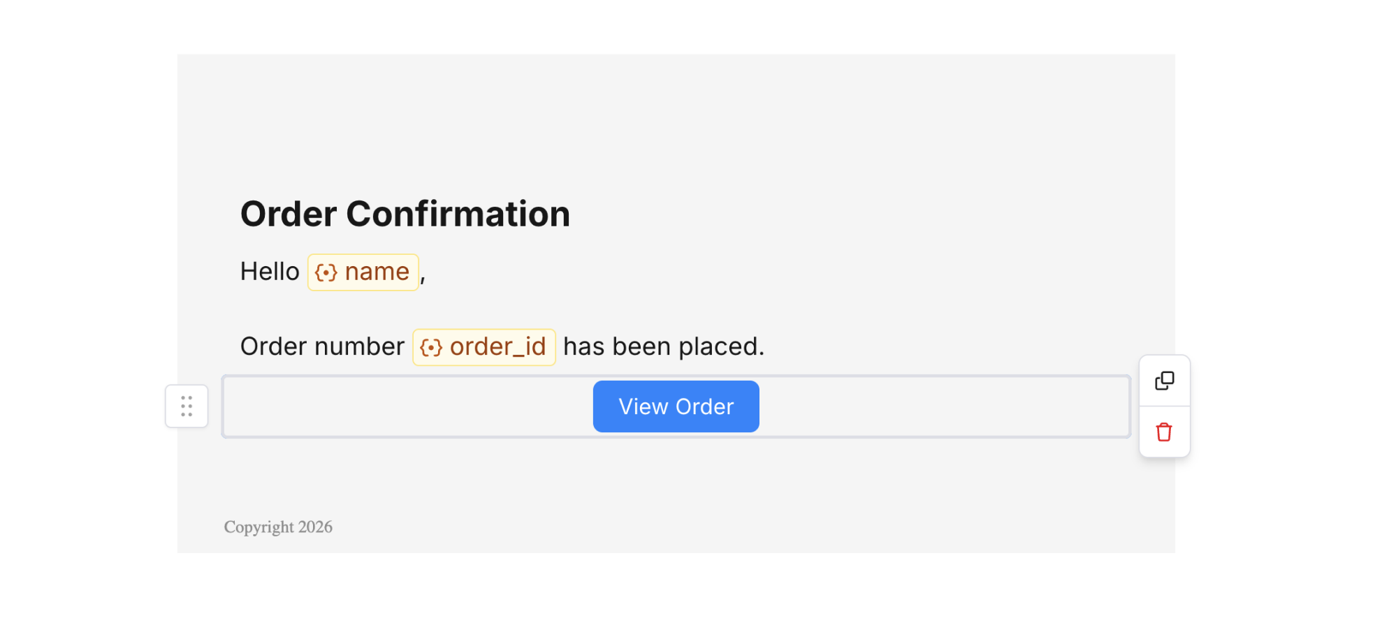
Button Block
Button settings
Select a button block to open the settings panel on the right. Here you can configure:- Label – Text shown on the button. You can use variables (e.g. “View
{{product_name}}”). - Link URL – Destination when the button is clicked. Use variables for dynamic URLs.
- Alignment – Left, center, or right.
- Background color – Button fill color.
- Border radius – Corner rounding.
- Border size – Outline thickness.
- Padding – Space around the button.
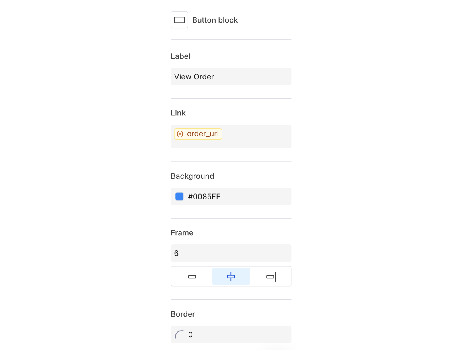
Button Block Settings